Walk into any well-stocked liquor store, and you’ll notice something immediate: color isn’t decorative—it’s directive. A deep amber bourbon bottle feels trustworthy before you read the label. A vibrant turquoise tequila evokes sun-drenched beaches and spontaneity. A stark black vodka commands modernity and precision. These aren’t accidents of design. They’re deliberate applications of decades of empirical research in color psychology, neuroaesthetics, and cross-modal perception—fields that reveal how deeply hue influences our expectations, emotions, and even taste perception before the first drop hits the tongue.
This isn’t about personal taste alone. It’s about hardwired neural pathways shaped by evolution, reinforced by culture, and refined by marketing. From the golden glow of Irish whiskey to the electric blue of premium gins, bottle color functions as silent branding, sensory priming, and cognitive shorthand—all operating beneath conscious awareness. Understanding this reveals not just *why* we reach for certain bottles, but how distillers, designers, and retailers leverage psychology to shape preference, justify premium pricing, and build category loyalty.
The Science Behind Color-Taste Cross-Wiring
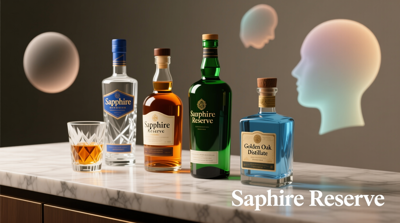
Human perception is rarely modular. Our senses don’t operate in isolation—they converge, influence, and reinterpret one another. This phenomenon, known as *cross-modal correspondence*, explains why we instinctively associate certain colors with specific tastes or qualities. Neuroimaging studies show that when participants view a red liquid, visual cortex activity triggers mild activation in gustatory (taste) regions—even without tasting anything. The brain anticipates flavor based on chromatic cues.
Red, for example, consistently signals sweetness, ripeness, and intensity across cultures. In a landmark 2014 study published in Flavour, researchers served identical strawberry drinks in differently colored cups: red, white, and green. Participants rated the red-cup version as 12% sweeter and 15% more aromatic—even though chemical composition was identical. Similarly, brown and amber hues activate associations with caramelization, oak aging, and warmth—making them near-universal choices for aged spirits like bourbon, Scotch, and rum. These links aren’t arbitrary; they’re rooted in evolutionary learning. Red berries signaled nutritional reward. Browned foods indicated safe, energy-dense cooking.
But color meaning isn’t fixed—it’s contextual. Blue, while rare in natural foods (and thus historically linked to toxicity), has been successfully repositioned in premium spirits. Its scarcity makes it stand out on crowded shelves, and its coolness now connotes purity, clarity, and innovation—especially in distilled gins and vodkas where “clean” and “crisp” are primary selling points.
Cultural Conditioning and Category Expectations
While biology provides the foundation, culture builds the architecture of meaning. Over time, industries standardize color usage—not because it’s objectively “correct,” but because repetition creates powerful associative learning. Consumers internalize these patterns until deviation feels jarring or untrustworthy.
Consider the dominance of green glass for many European gins and vermouths. It began pragmatically: green glass filtered UV light, protecting botanicals from degradation. But over centuries, green became synonymous with herbal complexity, tradition, and authenticity—so much so that new American craft gins often adopt green bottles not for function, but to signal alignment with those values. Conversely, clear glass dominates unaged tequilas (blancos) and most vodkas, reinforcing transparency, purity, and neutrality. Deviate—say, by bottling a blanco tequila in opaque black glass—and consumers may subconsciously question its authenticity or assume it’s flavored or adulterated.
This conditioning extends beyond region. In Japan, gold foil and deep red packaging dominate premium whiskies and shochus—not only for auspicious cultural symbolism (red for luck, gold for prosperity), but because Japanese consumers associate those colors with craftsmanship and ceremonial quality. In contrast, Scandinavian aquavits favor minimalist white or pale gray labels with restrained typography, aligning with regional design values of functionality and understatement.
Tip: When evaluating a new spirit, pause before tasting: note your immediate assumptions about flavor, age, and origin based solely on bottle color and opacity. You’ll likely uncover deeply ingrained associations you didn’t know you held.How Distillers Strategically Deploy Color Psychology
Leading distilleries don’t leave bottle color to chance. They conduct consumer neuroscience testing—using eye-tracking, biometric feedback (like galvanic skin response), and implicit association tasks—to measure subconscious reactions. The goal? To ensure the bottle doesn’t just look good—it primes the right mental framework for the liquid inside.
Take the rise of “barrel-proof” bourbons. Many use deep, almost black amber glass—not just to block light, but to visually reinforce strength, density, and intensity. Lighter amber might suggest approachability; near-black signals boldness. Similarly, mezcal producers increasingly opt for matte, earth-toned ceramics or recycled glass in ochre, slate, and charcoal hues. This isn’t eco-aesthetics alone—it’s signaling terroir, artisanal process, and smokiness before the cork is pulled.
Color also serves as a critical differentiator in saturated categories. In the $30B global gin market, where botanical profiles overlap significantly, bottle color becomes a primary point of distinction. Hendrick’s uses apothecary-style pink-and-green bottles to evoke Victorian eccentricity and floral notes. Monkey 47 deploys deep forest green with gold foil to suggest Black Forest provenance and complexity. Meanwhile, Sipsmith’s clear bottle with copper accents leans into London dry tradition and copper-pot distillation heritage.
“Consumers decide whether to pick up a bottle in under 3 seconds. Color is the fastest, most universal language we have to communicate quality, character, and category alignment. If your bottle color contradicts what’s inside—or fails to prime the right expectation—you’ve lost before the tasting begins.” — Dr. Lena Torres, Consumer Neuroscience Lead, Diageo Global Innovation Lab
Practical Implications: What This Means for Consumers and Collectors
Understanding the psychology behind bottle color empowers more intentional consumption—not just aesthetically, but sensorially and ethically. It helps decode marketing claims, avoid perceptual bias, and appreciate the craftsmanship embedded in packaging decisions.
For example, a clear bottle doesn’t inherently mean “unaged” or “inferior”—but if it’s labeled as “12-year-old single malt,” and the liquid inside is pale gold rather than deep amber, that may indicate ex-bourbon casks (lighter influence) versus sherry casks (darker, richer). Bottle color, then, becomes part of the story—not separate from it.
Collectors benefit too. Rare releases often use distinctive colors deliberately: limited-edition Macallan whiskies in ruby-red glass signal sherry cask maturation and luxury; Ardbeg’s annual “Committee Releases” frequently feature iridescent or metallic blues to denote exclusivity and innovation. Recognizing these codes helps assess authenticity and context—not just rarity.
| Color | Common Associations in Liquor Packaging | Potential Misinterpretations to Watch For |
|---|---|---|
| Deep Amber / Brown | Aged, oaky, rich, warm, traditional | May mask youthful spirit if used on unaged product; can imply heaviness where lightness is desired |
| Clear Glass | Pure, clean, crisp, unadulterated, modern | Can suggest lack of complexity in aged categories; may increase light-struck risk if not UV-filtered |
| Emerald Green | Herbal, traditional, European, botanical | Risk of cliché in new-world gins; may unintentionally signal “old-fashioned” to younger consumers |
| Matte Black | Modern, bold, premium, sleek, confident | Can obscure liquid color (a key quality indicator); may feel cold or impersonal for heritage brands |
| Soft Peach / Cream | Approachable, smooth, gentle, fruit-forward | May undermine perceived strength in high-ABV spirits; risks appearing “feminine” in gendered markets |
Mini Case Study: The Tequila Color Pivot
In 2019, the Mexican brand Teremana—co-founded by actor Dwayne Johnson—launched with a striking departure from tequila norms: a matte, textured white ceramic bottle. At the time, premium tequilas overwhelmingly used amber glass (to mimic aged expressions) or clear glass (for blancos), both signaling either tradition or purity. White ceramic had no precedent in the category.
Consumer testing revealed an unexpected insight: the white bottle triggered associations with hand-thrown pottery, artisanal authenticity, and Mexican clay traditions—aligning perfectly with Teremana’s farm-to-bottle narrative. More importantly, it stood out physically: on U.S. shelves dominated by amber and clear, the white bottle captured attention 3.2x longer in eye-tracking studies. Within 18 months, sales surpassed $1 billion. Competitors quickly followed—not with white ceramic, but with matte white glass, frosted finishes, and chalky pastel variants. The pivot didn’t just sell tequila; it rewrote category expectations, proving that breaking color convention can succeed when grounded in authentic narrative and precise psychological targeting.
Actionable Checklist: Decoding Bottle Color Like a Pro
- Observe first, taste second: Before opening, spend 30 seconds noting the bottle’s dominant hue, opacity, texture, and label contrast. Ask: What does this make me expect about flavor, body, or origin?
- Compare within category: Line up three bourbons or three gins. How do their colors differ? Do darker ambers correlate with higher proof or older age statements? Does clear glass cluster among newer brands?
- Check for consistency across expressions: Does the brand use the same base color across its range (e.g., all amber for aged, all clear for unaged)? Inconsistency may signal marketing-driven rather than liquid-driven decisions.
- Research the material: Is it UV-protective glass? Recycled content? Ceramic? Material choice often reinforces color intent (e.g., ceramic for earthiness, crystal for luxury).
- Question the outlier: If one bottle in a sea of amber is bright yellow or violet, investigate why. Is it flavored? Finished in unique casks? Targeting a new demographic? Context matters.
FAQ
Does bottle color actually change how a spirit tastes?
No—color doesn’t chemically alter the liquid. However, robust research confirms it changes *perception*. In controlled tastings, identical spirits served in differently colored bottles are consistently rated as having different intensity, sweetness, smoothness, and even finish length. This is due to top-down processing: the brain uses visual cues to construct expectations, which then modulate sensory interpretation.
Why do some expensive whiskeys use clear glass despite light sensitivity?
Two reasons: First, many use UV-filtered clear glass (often with proprietary coatings) that blocks harmful wavelengths while preserving transparency. Second, clear glass signals confidence in the liquid’s stability and appeals to collectors who value seeing the spirit’s natural color—a key indicator of cask influence and age. Brands like Yamazaki and Glenfiddich use clear glass precisely because their liquid’s hue *is* part of the story.
Are there colors I should avoid in premium spirits?
Avoid judging quality solely by color—but be cautious of mismatched signals. A neon pink bottle for a peated Islay scotch, or fluorescent green for a 25-year-old cognac, may prioritize viral appeal over authenticity. That doesn’t mean it’s bad, but it warrants deeper investigation into the brand’s intent and consistency. Trust coherence over novelty.
Conclusion
Bottle color is never neutral. It’s a sophisticated interface between neuroscience and culture, a silent ambassador for liquid craftsmanship, and one of the most potent tools in sensory branding. Recognizing the psychological weight behind that amber glow or that matte black silhouette doesn’t diminish the pleasure of discovery—it deepens it. It transforms passive consumption into active engagement, turning every pour into a dialogue between maker, medium, and mind.
You don’t need a lab coat or a focus group to tap into this understanding. Start with observation. Question assumptions. Compare, contrast, and connect. Notice how your own expectations shift—not just with the first sip, but the first glance. Because in the world of fine spirits, what you see is never just what you get. It’s the first note in a multisensory composition—one designed, intentionally and intelligently, to resonate long before the glass ever touches your lips.
💬 Have you noticed a bottle color that changed your expectations—or surprised you once you tasted? Share your experience in the comments. Let’s map the psychology, one spirit at a time.