In the world of personal style, accessories are no longer afterthoughts—they’re statements. Among the most versatile yet underutilized tools in a modern wardrobe is the contrast canvas bag. Unlike neutral-toned leather or monochrome totes, contrast canvas bags introduce deliberate color, texture, and personality into an ensemble. When used intentionally, they don’t just carry your essentials—they elevate your entire look. The key lies not in avoiding contrast, but in embracing it with confidence and precision.
Canvas bags offer durability, breathability, and a casual elegance that suits everything from weekend errands to urban commutes. But when they come in contrasting colors—think cobalt blue against beige linen, or cherry red paired with charcoal gray—their impact multiplies. Mastering how to coordinate these pieces transforms an ordinary outfit into something memorable, balanced, and uniquely yours.
The Power of Contrast in Fashion
Contrast is one of the foundational principles of visual design. In fashion, it refers to the deliberate use of opposing elements—color, texture, shape, or proportion—to create visual interest. A well-placed contrast draws attention, guides the eye, and adds depth to an otherwise flat composition.
When applied to accessories, contrast works as a silent highlighter. A neutral outfit—say, a white shirt and black trousers—becomes dynamic when paired with a mustard-yellow canvas tote. That single element shifts the narrative from “minimalist” to “intentionally curated.” The bag doesn’t clash; it completes.
Fashion psychologist Dr. Lydia Chen notes:
“Color contrast in accessories triggers subconscious associations with confidence and creativity. People who wear bold accents are often perceived as more decisive and self-assured—even if the rest of their outfit is simple.”
Choosing the Right Canvas Bag for Your Wardrobe
Not all canvas bags deliver the same stylistic payoff. To maximize versatility and cohesion, consider three factors before selecting one: color theory, structural silhouette, and fabric finish.
Color Theory Basics: Complementary colors (opposites on the color wheel) create high contrast and energy. Analogous colors (neighbors on the wheel) offer subtler harmony. For maximum impact with minimal effort, choose a bag that complements your most-worn neutrals. If you favor navy, tan, and gray, a rust-orange or emerald-green bag will stand out without overwhelming.
Silhouette Matters: A structured rectangular tote projects professionalism, while a slouchy crossbody suggests relaxed sophistication. Match the bag’s shape to the occasion—and the message you want to send.
Texture & Finish: Matte canvas absorbs light, creating a soft presence. Wax-coated or slightly glossy finishes reflect light, adding polish. Pair matte bags with cotton, wool, or denim for earthy balance. Use sheened finishes to bridge casual fabrics with semi-formal layers like blazers.
Tip: Test a bag’s versatility by wearing it with three different outfits over consecutive days. If it works with at least two, it’s a keeper.Outfit Coordination Strategies Using Contrast Bags
Integrating a contrast canvas bag successfully depends less on rules and more on rhythm. Here are four proven strategies to achieve balance without overthinking.
1. Anchor With Neutrals
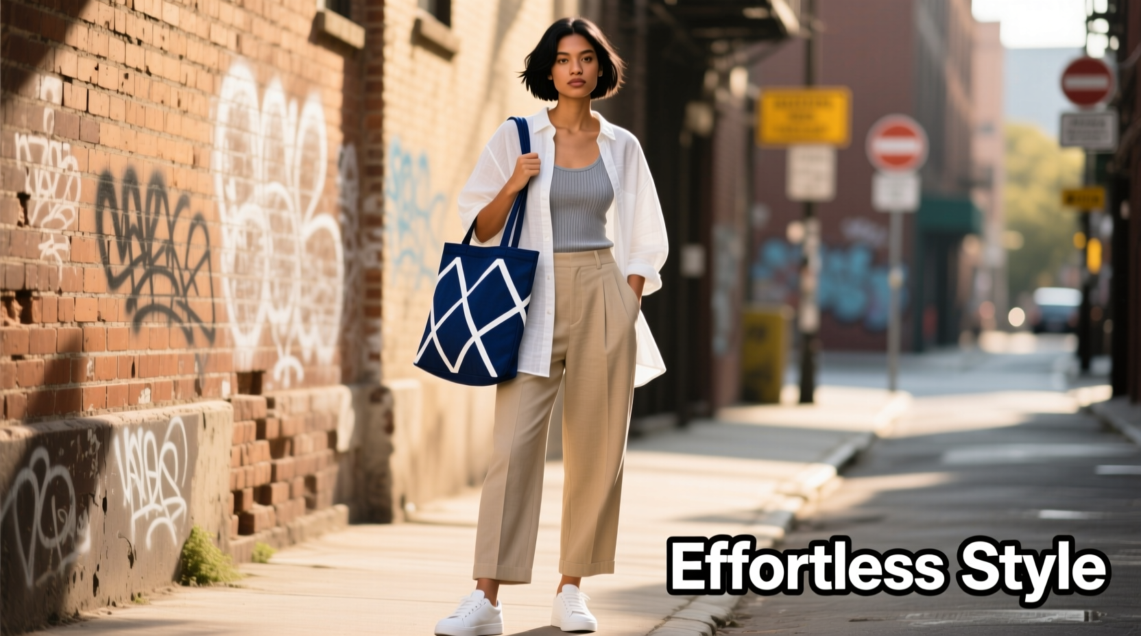
Build your base with timeless neutrals—white, black, beige, gray, or navy. These tones act as a blank canvas (literally and figuratively), allowing your bag to shine. Example: pair olive-green wide-leg pants with a cream silk blouse and a deep coral canvas shoulder bag. The outfit remains wearable, but the pop of color feels intentional.
2. Echo the Bag Elsewhere
Create cohesion by repeating the bag’s hue in a smaller detail—a scarf, shoelaces, belt, or even nail polish. This technique prevents the accessory from feeling isolated. A royal-blue bag gains legitimacy when matched with navy loafers or a thin blue stripe in a striped tee.
3. Use the 60-30-10 Rule
This interior design principle translates beautifully to styling: 60% dominant color (e.g., beige coat), 30% secondary (white sweater), 10% accent (bright yellow bag). The bag becomes the exclamation point in a grammatically correct sentence.
4. Let Proportion Guide You
A large tote in a vivid hue dominates space—ideal for minimalist wardrobes. A small crossbody in a contrasting color can punctuate a busier outfit. Avoid competing patterns unless one element is clearly subordinate.
“The most stylish people don’t match everything. They balance.” — Marcus Tran, Stylist & Creative Director at Threadline Studio
Step-by-Step Guide: Building a Week of Outfits Around One Contrast Bag
Suppose you’ve just purchased a deep plum canvas tote. Here’s how to integrate it across five work-to-weekend looks without repetition or strain.
- Monday – Professional Edge: Tailored gray trousers, crisp white button-down, black blazer, black ankle boots. The plum bag adds warmth and softens the monochrome palette.
- Tuesday – Casual Layering: Light-wash jeans, oatmeal-colored turtleneck, camel trench coat. The bag introduces richness without clashing.
- Wednesday – Pattern Play: Black-and-white striped Breton top, navy midi skirt, nude flats. The plum bag unifies the look by sitting outside the pattern’s spectrum.
- Thursday – Monochromatic Lift: All-beige outfit: khaki chinos, sand-colored sweater, tan shoes. The bag serves as the sole focal point.
- Friday – Weekend Ready: Denim jacket, white tee, black leggings, chunky sneakers. Swap the tote for a smaller plum crossbody to maintain continuity with lighter proportions.
Do’s and Don’ts: Common Mistakes in Contrast Coordination
| Do | Don’t |
|---|---|
| Use contrast to draw attention upward (e.g., bright bag at chest level) | Pair multiple loud accessories (e.g., red bag + yellow shoes + patterned scarf) |
| Match undertones (warm bag with warm clothing tones) | Ignore seasonal palettes (e.g., icy pastels in winter, heavy burgundy in summer) |
| Test combinations in natural light | Assume all neutrals go together (cool gray vs. warm beige can clash) |
| Limit contrast to one primary accent per outfit | Over-accessorize—let the bag breathe as the star |
Real-Life Example: How Sarah Transformed Her Style
Sarah, a 34-year-old project manager, relied on black handbags for years. “I thought bold colors were too ‘extra,’” she says. After receiving a teal canvas tote as a gift, she resisted using it for weeks. Finally, she paired it with white jeans and a navy sweater. The response was immediate—colleagues complimented her look, and she felt more energized.
She began experimenting: matching her tote to her daughter’s raincoat on school drop-offs, using it to offset a gray work suit. Within two months, she had built three new capsule outfits around the bag. “It didn’t change my wardrobe,” she reflects. “It changed how I see it.”
Checklist: Mastering Outfit Coordination with Contrast Bags
- ✅ Identify your core neutrals (5–7 staple pieces)
- ✅ Choose a contrast bag in a color that excites you
- ✅ Test it with at least three existing outfits
- ✅ Add one small echo of the bag’s color elsewhere (shoes, socks, jewelry)
- ✅ Limit other statement accessories on bag-centric days
- ✅ Store the bag properly when not in use (see care tips below)
- ✅ Wear it for a full day to assess comfort and real-world fit
Care Tips to Preserve Style and Function
A vibrant canvas bag loses impact if it’s stained, faded, or misshapen. Maintain its appeal with consistent care.
Clean spills immediately with a damp cloth. For deeper cleaning, hand-wash with mild detergent and air-dry away from direct sunlight to prevent fading. Never machine-wash unless the label explicitly allows it. Store the bag upright with tissue inside to preserve shape, and avoid stacking heavy items on top.
“Consistent care and proper storage can double a bag’s lifespan.” — Emma Clarke, Fashion Care Expert
Frequently Asked Questions
Can I wear a contrast bag with patterns?
Yes, but ensure the bag’s color appears in the pattern or sits harmoniously beside it. For example, a floral dress with hints of turquoise pairs well with a solid turquoise bag. Avoid introducing a fourth unrelated color.
How do I know if a color truly contrasts well?
Hold the bag next to your face in natural light. If your skin tone looks brighter and more even, the color complements you. If you appear washed out, try a shade closer to your undertone—warm (golden/peach), cool (pink/blue), or neutral.
Are contrast bags appropriate for formal settings?
Depends on execution. A structured canvas bag in deep jewel tones (burgundy, forest green) can work in creative or business-casual environments. Avoid cartoonish prints or frayed edges. Pair with polished footwear to signal intentionality.
Conclusion: Make It Yours
Effortless style isn’t about perfection—it’s about presence. A contrast canvas bag is more than a container; it’s a declaration of taste, timing, and courage. When coordinated with awareness, it brings life to quiet outfits and focus to busy ones. The most compelling looks aren’t those without risk, but those where risk is balanced with insight.
You don’t need a closet overhaul to start. Pick one bag that speaks to you, pair it with what you already own, and observe the shift—not just in how others see you, but in how you carry yourself. Style grows from repetition, reflection, and the willingness to stand out just enough.
💬 Ready to redefine your daily look? Choose a contrast canvas bag this week and build one intentional outfit around it. Share your experience—or ask for feedback—in the comments below.