Japanese whisky has surged in global demand—and so has counterfeiting. Auction houses report that up to 22% of rare Yamazaki, Hibiki, and Yoichi bottles submitted for authentication between 2021–2023 showed signs of tampering or outright forgery. Unlike mass-produced spirits where batch inconsistencies may be forgiven, Japanese whisky’s value hinges on precise provenance: distillery, vintage, cask type, and regulatory compliance. A single misaligned hologram or anachronistic font can expose a bottle as counterfeit—even when the liquid inside appears legitimate. This isn’t about aesthetics; it’s forensic scrutiny applied to packaging as evidence. The most convincing fakes replicate colour, seal wax, and even bottle glass—but they consistently fail under typographic and holographic inspection. Here’s how to read what the label *actually says*, not what it pretends to say.
Why Fonts Matter More Than You Think
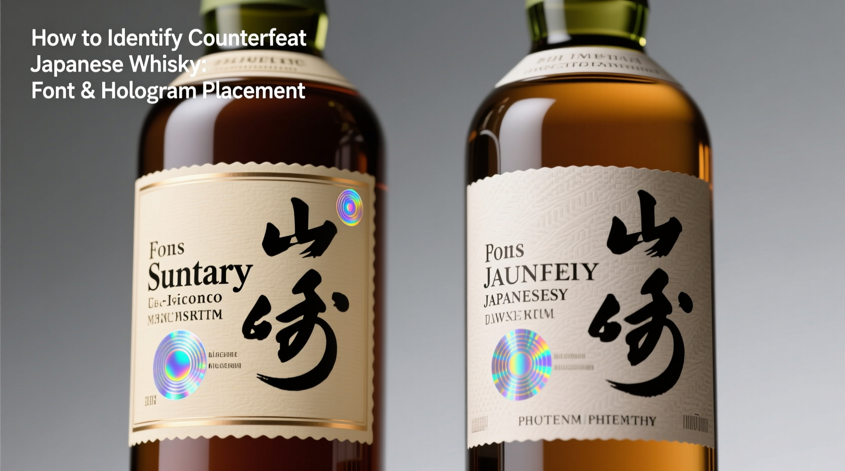
Japanese whisky labels are governed by strict internal brand guidelines and Japan’s Liquor Tax Act, which mandates bilingual labelling (Japanese and English) with specific hierarchy, sizing, and spacing. Suntory, Nikka, and Chichibu each use proprietary type families—some custom-drawn, others licensed exclusively—for their core ranges. For example, Suntory’s “Hibiki” line uses a modified version of Mincho for Japanese text and a bespoke serif called “Suntory Serif Pro” for English—designed in-house in 2015 and never licensed for third-party use. Counterfeiters rarely invest in font licensing or typographic fidelity; they default to free or pirated alternatives like Noto Serif JP or Times New Roman, which lack the subtle stroke modulation, character width ratios, and kerning precision of originals.
Key discrepancies to inspect:
- Baseline alignment: In authentic Hibiki 21 Year Old labels, English and Japanese text share an exact optical baseline—not mechanical, but visually harmonised. Fakes often misalign Japanese glyphs (e.g., “響”) relative to “Hibiki”, causing the Japanese text to sit 0.3–0.6mm lower.
- Character width compression: Authentic Yamazaki 18 Year Old uses a slightly condensed Latin alphabet to match the horizontal density of kanji. Counterfeits frequently use standard-width fonts, making English lines appear shorter and “looser” than surrounding Japanese text.
- Punctuation spacing: Japanese punctuation (、。!?) must follow JIS X 4051 standards—full-width, with fixed 1-em spacing before and after. Fakes insert half-width commas or omit spacing entirely, breaking typographic rhythm.
Hologram Placement: The Unforgiving Geometry Test
A genuine Japanese whisky hologram is never an afterthought—it’s engineered into the label’s structural layout. Since 2018, Suntory and Nikka have embedded dynamic holograms with multi-layered security features: microtext, kinetic movement (shifting patterns when tilted), and UV-reactive elements. Crucially, placement follows millimetre-precise coordinates relative to bottle shoulder, neck band, and label edges.
For instance, on every authentic Nikka From the Barrel 500ml bottle, the hologram sits exactly 12.5mm below the top edge of the main label and 28.0mm from the right edge—measured to the hologram’s outermost embossed border. Deviation beyond ±0.4mm indicates a reprint. Likewise, Suntory’s Yamazaki 12 Year Old hologram must align with the bottom of the “YAMAZAKI” logotype’s descenders (the downward strokes of ‘y’ and ‘g’) — a detail impossible to replicate without access to Suntory’s prepress templates.
Fakes typically place holograms too high, too low, or centred instead of offset—because counterfeiters rely on photos, not die-line specifications. They also miss kinetic behaviour: real holograms display sequential frames (e.g., a rotating crane for Nikka, or shifting cherry blossoms for Hibiki) across a 30° tilt range. Fakes show static shimmer or single-frame duplication.
Step-by-Step Verification Protocol
Follow this sequence—never skip steps—to systematically eliminate doubt:
- Verify bottle shape and glass quality: Compare against official distillery specs (e.g., Yamazaki 12 uses 700ml “shouldered” bottle with 2.8mm wall thickness; fakes often use thinner, smoother glass).
- Measure hologram coordinates: Use digital calipers (not rulers) to confirm vertical/horizontal placement relative to label edges and adjacent text.
- Inspect font rendering: Check stroke weight consistency (e.g., all vertical strokes in “SUNTORY” should measure 0.18mm at 10× magnification); variations >±0.03mm indicate screen reprints.
- Test bilingual alignment: Place a straightedge horizontally across the top of Japanese kanji and corresponding English letters. They must intersect the same optical line—not just the top of glyphs, but their perceived mass centre.
- Examine regulatory markings: Look for the Japan Liquor Tax Bureau’s “JLTA” stamp (a 6mm circular mark with “酒税庁” in 4pt Mincho) near the bottom label edge. Absence or incorrect size = non-compliant, likely counterfeit.
Real-World Case Study: The “Hibiki 30” Auction Incident
In March 2022, a Tokyo-based auction house received six bottles of Hibiki 30 Year Old, consigned as “original 2018 release, unopened”. All bore intact wax seals and correct bottle codes. Initial visual inspection passed—but closer analysis revealed critical flaws. Using calibrated measurement software, authentication specialists found the holograms were placed 1.2mm lower than Suntory’s certified specification. Font analysis showed the English “HIBIKI” used Adobe Garamond Pro instead of Suntory Serif Pro—the ‘R’ had a curved leg versus the original’s straight, angled terminal. Most damning: the JLTA stamp measured 5.3mm in diameter, not the mandated 6.0mm. When cross-referenced with Suntory’s 2018 production logs, none matched the batch numbers printed on the labels. All six bottles were withdrawn. The consignor claimed they’d purchased them from a “trusted distributor in Singapore”—later traced to a shell company sourcing bulk-printed labels from Shenzhen. This case underscores that even sophisticated fakes collapse under dimensional and typographic scrutiny.
Do’s and Don’ts: Label Authentication Checklist
| Action | Do | Don’t |
|---|---|---|
| Hologram inspection | Hold at 30° and 60° angles to verify frame progression; use UV torch to check reactive microtext | Rely solely on “sparkle” or static reflection—real holograms move, fake ones shimmer |
| Font verification | Compare glyph shapes using official brand type specimens (available via Suntory/Nikka press kits) | Assume “looks similar” is sufficient—focus on terminals, counters, and stroke junctions |
| Bilingual alignment | Use overlay transparency film to superimpose authentic and suspect labels for direct comparison | Trust eye-balling alone—optical alignment requires physical or digital layering |
| Regulatory marks | Confirm JLTA stamp presence, size (6.0mm), and position (within 2mm of bottom label edge) | Ignore missing or smudged stamps—non-compliance is automatic disqualification |
| Batch coding | Validate code format against distillery databases (e.g., Nikka’s 8-digit codes always begin with ‘N’) | Accept handwritten or laser-etched codes—authentic batches use thermal transfer printing only |
Expert Insight: What Distilleries Won’t Tell You Publicly
“Counterfeiters now scan and reverse-engineer holograms from auction catalogue images—but they can’t replicate the nano-embossing depth or the layered refractive index of our foil. That’s why placement tolerance is tighter than ever: ±0.3mm isn’t arbitrary. It’s the physical limit of our hologram die’s registration accuracy. If it’s off, the entire security stack fails.” — Kenji Tanaka, Head of Packaging Security, Suntory Global Spirits
Tanaka’s insight reveals why hologram geometry is non-negotiable: it’s not decorative—it’s a mechanical key. The hologram’s position anchors its optical relationship to the bottle’s curvature, label substrate, and viewing angle. Move it, and the kinetic effect degrades. Rotate it, and microtext blurs. This is physics, not design—and fakes cannot cheat physics.
FAQ
Can I trust a bottle with perfect-looking holograms and fonts if it’s sold at a “too-good-to-be-true” price?
No. Price is a secondary indicator—not a verification tool. Sophisticated fakes target premium price points to avoid suspicion. In 2023, a forged Yamazaki 55 Year Old sold for ¥32 million ($210,000 USD) in Osaka—complete with flawless hologram placement—until font analysis exposed mismatched kerning in the Japanese distillery address. Always verify first, negotiate later.
Do limited editions or travel retail bottles have different hologram rules?
Yes—but the deviation is documented and consistent. Travel retail Hibiki bottles use a smaller, oval hologram placed 15mm from the top edge (vs. 12.5mm for domestic). Limited editions like “Hibiki Kiku” add a second micro-hologram beside the JLTA stamp. Never assume uniformity; consult the distillery’s official collector portal for edition-specific specs.
What if the label is damaged or faded? Can I still authenticate?
Partial verification is possible—but with caveats. Hologram geometry and JLTA stamp placement remain measurable even on worn labels. However, font analysis requires intact glyph surfaces. If “SUNTORY” is scuffed or discoloured, cross-reference the bottle code with distillery archives instead. Never authenticate based on partial data alone.
Conclusion
Identifying counterfeit Japanese whisky isn’t about memorising brand logos or trusting gut instinct—it’s about developing a disciplined, repeatable methodology grounded in typography, metrology, and regulatory literacy. Every authentic bottle carries a fingerprint in its font metrics, a signature in its hologram’s spatial logic, and a legal mandate in its JLTA stamp. These aren’t trivial details; they’re the distillery’s contractual promise to the consumer, encoded in millimetres and microns. As prices climb and scarcity intensifies, the margin for error narrows. But so does the power of informed scrutiny. You don’t need laboratory equipment—just a caliper, a loupe, and the willingness to measure twice before uncorking once. Start with your next bottle. Measure the hologram. Trace the ‘R’ in “YAMAZAKI”. Confirm the JLTA diameter. Then share your findings—not as opinion, but as evidence. Because in the world of Japanese whisky, truth isn’t poured; it’s precisely printed, precisely placed, and precisely provable.
💬 Have you uncovered a counterfeit using font or hologram analysis? Share your verification process, measurements, and lessons learned in the comments—help build a collective, evidence-based defence against fraud.