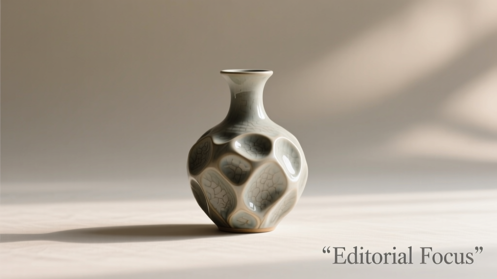
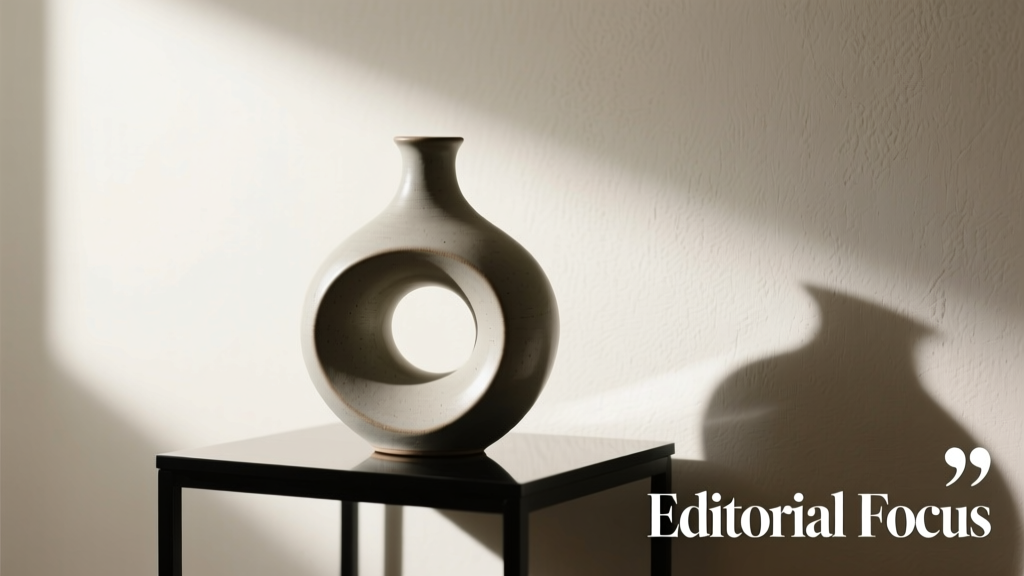
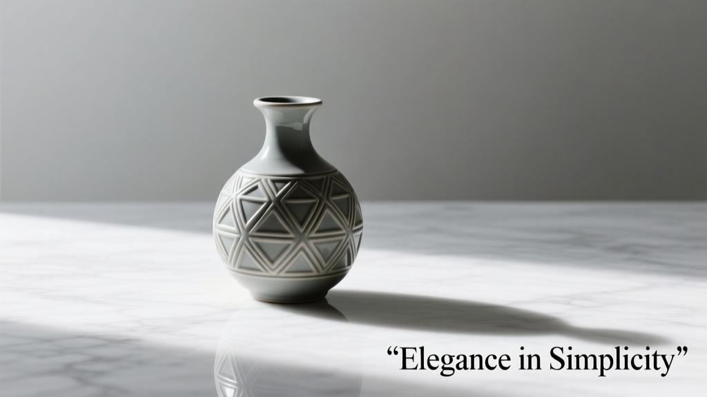
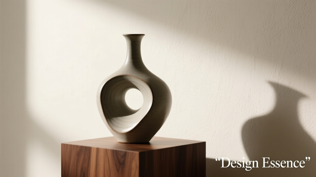
Colorful vases do more than hold flowers—they anchor a room’s mood, reflect personal expression, and serve as sculptural punctuation in interior design. Yet selecting one that feels intentional—not chaotic or fleeting—is rarely as simple as picking the prettiest hue off the shelf. Too often, buyers choose based on impulse, only to find their vibrant vase clashes with existing décor, overwhelms its surface, or gathers dust because it doesn’t suit daily use. This guide distills over a decade of interior styling experience—including work with residential clients, ceramic studios, and retail buyers—to help you make confident, lasting choices. It moves beyond aesthetics alone and grounds every recommendation in function, spatial logic, material integrity, and color psychology.
1. Match Scale and Proportion to Your Space—Not Just Your Shelf
A vase’s visual weight is determined less by its color and more by its height, width, and silhouette. A 14-inch cobalt blue ceramic vase may feel commanding on a wide console table but visually topples a narrow windowsill. Likewise, a cluster of small, jewel-toned glass vases can energize a mantel without crowding, while a single oversized piece might dominate—and isolate—itself in a compact entryway.
Use these proportional guidelines as starting points:
- Tabletops (dining, side, coffee): Vase height should be no more than one-third the height of the surface. For a 30-inch-tall side table, aim for vases under 10 inches tall—or pair a taller vase (e.g., 16\") with low, sprawling greenery to balance vertical emphasis.
- Mantels & shelves: Group vases in odd numbers (3 or 5), varying heights by at least 2–3 inches between pieces. The tallest should not exceed two-thirds the mantel’s height. Avoid uniform heights—they read as repetitive, not rhythmic.
- Floor placement: Reserve floor vases for open corners or beside armchairs. Minimum height: 28 inches. Ideal base diameter: 6–9 inches for stability and presence. A slender 36-inch emerald green stoneware vase gains gravitas when placed beside a neutral linen sofa—but disappears beside a dark leather sectional.
2. Prioritize Material Integrity Over Surface Flash
Colorful vases come in ceramic, glass, metal, concrete, and hand-blown or hand-thrown variations—each with distinct behavior under light, wear, and seasonal shifts. Glossy glazes pop under daylight but show fingerprints easily; matte ceramics mute intensity but age gracefully. Transparent glass amplifies color through refraction, while opaque enamel finishes deliver saturated, consistent tone.
Material choice directly impacts longevity and maintenance:
| Material | Best For | Key Consideration | Lifespan Expectancy* |
|---|---|---|---|
| Ceramic (stoneware/porcelain) | Indoor display, frequent floral use | Ensure fully vitrified body—unglazed bases should feel dense, not chalky. Non-porous = stain-resistant. | 20+ years with care |
| Hand-blown glass | Statement pieces, ambient light diffusion | Thick walls (>3mm) resist chipping. Avoid leaded glass for food-adjacent areas (e.g., dining tables). | 15–30 years if not subjected to thermal shock |
| Enamel-coated steel | Modern kitchens, outdoor patios (covered) | Check for chip-resistant undercoating. Rust forms where enamel fractures—inspect seams and bases. | 10–15 years |
| Concrete | Industrial lofts, grounded living rooms | Sealed surfaces prevent water absorption and efflorescence (white mineral bloom). Unsealed = not for fresh-cut stems. | 25+ years indoors |
| Wood (lacquered bamboo, ebonized ash) | Dry arrangements only (dried florals, pampas, branches) | Never submerge. Humidity warps untreated wood. Look for UV-stable lacquer for sunlit rooms. | 12–20 years |
*Assumes proper indoor placement, avoidance of direct heat/sun exposure, and routine dusting.
Always inspect craftsmanship: run a finger along the rim—if it catches on ridges or uneven glaze pooling, the firing was inconsistent. A well-made colorful vase shouldn’t rely on pigment to mask structural flaws.
3. Apply Color Theory—Not Just Personal Preference
Choosing a “colorful” vase isn’t about loving turquoise—it’s about understanding how that turquoise interacts with surrounding hues, light temperature, and spatial context. A tangerine vase reads warm and energetic against cool gray walls but appears dull next to burnt sienna upholstery. Likewise, a violet glass vase deepens under incandescent light but turns slightly grayish in north-facing natural light.
Use this framework to test compatibility before purchase:
- Analyze your dominant wall and large-furniture colors. Are they warm-based (red/yellow undertones) or cool-based (blue/green undertones)? Choose vase colors within the same family—or use complementary contrast intentionally (e.g., coral vase on teal wall).
- Observe light quality in the intended location. South-facing rooms amplify saturation; north-facing spaces mute it. Bring a fabric swatch or paint chip with you to the store and hold it beside the vase under the same lighting conditions.
- Consider chroma and value. High-chroma (intense) colors command attention—best used sparingly. Low-chroma (muted) colors like dusty rose or sage green integrate more quietly. Value (lightness/darkness) affects perceived weight: a pale yellow vase feels airy; a deep indigo one feels grounded.
“Color isn’t decorative—it’s architectural. A vibrant vase reshapes how light moves through a room and how the eye travels across surfaces. Treat it like a structural element, not an afterthought.” — Lena Torres, Color Consultant & Author of Chromatic Space: Designing with Intentional Hue
4. Real-World Case Study: The Sunroom Dilemma
Maya, a graphic designer in Portland, renovated her sunroom with white oak floors, ivory linen sofas, and floor-to-ceiling windows facing west. She purchased three bright vases online: a fuchsia ceramic cylinder, a lime-green glass bud vase, and a cobalt blue blown-glass piece. Within weeks, she noticed the fuchsia clashed with her terracotta plant pots, the lime green vanished against sun-bleached oak, and the cobalt blue created a jarring focal point that competed with her art prints.
She consulted a stylist who recommended a different approach: keep the cobalt blue—but replace the others with a set of three matte-glazed ceramic vases in tonal blues (sky, slate, navy), all sharing the same organic, asymmetrical shape. The variation in value created rhythm without chaos. She also added a single brass-trimmed, amber-tinted glass vase—its warmth echoed the sunset glow, and its transparency prevented visual density. The result? A cohesive, layered vignette that felt curated, not crowded. The key shift wasn’t less color—it was integrated color.
5. The Functional Checklist: What Your Vase Must Do—Beyond Looking Pretty
A beautiful vase that leaks, stains, or can’t hold a bouquet is a decorative liability. Use this checklist before finalizing any purchase:
- ✅ Stability test: Gently tilt the vase 15 degrees on a flat surface. It should return upright without wobbling or sliding.
- ✅ Neck clearance: For fresh flowers, interior neck diameter must accommodate at least 3–4 stems without crushing. Measure with a pencil—if it fits snugly, it’s adequate.
- ✅ Base integrity: No hairline cracks, uneven glaze pooling at the foot, or unglazed raw clay exposed on the bottom (indicates incomplete firing).
- ✅ Weight distribution: Heavier at the base than the shoulder. Tap lightly—if it rings hollow near the top but sounds dense below, balance is correct.
- ✅ Cleaning access: Can you reach inside with a bottle brush? Narrow-necked vases require dedicated cleaning tools—verify availability or choose wider openings.
Also consider usage frequency. If you regularly arrange seasonal blooms, prioritize dishwasher-safe glass or fully glazed ceramic. If the vase serves purely as sculpture, matte finishes and delicate forms become viable—even desirable.
6. Step-by-Step: Curating a Cohesive Vase Collection
Building a collection—not just buying one-off pieces—creates narrative depth in your home. Follow this sequence to evolve thoughtfully:
- Anchor with one foundational vase: Choose a medium-scale (10–14\"), high-quality ceramic in a versatile mid-tone color—e.g., olive green, rust, or charcoal blue. It should harmonize with your largest furniture pieces.
- Add contrast through texture: Introduce a second piece in a different material—say, a hammered brass vase in the same tonal family but with tactile surface interest.
- Introduce chroma deliberately: Select a third vase in a higher-saturation color (e.g., tangerine, emerald, or violet), but ensure its shape echoes one of the first two—repetition of form ties bold color together.
- Refine with scale variation: Add a fourth piece—either very small (3–4\" bud vase) or very tall (24\"+)—to break rhythm and invite closer looking.
- Edit annually: Remove one piece each year that no longer serves your evolving space or style. Donate or repurpose—don’t let underused color clutter your surfaces.
7. FAQ: Practical Questions Answered
Can I mix multiple bright colors in one room?
Yes—if they share a common thread: identical value (lightness), similar saturation, or recurring undertone (e.g., all warm-toned reds and oranges). Avoid pairing high-chroma cool and warm hues without a neutral buffer (like cream walls or natural wood). A trio of coral, mustard, and teal works when all are muted and sit on a beige rug—less so on stark white.
Are colorful vases harder to sell or donate later?
Surprisingly, no—vibrant, well-made vases often have stronger resale appeal than generic neutrals, especially among younger buyers seeking personality-driven décor. Document provenance if possible (e.g., “hand-thrown by Oregon ceramist Elena Ruiz, 2023”) and retain original packaging for gifting or resale.
Do colored vases affect flower longevity?
Only indirectly. Dark glass or opaque ceramic blocks light from reaching water—slowing algae growth and extending stem life. Clear glass allows light penetration, which can accelerate bacterial growth unless water is changed daily. Color itself has no biochemical effect—but material opacity does.
Conclusion
Choosing a colorful decoration vase is an act of spatial literacy, material respect, and quiet confidence. It asks you to look beyond trend cycles and consider how light falls at 4 p.m., how your hand feels the curve of a rim, how a certain shade of saffron interacts with your morning coffee mug. The most memorable interiors aren’t defined by how many colors they contain—but by how thoughtfully those colors are placed, proportioned, and preserved. Start with one vase that meets your functional checklist and resonates with your space’s true character—not its idealized version. Then build outward, edit without guilt, and trust that intentionality, not intensity, makes color sing.
💬 Your turn: Share one vase you’ve owned for five years or more—and what made it endure. Was it the color? The weight? The way it holds peonies? We’re collecting real stories to inspire thoughtful curation—comment below.