Most wine collections are arranged by grape—Pinot Noir here, Cabernet there, Sauvignon Blanc in its own row. But that system fails the moment you reach for a bottle to match dinner, mood, or guest preference. You’re not choosing a varietal—you’re choosing a feeling: crisp and refreshing, round and supple, or dense and enveloping. Body—the perceived weight and texture of wine on the palate—is the most reliable predictor of that experience. Yet it’s rarely used as an organizing principle. This approach flips the script: instead of grouping wines by what’s written on the label, you group them by how they feel in the glass—and use color as a silent, intuitive guide across your entire rack.
Body is determined by measurable factors—alcohol content (typically 11–14.5% ABV), extract (glycerol, tannin, residual sugar), and acidity—but experienced tasters agree it manifests as a tactile impression: light-bodied wines glide; medium-bodied wines coat; full-bodied wines linger with presence. When your rack reflects that continuum visually, decision fatigue vanishes. You stop scanning text and start reading color—then instinctively reach for the right bottle.
Why Body Beats Varietal for Visual Organization
Varietal labeling assumes uniformity—but reality is far messier. A cool-climate Pinot Noir from Oregon can be fuller and more tannic than a warm-climate Merlot from southern Italy. A skin-contact “orange” Riesling may weigh more than a young Chardonnay aged in stainless steel. Even within the same region, vintage variation shifts body dramatically: the 2020 Burgundian Chardonnay might be lean and nervy; the 2022, broader and creamier. Organizing by varietal forces you to override sensory intuition with taxonomy—an inefficient cognitive load when you’re hosting or unwinding after work.
Body, by contrast, is functional. It aligns with food pairing logic (light with delicate dishes, full with rich proteins), serving temperature (lighter wines served cooler), and even glassware selection (flutes for sparkling lightness, wide bowls for full-bodied reds). And crucially—it’s scalable. Whether you have 12 bottles or 120, a three-tier body system remains legible and actionable.
“Body is the single most consistent sensory anchor across all wine styles. Once you train your eye to see it—not just taste it—you stop hunting for ‘what’s next’ and start flowing with intention.” — Dr. Laura Chen, Sensory Scientist & Wine Educator, UC Davis Department of Viticulture and Enology
The Three-Color Body System: Meaning, Application, and Psychology
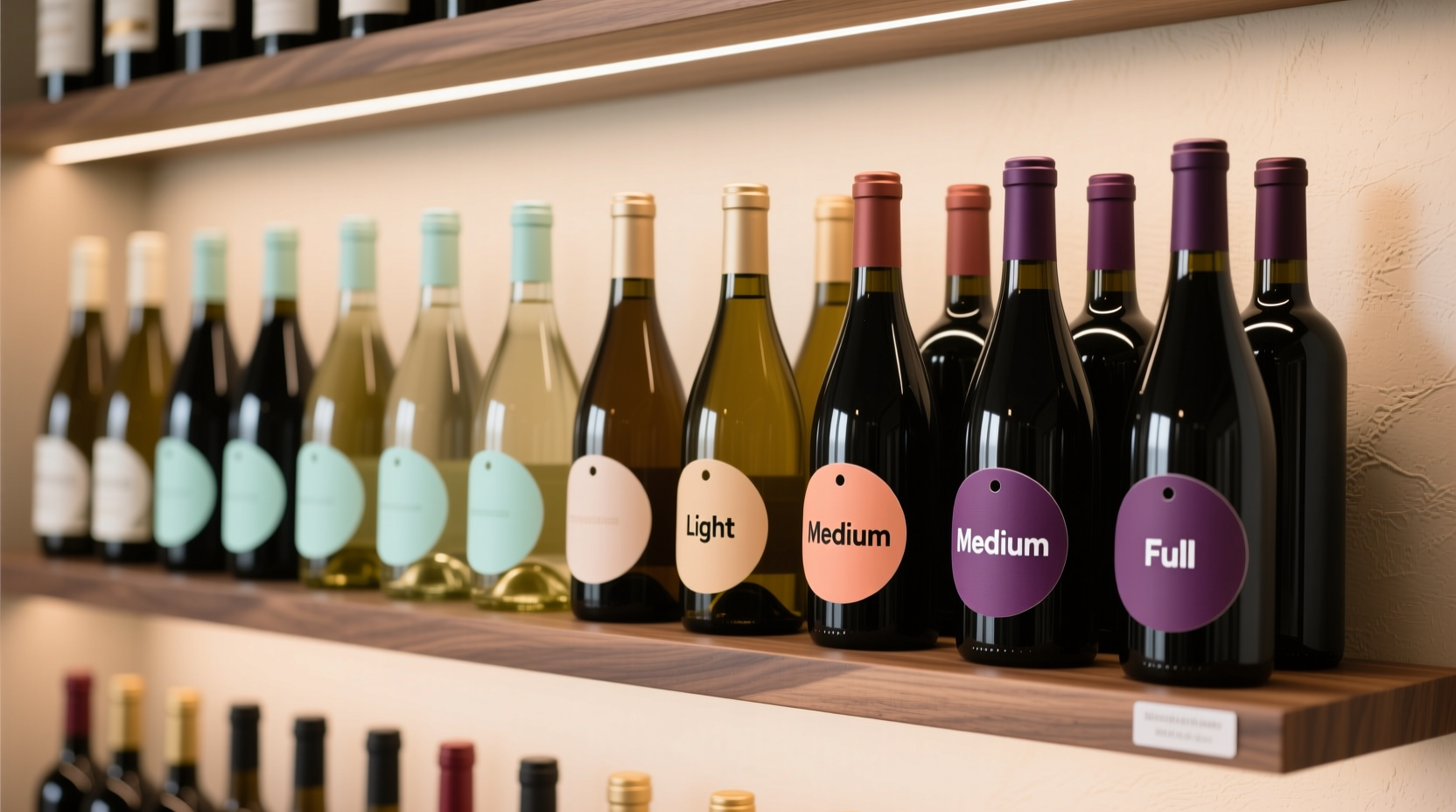
A successful color-coded system must be unambiguous, accessible, and psychologically resonant. We recommend a triad grounded in cross-cultural color associations and perceptual clarity:
- Blue (Light Body): Evokes freshness, coolness, clarity—mirroring the sensation of high-acid, low-alcohol whites and rosés (e.g., Vinho Verde, Muscadet, Gamay, Loire Cabernet Franc). Use a matte, desaturated cobalt or slate blue—avoid neon or purple-tinged blues that suggest sweetness or fruit intensity.
- Green (Medium Body): Signals balance, harmony, and versatility—ideal for wines with moderate structure and layered texture (e.g., Albariño, Grenache, Barbera, unoaked Chardonnay, Cru Beaujolais). Choose an olive or sage green: earthy enough to avoid “grassy” misreading, but vivid enough to stand apart from blue and rust.
- Rust (Full Body): Conveys warmth, density, and depth—anchoring bold reds and rich whites (e.g., Napa Cabernet, Amarone, oaked Chardonnay, Syrah from Rhône or Barossa). Rust—not red—avoids confusion with “red wine” labeling and adds sophistication. Its muted, organic tone signals maturity and weight without shouting.
A Step-by-Step Guide to Implementing Your Body-Based Rack
- Inventory & Triage: Remove every bottle. Taste or consult trusted sources (Wine Spectator, Vinous, regional importer notes) to assign each wine to Light, Medium, or Full body. Don’t rely solely on ABV—check tasting notes for descriptors like “zesty,” “silky,” “chewy,” or “opulent.” Flag outliers (e.g., a 14.2% ABV Grüner Veltliner that’s razor-sharp and lean) for re-evaluation.
- Label Design & Printing: Create simple, minimalist labels: 1.5” × 0.75”, with only the color swatch + one-word descriptor (“Light,” “Medium,” “Full”) in 8pt sans-serif type. Print in batches of 30 per color. Avoid borders or decorative elements—they distract from the color signal.
- Label Placement Protocol: Affix labels to the lower third of the bottle’s shoulder—never on the front label or capsule. This ensures visibility when bottles are racked horizontally or stacked vertically, and prevents obscuring producer information. Align all labels at the same height for rhythm.
- Rack Zoning: Divide your rack into three horizontal bands or vertical sections: top = Light (blue), middle = Medium (green), bottom = Full (rust). If space is limited, use left-to-right progression: left = Light, center = Medium, right = Full. Reserve the very bottom shelf for heavy-format bottles (Magnums, Jeroboams)—label them with a double-rust stripe.
- Dynamic Maintenance System: Reassess body assignment quarterly. New arrivals go into a “holding zone” (a small basket labeled “Unassigned”) until tasted. Replace faded or peeling labels immediately—color integrity is non-negotiable. Keep a master log (digital or notebook) noting vintage, producer, and assigned body tier for future reference.
Real-World Implementation: The Portland Sommelier’s Home Cellar
Maya Rodriguez, a certified sommelier and co-owner of a natural-wine-focused bar in Portland, faced constant friction in her 80-bottle home cellar. Guests would ask for “something interesting but not too heavy,” and she’d fumble between Nebbiolo and Vermentino—both labeled “red” and “white,” neither answering the question. She switched to body-based organization over a rainy November weekend.
She began by blind-tasting 20 representative bottles with a friend, using only a standardized sheet: ABV, noted tannin level (low/med/high), acidity (crisp/balanced/soft), and mouthfeel descriptor. They debated fiercely over two Italian reds—both 13.5% ABV, but one (a 2021 Grignolino) felt lithe and peppery; the other (a 2019 Aglianico) gripped the tongue with fine-grained tannin. Consensus: Grignolino = Medium (green), Aglianico = Full (rust). That nuance became the foundation.
Within three weeks, Maya reported guests selecting bottles independently—pointing to the blue section for aperitifs, rust for cheese course pairings. Her own restocking time dropped from 12 minutes to under 90 seconds. Most telling: she started drinking more white and rosé in winter, drawn by the calming visual continuity of the blue band—even when she hadn’t consciously planned it. “The color didn’t just tell me what the wine was,” she said. “It reminded me how I wanted to feel.”
Do’s and Don’ts of Color-Coded Body Organization
| Action | Do | Don’t |
|---|---|---|
| Label Material | Use archival-quality, acid-free sticker paper with matte finish | Use laser-printed paper taped on—peels, yellows, and catches dust |
| Color Consistency | Print all labels on the same printer, same ink batch; test swatches under rack lighting | Rely on screen colors alone—RGB values shift drastically on paper vs. monitor |
| Body Assignment | Consult at least two independent professional reviews per bottle; prioritize mouthfeel language over alcohol % | Assume all Zinfandels are full-bodied—or all Rieslings are light—without tasting context |
| Rack Layout | Maintain minimum 1-inch vertical spacing between color zones; use subtle shelf dividers (thin walnut strips) if needed | Stack Light and Full bottles on the same shelf without visual separation—breaks the flow |
| Updates | Re-label within 48 hours of opening a new vintage known to shift body (e.g., a warmer-year Chablis gaining weight) | Let outdated labels persist for “consistency”—body evolves; your system must too |
FAQ
Can sparkling wines fit into this system?
Absolutely—and they belong primarily in the Light (blue) band. Traditional method sparklers (Champagne, Cava, Franciacorta) share structural hallmarks with light-bodied still wines: high acidity, low alcohol (12–12.5%), and ethereal texture. Exception: vintage-dosage Champagne aged 10+ years may develop nutty, bready weight—consider moving those to Medium (green) if they show noticeable glycerol or oxidative breadth.
What about dessert wines? They’re often high in alcohol and sugar—do they go in Full (rust)?
Not automatically. Body ≠ sweetness or alcohol. A 19% ABV Pedro Ximénez sherry is unctuous and dense—rust fits. But a 7% ABV German Beerenauslese, though intensely sweet, retains piercing acidity and levity—it reads as Light (blue). Always prioritize mouthfeel over numbers. When in doubt, compare side-by-side with a benchmark: does it feel closer to Mosel Riesling (blue) or Sauternes (rust)?
I collect mostly natural wines—many are cloudy, funky, or low-intervention. Does body still apply reliably?
More so than ever. Natural wines often emphasize texture over fruit—skin contact adds phenolic grip, extended lees aging builds glycerol, spontaneous ferments yield complex umami weight. These qualities make body *more* perceptible and stable across vintages than in highly manipulated commercial wines. In fact, many natural winemakers describe their philosophy explicitly in body terms: “We want the wine to sit softly on the tongue, not shout.” Trust your palate—and the color code will follow.
Conclusion: Let Color Carry the Cognitive Load
Organizing by body isn’t about discarding varietal knowledge—it’s about elevating intentionality. It asks you to move beyond “What grape is this?” to “What role does this play in my evening?” That shift—from taxonomy to experience—transforms your wine rack from a storage unit into a curated interface. The colors do the work your eyes used to strain for: blue invites refreshment, green offers conversation, rust promises resonance. No more squinting at tiny print in dim light. No more second-guessing whether that “light” Pinot Noir will actually feel light tonight. Just color, clarity, and confidence.
Your rack shouldn’t require interpretation. It should respond—immediately, intuitively, beautifully—to your mood, your meal, your moment. Start with ten bottles. Assign them by body. Stick on the first blue label. Watch how quickly the rest fall into place—not because the system is rigid, but because it’s honest. Because it mirrors how wine actually lives in the world: not as a category, but as a sensation.
💬 Ready to reclaim your rack? Pick one shelf this week. Taste three bottles. Assign their body. Apply the color. Then share your first rust, green, or blue moment in the comments—we’ll help troubleshoot, celebrate, and refine.