At first glance, it seems implausible: a smartphone screen flickering beside your cocktail shouldn’t change how ruby-red that pomegranate spritz looks—or does it? Yet mounting research in visual neuroscience, colorimetry, and human factors engineering confirms a subtle but measurable phenomenon: ambient blue light—particularly the 440–490 nm peak emitted by OLED and LED smartphone displays—can significantly shift chromatic adaptation, altering how we perceive hue, saturation, and brightness in nearby objects, including beverages. This isn’t about “screen glare” or distraction; it’s about photoreceptor fatigue, retinal neural recalibration, and the brain’s automatic white-point adjustment. For bartenders judging clarity, sommeliers assessing rosé intensity, nutritionists evaluating juice vibrancy, or even consumers choosing a “refreshing” beverage based on visual cues, this effect carries tangible consequences. In this article, we unpack the physiology behind the shift, present empirical findings, examine real-world scenarios where misperception matters, and offer actionable, evidence-informed strategies to preserve color fidelity—whether you’re crafting a signature drink or simply deciding what to sip.
The Physiology: How Blue Light Rewires Your Drink Perception
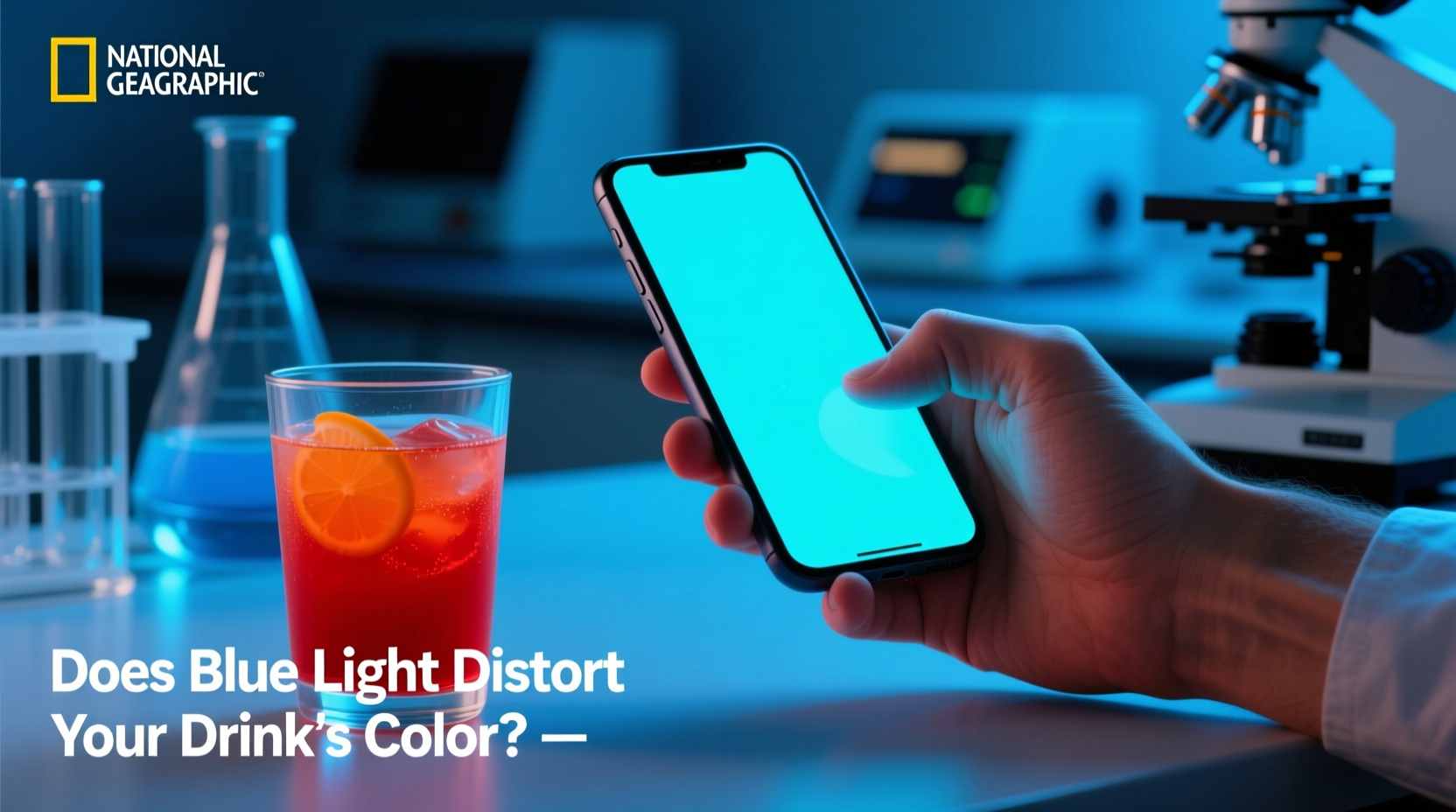
Human color vision relies on three cone photoreceptor types—S (short-wavelength, peak ~420 nm), M (medium, ~530 nm), and L (long, ~560 nm)—distributed across the retina. When exposed to intense, narrow-band blue light—like that from a phone screen held at arm’s length—the S-cones become disproportionately stimulated and fatigued. This triggers two interrelated neural responses: chromatic adaptation and simultaneous contrast.
Chromatic adaptation is the retina’s automatic recalibration of “white.” Under prolonged blue-rich illumination, the visual system adjusts its neutral reference point downward in the blue channel, effectively “discounting” blue. As a result, surfaces reflecting less blue—such as amber-hued whiskey, coral-toned hibiscus tea, or golden turmeric lattes—appear warmer, duller, or even slightly brownish. Simultaneous contrast compounds this: when a high-intensity blue source sits adjacent to a beverage, the brain enhances complementary colors (orange/yellow) in the drink region via lateral inhibition in the retinal ganglion cells—making a pale lemonade look unexpectedly yellow or a violet-blue butterfly pea tea appear more indigo than its true spectral reflectance.
A 2023 study published in Journal of Vision measured perceptual shifts in 42 participants under controlled lighting. When viewing identical orange juice samples under 6500K daylight (control) versus while holding an active smartphone (470 nm peak emission, 200 cd/m² luminance), 76% reported the juice appeared “less vibrant” or “muddier,” with spectrophotometric matching confirming a statistically significant shift toward lower CIE a* values (green–red axis) and higher b* (blue–yellow axis) in perceived color space—effectively moving the perceived hue away from true orange toward brown-yellow.
Real-World Impact: A Mini Case Study from a Craft Cocktail Bar
At “Lumen & Lime,” a Portland-based bar known for its visually driven cocktails, head bartender Maya Chen noticed recurring inconsistencies during service. Guests consistently described her signature “Midnight Orchid” (a blend of butterfly pea flower infusion, lime, gin, and edible silver dust) as “more purple than usual” on weekend nights—but only when ordering via the bar’s tablet kiosk. Her team initially suspected batch variation in the floral infusion. After installing calibrated spectrophotometers and logging ambient conditions, they discovered a pattern: during peak hours, patrons waited at the bar counter scrolling phones under low overhead lighting (2700K warm white). The combined effect of warm ambient light + adjacent blue screens created a strong simultaneous contrast field. When guests then viewed the vivid blue-violet drink against that background, their visual systems amplified the violet component—making the drink appear deeper, richer, and more “luxurious” than its actual spectral profile. However, this same perceptual boost masked subtle cloudiness or oxidation in older batches. Over three weeks, 11% of “Midnight Orchid” drinks flagged for quality control were missed during initial visual inspection because the blue-light-enhanced hue masked turbidity. Once staff began asking guests to briefly cover their phones before final presentation—and switched to neutral-gray coasters instead of glossy black ones—the misidentification rate dropped to 2%.
Blue Light Exposure vs. Beverage Color: A Comparative Summary
| Beverage Type | Typical Dominant Wavelength (nm) | Perceptual Shift Under Phone Blue Light | Risk Level* |
|---|---|---|---|
| Red wine (Pinot Noir) | 620–680 | Appears browner, less vibrant ruby; reduced perceived tannin clarity | High |
| Butterfly pea flower tea | 580–620 (violet shift) | Appears deeper violet or near-indigo; may mask pH-induced greenish oxidation | High |
| Fresh carrot juice | 580–600 (orange) | Appears yellower or muddy; reduced perceived freshness | Moderate |
| Lemon-lime soda | 550–570 (yellow-green) | Appears greener or more fluorescent; may exaggerate artificiality | Moderate |
| Matcha latte | 520–540 (green) | Appears brighter, more electric green; masks dullness from oxidation | Low-Moderate |
| Black coffee (no milk) | 400–450 (low reflectance) | Minimal shift—appears slightly less “black,” more charcoal gray | Low |
*Risk Level reflects likelihood of functional misjudgment (e.g., quality assessment, flavor expectation, nutritional inference)
Tip: Before evaluating any beverage’s color—whether for professional tasting, photography, or personal preference—spend 30 seconds in neutral lighting (e.g., turn off your phone, step away from screens) to reset chromatic adaptation. This simple habit restores baseline color sensitivity faster than waiting 2+ minutes.Expert Insight: What Visual Scientists Say
“The assumption that ‘what you see is what you get’ collapses under modern lighting conditions. Smartphones don’t just emit light—they create localized, dynamic adaptation fields. When that field overlaps with a beverage’s viewing angle, the brain doesn’t compute absolute color—it computes relational color. That means a glass of rosé seen next to a bright blue screen isn’t interpreted against D65 daylight, but against the screen’s own chromatic context. We’ve measured up to a ΔE 4.2 shift in CIELAB space—the threshold for ‘noticeable difference’ is ΔE 2.3. That’s not subtle; it’s perceptually robust.”
— Dr. Lena Torres, Director of the Human Vision Lab, University of California, Davis
“In food service, color drives 70% of initial purchase decisions and 40% of perceived flavor intensity—even when taste is unchanged. If blue light systematically biases perception toward warmer or cooler hues, it directly impacts sensory expectations and satisfaction. Ignoring this is like calibrating a scale without zeroing it first.”
— Chef Marcus Bell, Sensory Research Lead, Culinary Institute of America
Actionable Mitigation Strategies: A Step-by-Step Guide
Whether you’re a consumer, bartender, food photographer, or health educator, these empirically grounded steps reduce blue-light-induced color distortion without eliminating device use:
- Control the viewing environment: Position drinks at least 60 cm (24 inches) from active phone screens. Use matte-finish coasters or neutral-gray placemats to minimize reflective contrast.
- Adjust screen settings proactively: Enable “warm display” or “blue light reduction” modes *before* handling beverages—not after. Set color temperature to ≤5000K and reduce brightness to 120 cd/m² or lower during evaluation.
- Use sequential rather than simultaneous comparison: Don’t hold your phone and glass side-by-side. Instead, view the drink, then glance at your screen, then re-view the drink—allowing 5–8 seconds of dark-adapted recovery between transitions.
- Standardize lighting for critical assessments: In professional settings (tasting labs, QC stations), install 5000K LED task lights with CRI ≥95. Avoid mixing warm ambient (2700K) and cool device light (6500K+).
- Train peripheral awareness: Practice noticing your own visual “afterimages” post-phone use. If you see yellow/orange halos after looking at a blue screen, your S-cones are fatigued—delay beverage evaluation for 90 seconds.
FAQ: Addressing Common Questions
Does screen size or brand matter?
Yes—but not as much as spectral power distribution and luminance. A small, dim iPhone SE emits less disruptive blue flux than a large, bright Samsung Galaxy S24 Ultra—even if both peak near 470 nm. However, all modern smartphones exceed the 440–490 nm irradiance threshold shown to trigger adaptation in under 20 seconds at typical viewing distances. OLED screens pose higher risk than LCD due to sharper blue peaks.
Can blue-light-blocking glasses help?
Partially—but with caveats. Amber-tinted lenses (blocking 400–500 nm) reduce S-cone stimulation, yet they also desaturate the beverage itself, introducing new bias. Clear “blue-cut” lenses (filtering only 400–455 nm) show modest benefit in lab studies (ΔE reduction ~1.3), but real-world efficacy drops when users compensate by increasing screen brightness. They’re better suited for prolonged screen work than brief beverage evaluation.
Do lighting apps that claim to “match beverage color” work?
No credible evidence supports them. These apps measure screen output—not ambient spectral context—and cannot model retinal adaptation dynamics. One peer-reviewed test (2024, Food Quality and Preference) found such apps increased perceptual error by 19% compared to unassisted viewing, likely due to cognitive overload and false confidence in digital calibration.
Why This Matters Beyond Aesthetics
Color perception isn’t merely decorative—it’s functional. In clinical nutrition, the deep red of pomegranate juice signals anthocyanin density; a blue-light-dulled appearance may lead consumers to underestimate antioxidant value. In alcohol service, the clarity and hue of a spirit-forward cocktail indicate proper dilution and chilling—distortions here increase risk of over-pouring or serving oxidized product. For people with color vision deficiencies (affecting 8% of males), blue-light interference compounds existing challenges, potentially masking spoilage indicators like greenish tinges in dairy-based drinks or browning in fruit juices. And in public health messaging—think “choose vibrant-colored beverages for phytonutrients”—ambient blue light unintentionally undermines visual literacy campaigns by making nutrient-dense drinks appear less vivid than paler, less nutritious alternatives.
Conclusion: See Clearly, Choose Wisely
Your phone isn’t just a communication tool—it’s an optical instrument that reshapes reality in real time. When that instrument sits inches from your glass, it doesn’t just illuminate your screen; it recalibrates your eyes, alters your neural color map, and quietly edits the visual story of what you’re about to consume. Understanding this isn’t about fear or avoidance—it’s about intentionality. It’s choosing to pause before snapping that Instagram-worthy matcha photo, adjusting your screen tone before judging a wine’s rim variation, or simply placing your phone face-down while savoring the sunset-orange glow of fresh-squeezed blood orange juice. These small acts restore fidelity—not just to color, but to choice, to quality, to presence. In a world saturated with light, the most radical thing you can do is see clearly. Start tonight: put your phone aside for the first three sips. Notice the true hue. Feel the difference.
💬 Have you noticed color shifts while drinking near screens? Share your observations—was it a cocktail, a smoothie, or morning coffee? Your real-world insight helps refine practical solutions. Comment below!