Coral is a vibrant yet surprisingly versatile colour—part pink, part orange, and full of warmth. It brings energy to any space or outfit while maintaining a softness that makes it more approachable than bold reds or bright oranges. But because coral sits between warm and cool tones, choosing the right companion colours can be tricky. Get it wrong, and the look feels clashing; get it right, and you’ve created something fresh, balanced, and stylish.
Whether you're selecting an outfit, decorating a room, or designing graphics, understanding which colours harmonise with coral will help you create cohesive, visually appealing combinations. This guide breaks down the science and style behind coral pairings, offering practical advice, real-world applications, and expert-backed principles to make colour matching effortless.
The Nature of Coral: A Balanced Warm-Tone
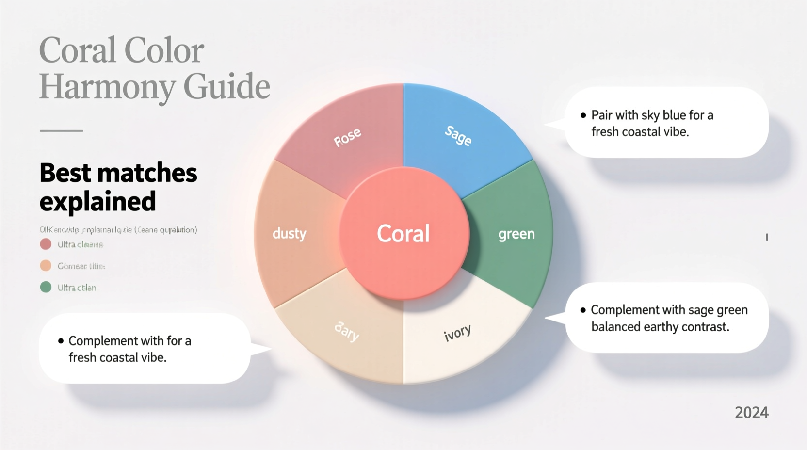
Coral is a chromatic blend of pink and orange, typically leaning warmer due to its orange base. However, depending on the specific shade—ranging from peachy coral to pinker salmon—the undertones can shift subtly. Recognising this helps in selecting complementary hues.
In the colour wheel, coral sits near analogous shades like peach, terracotta, and soft orange. Its natural complements lie in the cooler spectrum, particularly blues and greens, which provide contrast without overwhelming its vibrancy. Understanding these relationships allows for intentional and elegant colour coordination.
Tip: Test coral swatches under natural light to see if they lean warm (orange) or cool (pink)—this affects which partner colours will work best.Top Colours That Go Best with Coral
Not all colours work equally well with coral. The most successful matches either enhance its warmth, balance it with contrast, or create a monochromatic flow. Below are the top five categories of colours that pair beautifully with coral, along with explanations and use cases.
1. Navy Blue – Elegant Contrast
Navy blue is one of the strongest partners for coral. As a deep, cool tone, it creates a striking contrast that’s both modern and timeless. This combination works exceptionally well in fashion (e.g., coral dress with navy cardigan) and interior design (e.g., coral accent wall with navy furniture).
The high contrast ensures visual interest without chaos, making it ideal for professional settings or sophisticated home decor.
2. Soft Grey – Modern Neutrality
Unlike stark white or black, soft grey acts as a calming neutral that lets coral shine. Light greys, especially those with cool undertones, prevent the orange in coral from appearing too intense. This pairing is perfect for minimalist aesthetics, office wear, or contemporary living rooms.
3. Cream or Beige – Warm Harmony
If you prefer a softer, more organic feel, pair coral with warm neutrals like cream, ivory, or beige. These tones share coral’s warmth, creating a seamless, inviting palette. Use this combination in bedrooms, spring wardrobes, or wedding themes for a gentle, uplifting effect.
4. Teal or Turquoise – Vibrant Balance
Teal sits opposite coral on the colour wheel, making it a near-complementary match. When paired, they create a lively, tropical vibe—ideal for beach-themed designs, summer outfits, or playful children’s rooms. The key is balancing saturation: choose muted teal to avoid overwhelming the coral.
5. Sage Green – Earthy Sophistication
Sage green adds an earthy, botanical element that grounds coral’s brightness. This duo evokes natural landscapes—think coral flowers against olive foliage. It’s increasingly popular in bohemian interiors and sustainable fashion brands aiming for a relaxed yet refined aesthetic.
| Colour | Effect with Coral | Best Used In |
|---|---|---|
| Navy Blue | High contrast, elegant | Formal wear, coastal interiors |
| Soft Grey | Calm, modern | Minimalist design, office attire |
| Cream/Beige | Warm, soothing | Bedrooms, bridal palettes |
| Teal/Turquoise | Vibrant, energetic | Summer fashion, tropical decor |
| Sage Green | Earthy, balanced | Boho interiors, eco-fashion |
Step-by-Step Guide: How to Match Coral Like a Pro
Choosing the right colour doesn’t have to be guesswork. Follow this five-step process to confidently pair coral in any context.
- Identify the Undertone: Place your coral sample next to pure pink and pure orange. Does it lean closer to one? If it's more orange, go for deeper or cooler contrasts. If it's pinker, pair with soft pastels or warm whites.
- Select a Base Neutral: Decide whether your scheme needs warmth (beige, cream) or coolness (grey, white). This sets the foundation for the rest of the palette.
- Add One Accent Colour: Choose a single bold partner—like navy, teal, or sage—to create focal points. Limiting yourself to one strong accent prevents visual clutter.
- Test in Context: Lay out fabric swatches or paint samples together in the actual environment (natural daylight for clothes, room lighting for walls). Observe how they interact throughout the day.
- Adjust Saturation: If the combo feels too loud, mute one colour. For example, pair bright coral with dusty teal instead of electric turquoise.
“Coral is one of the most forgiving trend colours because it bridges warm and cool palettes. The secret is grounding it with a strong neutral.” — Lena Patel, Interior Designer & Colour Consultant
Real Example: A Living Room Makeover
Sarah wanted to refresh her small living room with a pop of personality. She chose a coral throw pillow set but wasn’t sure what furniture or wall colour would work. After testing several options, she painted the walls in a soft greige (a mix of grey and beige), added a navy-blue armchair, and layered in cream curtains and a sage-green plant pot.
The result was a balanced, airy space that felt both energetic and calm. The coral became the focal point, enhanced—not competed with—by the supporting palette. Friends consistently commented on how “inviting” the room felt, proving that thoughtful colour matching has emotional impact.
Tip: When using coral in large amounts (like a sofa), keep walls and major elements neutral to avoid sensory overload.Common Mistakes to Avoid
- Pairing coral with bright red: They clash due to competing undertones—red pulls cooler, coral warmer.
- Using too many brights: Combining coral with yellow, lime, and hot pink creates chaos, not harmony.
- Ignoring lighting: Artificial lights can distort coral, making it look too orange or dull. Always test in the actual space.
- Mixing warm and cool whites: Pair coral with warm white (ivory, eggshell), never cool white, which can make it look dirty.
Frequently Asked Questions
Can I wear coral if I have cool undertones?
Yes, but choose coral shades with a pinker base rather than orange-heavy ones. Pair it with cool neutrals like charcoal, silver-grey, or icy blue to maintain harmony with your skin tone.
Does coral go with gold or silver accessories?
Coral generally pairs better with gold. Its warm nature aligns with golden tones, enhancing warmth in both clothing and décor. However, if paired with cool greys or navy, silver accents can work for contrast.
What if I want a monochromatic coral look?
A monochrome coral scheme uses varying shades of coral, peach, blush, and terracotta. Add depth with textures—linen, velvet, rattan—and break up intensity with cream or sand-coloured pieces. This approach is elegant and inherently cohesive.
Conclusion: Master Coral with Confidence
Coral isn’t just a passing trend—it’s a dynamic, emotionally resonant colour that, when paired wisely, elevates any design. From the sharp elegance of navy to the quiet comfort of cream, the right companion colour transforms coral from bold to brilliant.
By understanding undertones, applying proven combinations, and avoiding common pitfalls, you can use coral with confidence across fashion, interiors, and creative projects. Don’t wait for inspiration—start experimenting today with swatches, palettes, and small updates. The right coral match isn’t just about looking good; it’s about feeling energised, balanced, and expressive.
💬 Which coral combination will you try first? Share your plans or tag us in your coral-inspired looks—we’d love to see how you bring this vibrant hue to life!