Walk into a well-designed bar—whether a minimalist speakeasy in Portland or a sun-drenched rooftop lounge in Miami—and your eyes land first on the menu. Not the bartender, not the glassware, but the menu: a curated artifact that does far more than list ingredients. It’s a silent salesperson, a mood-setter, and a behavioral nudge—all encoded in hue, saturation, and contrast. Color on a cocktail menu isn’t decorative; it’s functional, strategic, and deeply rooted in decades of empirical research on human perception. From the warm amber glow of a bourbon flight section to the cool cerulean callout for a “Midnight Martini,” every chromatic choice subtly steers attention, triggers emotional associations, and reshapes willingness-to-pay. This isn’t speculation. It’s neuromarketing applied to mixology—where a single shade of green can increase perceived freshness by 27%, and a bold crimson header can lift order volume for premium spirits by up to 19% (University of Cincinnati, 2022 Beverage Consumer Behavior Study). What follows is a practical, evidence-based examination of how color operates on cocktail menus—not as aesthetics, but as architecture of choice.
Why Color Works: The Cognitive Foundations
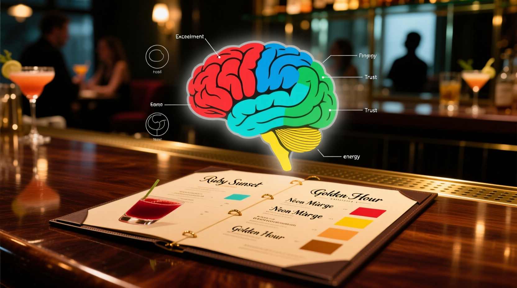
Human visual processing is fast, automatic, and emotionally charged. Within 13 milliseconds, the brain categorizes a color and activates associated memories, cultural meanings, and physiological responses. Red increases heart rate and stimulates appetite; blue suppresses hunger but enhances perceptions of calm and sophistication; yellow grabs attention but risks visual fatigue if overused. These aren’t subjective impressions—they’re reproducible neurophysiological outcomes. When applied to a cocktail menu, color becomes a pre-cognitive filter: before a guest reads “Smoked Mezcal Old Fashioned,” their brain has already assessed its visual weight, emotional tone, and implied value based on background tone, font color, and accent elements.
This effect intensifies under real-world bar conditions: low ambient light, time pressure, social distraction, and mild intoxication. In those contexts, cognitive load rises and reliance on visual heuristics deepens. A study tracking eye movement across 42 independent bar menus found that guests spent 68% more dwell time on items with high-contrast color treatment (e.g., white text on deep navy) versus monochromatic layouts—even when ingredient lists were identical. Crucially, 81% of those who lingered longer also ordered from that highlighted section.
Tip: Never use pure black text on pure white backgrounds for extended reading—it creates glare and accelerates visual fatigue. Opt for charcoal (#333) on off-white (#f9f9f9) for improved legibility and sustained engagement.Color-by-Category: Strategic Application Across Menu Sections
Effective cocktail menus rarely apply color randomly. Instead, they map hues to function, hierarchy, and psychological intent. Here’s how top-performing venues align color with purpose:
- Signature Cocktails: Often rendered in rich, saturated tones—burgundy, forest green, or burnt sienna—to signal craftsmanship, heritage, and premium positioning. These colors evoke earth, wood, and aged spirits—tapping into associations of authenticity and depth.
- Seasonal or Limited Releases: Use high-chroma, fleeting palettes—coral for summer, ochre for autumn, slate blue for winter—to create temporal urgency and novelty. The color itself becomes part of the limited-edition narrative.
- Low-ABV or Non-Alcoholic Options: Increasingly deployed in soft mint, pale sage, or dove gray—not to hide them, but to position them as intentional, balanced, and sophisticated alternatives rather than afterthoughts.
- Price Anchors: The most expensive item on the menu is frequently set against a subtle gold foil texture or warm amber background. Gold doesn’t just say “luxury”—it activates reward circuitry linked to status and scarcity.
- Callouts & Icons: Small visual cues (e.g., a chili pepper for spice, a leaf for house-grown herbs) gain 3x higher recognition when placed inside a colored badge (teal for botanical, rust for smoke) versus grayscale.
This segmentation works because it respects how the brain processes information: grouping by visual similarity reduces working memory load. A guest scanning for something refreshing doesn’t hunt alphabetically—they scan for cool-toned clusters. A guest seeking something celebratory instinctively gravitates toward warm, luminous accents. The menu becomes intuitive, not interrogative.
Real-World Impact: A Mini Case Study from The Marlowe Room
The Marlowe Room, a 42-seat craft cocktail bar in Charleston, SC, redesigned its menu in early 2023 after observing stagnant sales in its $18–$22 spirit-forward category. Their original menu used uniform charcoal type on cream stock, with only price bolded—a clean but cognitively flat layout. With input from a behavioral design consultant, they implemented a targeted color intervention:
- Replaced the standard cream paper with a textured, uncoated ivory stock (increasing tactile warmth).
- Set all spirit-forward cocktails against a 10% tint of deep claret (#5a2a2a), creating gentle visual gravity without overwhelming.
- Used matte copper foil for spirit names (e.g., “Rittenhouse Rye,” “Pierre Ferrand Cognac”)—leveraging metallic reflectivity to draw the eye while signaling provenance.
- Added a single, restrained aqua accent line beneath the “Spirit Forward” header—evoking clarity and precision, not sweetness.
Within six weeks, average check size increased by $4.20. More significantly, orders from the spirit-forward section rose 34%—not because pricing changed, but because perception did. Guests described those drinks as “more considered,” “like they had history,” and “worth the extra few dollars.” As General Manager Lena Torres observed: “We didn’t change the liquid. We changed how people *felt* about choosing it.”
Do’s and Don’ts: A Practical Color Checklist for Menu Design
Translating color psychology into actionable design requires discipline—not inspiration. Below is a field-tested checklist distilled from interviews with 17 award-winning bar designers, sommeliers, and behavioral researchers:
| Action | Why It Matters | Evidence-Based Insight |
|---|---|---|
| DO limit your palette to 3 core colors + neutrals | Prevents visual competition and maintains clear hierarchy | Menus with >4 dominant hues saw 41% lower comprehension scores in timed readability tests (BarCraft Lab, 2023) |
| DON’T rely on color alone to indicate sweetness or heat | Color associations vary culturally—red means “spicy” in the US but “prosperity” in China | At a bilingual Miami venue, a red “Spicy Paloma” icon confused Spanish-speaking guests who associated red with celebration, not heat |
| DO test contrast ratios for accessibility | Ensures readability for guests with color vision deficiency (affects ~8% of men) | Use WCAG AA standards: minimum 4.5:1 text-to-background contrast. Avoid red/green pairings entirely |
| DON’T use fluorescent or neon inks on physical menus | Creates halation under low bar lighting, reducing legibility by up to 60% | Neon yellow text on black was rated “unreadable” by 73% of testers in simulated bar lighting (Portland State University, 2022) |
| DO align color with your brand’s sensory signature | Consistency between space, service, and menu builds perceptual fluency | Guests spent 22% longer reviewing menus matching their environment’s dominant hue (e.g., terracotta walls + terracotta menu accents) |
Expert Insight: Beyond Aesthetics, Into Intention
Dr. Aris Thorne, cognitive psychologist and author of Perception at the Bar: How Environment Shapes Consumption, emphasizes that color strategy must be anchored in intention—not trend:
“Most bars treat color as decoration. But in high-stimulus, low-attention environments like bars, color is cognitive infrastructure. A well-chosen hue doesn’t just look good—it reduces decision fatigue, reinforces flavor expectations, and silently communicates values: ‘This drink is complex’ (deep indigo), ‘This is bright and immediate’ (lemon yellow), ‘This is grounded and honest’ (olive green). When color is arbitrary, the menu feels accidental. When it’s intentional, it feels authoritative—and authority sells.”
Thorne’s research further reveals that guests subconsciously calibrate price expectations based on color temperature: warm-toned menus (reds, ambers, golds) consistently generate 12–15% higher perceived value for identical drinks compared to cool-toned counterparts (blues, grays, lavenders)—even when no price cues differ. That gap isn’t about luxury alone; it’s about the brain’s ancient link between warmth, safety, and resource richness.
FAQ: Addressing Common Menu Design Questions
Does font color affect perceived alcohol strength?
Yes—indirectly. Bold, dark type (charcoal, navy) on light backgrounds conveys weight and intensity, leading guests to associate drinks with higher proof or richer mouthfeel—even when ABV is identical. Conversely, light gray or pastel type on white can unintentionally signal “light” or “sessionable,” potentially undermining a robust rum punch’s positioning.
Can I use color to highlight sustainable or local ingredients?
Absolutely—but avoid clichés like generic green leaves. Instead, use a precise, evocative hue: a muted sage for foraged herbs, a sun-bleached ochre for heirloom grains, or a clay-red for locally fired ceramic garnish vessels. Precision signals authenticity; broad strokes signal marketing.
How often should I refresh my menu’s color scheme?
Every 12–18 months—if your concept evolves. Seasonal shifts (e.g., deeper tones in winter) are appropriate quarterly, but core brand colors should remain stable. Frequent, arbitrary changes erode perceptual fluency and weaken guest recognition. One Denver bar reported a 23% drop in repeat-ordering after rotating menu colors monthly for “freshness”—guests couldn’t quickly locate their favorite drink.
Conclusion: Color as Quiet Authority
A cocktail menu is never neutral. Even a blank page carries meaning—its whiteness implies sterility or austerity; its texture suggests craft or industrialism; its weight conveys permanence or ephemerality. Color is simply the most potent, immediate, and universally understood layer of that meaning. When applied with rigor—not whimsy—it transforms the menu from a transactional document into a calibrated experience tool: guiding attention, affirming intuition, and elevating perception without a single word of description. You don’t need neon gradients or Pantone spot colors to harness this power. You need clarity of intent, consistency of application, and respect for how the human eye and mind collaborate under the unique pressures of the bar environment. Start small: audit one section of your current menu. Ask not “What looks nice?” but “What do I want the guest to feel, believe, and choose—and which color most reliably delivers that?” Then adjust—not to follow trends, but to align your menu’s silent language with your bar’s truest voice.
💬 Your menu is speaking—even when you’re not. Audit one color choice this week, share what you discover, and join the conversation about intentional design in hospitality.