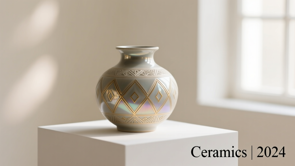
Types of Graphic Design Geometric Patterns
Geometric patterns are a cornerstone of modern graphic design, widely used in stationery, branding, packaging, and digital media. These designs leverage mathematical precision, clean lines, and structured forms to create visually compelling compositions that evoke balance, harmony, and clarity—especially effective in environments where organization and focus are essential, such as schools, offices, and corporate spaces.
Incorporating shapes like triangles, hexagons, chevrons, and polyhedrons, geometric patterns can be both decorative and functional. They range from minimalist motifs to complex tessellations, offering designers immense creative flexibility. Below is a detailed breakdown of the most common types of geometric patterns used in graphic design today.
Symmetrical Patterns
Created by rotating or reflecting identical geometric shapes around a central axis or point, symmetrical patterns convey balance and elegance.
Advantages
- Visually harmonious and balanced
- Easy to scale and repeat
- Ideal for formal branding and packaging
- Creates a sense of order and professionalism
Limitations
- Can appear static or predictable
- Limited creative freedom due to structure
- May lack visual excitement in minimal contexts
Best for: Logos, luxury packaging, corporate stationery, and formal invitations
Asymmetrical Patterns
These patterns use geometric shapes of varying sizes, orientations, and spacing to create dynamic, off-balance compositions that still maintain visual interest.
Advantages
- Highly dynamic and engaging
- Offers creative flexibility
- Stands out in modern design contexts
- Great for experimental or artistic branding
Limitations
- Harder to balance visually
- Can appear chaotic if not well-designed
- Less suitable for formal or traditional applications
Best for: Artistic projects, editorial design, youth-oriented branding, and digital interfaces
Repeating Patterns
Also known as tessellations, these patterns consist of geometric units (like squares, hexagons, or diamonds) that seamlessly repeat across a surface without gaps or overlaps.
Advantages
- Perfect for backgrounds and large surfaces
- Creates rhythm and visual consistency
- Highly scalable and printer-friendly
- Can produce hypnotic or meditative effects
Limitations
- Risk of appearing monotonous
- Requires precise alignment
- Limited variation within the motif
Best for: Wallpaper designs, textile prints, website backgrounds, and notebook covers
Angular Patterns
Composed of sharp-edged shapes like triangles, trapezoids, and chevrons, angular patterns convey movement, energy, and directionality.
Advantages
- Strong visual impact and dynamism
- Excellent for guiding the viewer’s eye
- Conveys modernity and innovation
- Works well in tech and sports branding
Limitations
- Can feel aggressive or overwhelming
- Limited softness or warmth
- May clash with organic or natural themes
Best for: Tech startups, athletic brands, modern logos, and motivational content
3D Geometric Patterns
Leveraging shading, perspective, and depth effects, 3D geometric patterns create optical illusions that simulate volume and spatial complexity.
Advantages
- Highly immersive and futuristic
- Adds depth and sophistication
- Perfect for digital and interactive media
- Impressive in presentations and advertisements
Limitations
- Resource-intensive to design and render
- May not translate well to print
- Can distract from core content if overused
Best for: Digital art, UI/UX design, sci-fi themes, and high-end marketing materials
Mosaic Patterns
Inspired by ancient tile art, mosaic patterns use small, interlocking geometric pieces—often irregular in shape—to form intricate, puzzle-like designs.
Advantages
- Rich in texture and historical charm
- Highly customizable and artistic
- Adds elegance and cultural depth
- Unique and eye-catching at any scale
Limitations
- Complex to design and align
- Not ideal for minimalist aesthetics
- May require high-resolution output
Best for: Cultural branding, artisanal products, wedding stationery, and heritage-themed designs
| Pattern Type | Visual Impact | Creativity | Best Use Case | Complexity Level |
|---|---|---|---|---|
| Symmetrical | High (balanced) | Medium | Corporate branding, formal stationery | Low to Medium |
| Asymmetrical | Dynamic | High | Editorial design, modern branding | Medium to High |
| Repeating | Consistent & rhythmic | Medium | Backgrounds, textiles, packaging | Low to Medium |
| Angular | Strong & directional | Medium | Tech, sports, modern logos | Low to Medium |
| 3D Geometric | Futuristic & immersive | High | Digital media, advertising | High |
| Mosaic | Intricate & textured | High | Artistic, cultural, luxury design | High |
Designer Tip: When working with geometric patterns, always consider the context and medium. For print, ensure high resolution and proper bleed; for digital use, optimize file size and scalability. Using vector-based software like Adobe Illustrator ensures precision and flexibility.
Uses of Graphic Design Geometric Patterns
Geometric patterns—composed of shapes such as circles, triangles, squares, and polygons—are foundational elements in modern graphic design. Their structured, repetitive nature not only adds aesthetic value but also serves functional and strategic purposes across various design disciplines. From branding to digital interfaces, these patterns enhance visual communication and user experience in meaningful ways.
Key Applications of Geometric Patterns in Design
Creating Visual Interest
Geometric patterns captivate the viewer’s attention through symmetry, rhythm, and repetition. By combining regular shapes in dynamic arrangements, designers can create focal points that guide the eye across a layout. This visual hierarchy is especially effective in posters, advertisements, and website banners, where engagement directly influences click-through rates and audience retention.
For example, a modern tech startup might use a sleek grid of hexagons in its landing page background to convey innovation and precision. These subtle yet powerful design cues enhance the overall appeal without overwhelming the primary content.
Brand Identity Development
Consistency in visual elements is crucial for brand recognition, and geometric patterns offer a scalable way to reinforce brand identity. Companies often embed signature patterns into their logos, business cards, packaging, and even office interiors to create a cohesive brand language.
Take luxury fashion brands or tech corporations—many use minimalist geometric motifs (like interlocking circles or angular lines) that reflect their values of sophistication, precision, and modernity. Over time, these patterns become subconsciously associated with the brand, increasing memorability and consumer trust.
Solving Practical Design Challenges
Beyond aesthetics, geometric patterns are problem-solving tools in layout design. They help organize content by defining zones, balancing asymmetrical compositions, or filling negative space with purpose. Grid-based patterns, for instance, are widely used in editorial design to align text and images cohesively.
Designers also use tessellated patterns to create seamless textures for backgrounds or overlays, ensuring visual continuity across different media formats. This functional aspect makes geometric patterns indispensable in both print and digital workflows.
Product Packaging Design
In retail environments, packaging must stand out instantly. Geometric patterns provide a bold, structured look that captures attention on crowded shelves. Whether it’s a beverage label with a vibrant triangular motif or a skincare line using soft, repeating wave patterns, these designs communicate brand personality at a glance.
Moreover, geometric patterns can be customized to reflect product attributes—sharp angles for energy drinks, smooth curves for organic goods—making them not just decorative but also semantically meaningful.
Interactive and Digital Media
In web and mobile app design, geometric patterns are frequently used in backgrounds, loading animations, and UI components. Animated geometric sequences (like rotating polygons or pulsing grids) can make loading screens more engaging, reducing perceived wait times.
Additionally, responsive geometric layouts adapt well to different screen sizes, maintaining visual harmony across devices. For instance, card-based interfaces often use geometric dividers or patterned hover effects to improve interactivity and user navigation.
Environmental & Spatial Design
While not explicitly mentioned in the original list, geometric patterns extend beyond flat surfaces into physical spaces. They are used in floor tiling, wall murals, exhibition stands, and signage systems to define areas and enhance spatial perception.
Museums, retail stores, and corporate lobbies often incorporate large-scale geometric installations to create immersive brand experiences, demonstrating the versatility of these patterns beyond traditional graphic media.
| Application | Design Benefit | Common Use Cases |
|---|---|---|
| Visual Interest | Enhances engagement and focus | Posters, banners, social media graphics |
| Brand Identity | Improves recognition and recall | Logos, stationery, brand guidelines |
| Layout & Composition | Provides structure and balance | Magazines, websites, presentations |
| Packaging | Differentiates products on shelves | Labels, boxes, bottles |
| Digital Interfaces | Boosts usability and aesthetics | Apps, websites, dashboards |
Best Practices for Using Geometric Patterns
Important: While geometric patterns are versatile, overuse can lead to visual fatigue or a sense of sterility. Always balance patterned elements with whitespace and organic forms where appropriate. Consider the context and audience—what works for a tech brand may not suit a wellness product. Thoughtful application ensures that geometric patterns enhance, rather than overpower, your design message.
Customization of Graphic Design Geometric Patterns
Geometric patterns offer exceptional versatility in design, making them ideal for a wide range of stationery and office supplies. Their structured yet artistic nature allows for extensive customization, enabling brands, individuals, and businesses to align these patterns with specific aesthetics, themes, or branding goals. Whether used for corporate gifting, personal organization, or product packaging, geometric designs can be tailored to create visually striking and functionally effective results.
Color Variation
One of the most impactful ways to customize geometric patterns is through strategic color selection. A simple shift in palette can dramatically alter the mood, tone, and application of a design.
- Pastel tones evoke calmness and sophistication, ideal for minimalist planners, journals, or wellness-themed products
- Bold, vibrant colors create energy and modernity—perfect for youth-oriented stationery or creative industry branding
- Monochrome or grayscale schemes offer timeless elegance and professional appeal, especially suitable for business notebooks or executive accessories
- Gradient color transitions within geometric shapes add depth and a contemporary digital aesthetic
Design Tip: Align color choices with brand identity or seasonal themes (e.g., earth tones for autumn, cool blues for winter) to enhance relevance and marketability.
Scale and Size
The size and repetition frequency of geometric elements significantly influence visual impact and functionality across different stationery types.
- Large-scale patterns make bold statements on notebook covers, file folders, and desk pads, drawing immediate attention
- Medium-scale repeats work well on planners, sticky note pads, and pen cases—offering visual interest without overwhelming the user
- Micro-patterns or fine detailing are excellent for subtle backgrounds on letterheads, business cards, or receipt books
- Variable scaling within a single design (e.g., gradient scaling from small to large hexagons) can guide visual flow and add dynamic movement
Pro Insight: Consider the product’s primary use—larger patterns suit decorative items, while smaller, repetitive motifs enhance usability on frequently handled tools.
Material and Texture Integration
The physical properties of materials and surface finishes can transform a flat geometric design into a multi-sensory experience.
- Matte finishes reduce glare and provide a modern, understated look—ideal for professional notebooks and portfolios
- Glossy coatings enhance color vibrancy and add a premium feel, particularly effective on presentation folders or gift boxes
- Embossing and debossing add tactile dimension to geometric shapes, making patterns stand out through touch as well as sight
- Textured materials like linen-finish paper, soft-touch plastics, or fabric-wrapped covers amplify the sensory appeal of geometric designs
- Metallic foils or spot UV can highlight specific geometric elements, creating contrast and luxury
Creative Application: Use texture to differentiate sections—e.g., embossed hexagons on a planner cover with matte background for visual hierarchy.
Pattern Combination & Layering
Combining multiple geometric patterns or layering them with other design elements creates unique, complex visuals that stand out in competitive markets.
- Chevron + Hexagon combinations produce dynamic mosaic-like effects, great for trendy stationery lines
- Overlapping grids and circles generate optical illusions or moiré patterns, appealing to tech or design-savvy audiences
- Layering transparent geometric shapes over solid backgrounds adds depth and modernity
- Integrating organic shapes (like leaves or waves) with geometric frameworks bridges natural and structured aesthetics
- Asymmetrical arrangements break traditional repetition, offering a contemporary, artistic edge
Innovation Tip: Use digital design tools to experiment with pattern overlays and transparency before production to ensure clarity and print feasibility.
Customization & Personalization Options
Modern manufacturing techniques allow for high levels of personalization, turning standard geometric stationery into meaningful, branded, or gift-worthy items.
- Name or logo embossing over geometric backgrounds enhances brand identity on corporate notebooks or executive gifts
- Custom color matching ensures alignment with brand guidelines or event themes (e.g., wedding stationery with personalized geometric motifs)
- QR code integration within geometric borders links physical products to digital content—ideal for promotional sets
- Laser engraving on metal or wood allows precise geometric detailing on premium pens, rulers, or desktop organizers
- Modular design systems let customers mix and match geometric elements online before ordering
Business Advantage: Offer limited-edition or seasonal geometric designs with customizable text to boost exclusivity and customer engagement.
Application-Specific Design Strategies
Tailoring geometric patterns to the intended product type ensures both aesthetic harmony and functional effectiveness.
- Notebooks & Planners: Use structured grids or calendar-aligned patterns for internal pages; bold covers for shelf appeal
- Business Cards: Employ minimalist geometric accents or corner motifs to maintain professionalism while standing out
- Pens & Desk Accessories: Apply repeating micro-patterns or color-blocked sections for visual rhythm
- Gift Packaging: Combine festive colors with scalable geometric wraps for cohesive gift sets
- Digital Stationery: Animate geometric elements (e.g., rotating triangles, pulsing dots) in PDF planners or apps
User-Centric Tip: Test pattern visibility and usability—ensure designs don’t interfere with writing space or readability.
Professional Recommendation: When developing a geometric stationery line, start with a core pattern and explore variations across color, scale, and finish. This creates a cohesive product family while offering diversity. For B2B clients, provide digital mockup tools so they can visualize customizations in real time—increasing conversion and satisfaction.
| Product Type | Recommended Pattern Style | Ideal Color Approach | Best Finish/Texture |
|---|---|---|---|
| Notebook Covers | Large-scale hexagons or tessellations | Brand-aligned or seasonal palette | Embossed with spot UV or foil |
| Business Cards | Subtle corner motifs or border patterns | Monochrome with accent color | Matte with soft-touch coating |
| Planners & Journals | Grid-based or calendar-integrated designs | Pastel or neutral tones | Matte or linen finish |
| Pens & Pencils | Striped, segmented, or geometric bands | High-contrast color blocking | Glossy or metallic finish |
| Corporate Gift Sets | Custom logo-integrated mosaics | Company brand colors | Mixed textures (matte + emboss) |
Additional Considerations for Designers & Buyers
- Print Technology: Ensure geometric patterns are optimized for the chosen printing method (offset, digital, screen, or pad printing) to avoid misalignment or blurring
- Sustainability: Pair geometric designs with eco-friendly materials like recycled paper or bioplastics to appeal to environmentally conscious consumers
- Cultural Sensitivity: Some geometric shapes carry cultural or symbolic meanings—research context when designing for global markets
- Scalability: Vector-based geometric designs ensure crisp reproduction at any size, from tiny icons to large packaging
- Accessibility: Maintain sufficient contrast between pattern and background to support readability for visually impaired users
How to Choose Graphic Design Geometric Patterns for Stationery Products
Selecting the right geometric pattern in graphic design is a powerful way to enhance the visual appeal and functionality of stationery products. Whether you're designing notebooks, business card holders, planners, or office organizers, geometric patterns can convey professionalism, creativity, or modernity—depending on how they're applied. However, a thoughtful approach is essential to ensure the design aligns with the product’s purpose, audience, and long-term usability.
Design Tip: Always consider the balance between aesthetics and usability. A visually striking pattern should never compromise readability or practicality, especially on functional stationery items like notebooks or letterheads.
Key Factors in Choosing Geometric Patterns
- Stationery Type and Functionality
The nature of the stationery product should be the primary driver in your pattern selection. Different items serve different purposes, and the geometric design must support that function:
- Planners & Journals: Intricate, artistic geometric patterns—such as tessellations, mandalas, or symmetrical grids—can inspire creativity and make the product feel special and personalized.
- Business Cards & Card Holders: Opt for clean, minimalist patterns like subtle lines, dot grids, or angular motifs that reflect professionalism and sophistication without distracting from the text.
- Notebooks & Writing Pads: Consider calming, low-contrast geometric backgrounds (e.g., soft hexagons or wave patterns) that provide visual interest without interfering with writing or note-taking.
- Office Organizers & Folders: Use structured, modular patterns (like isometric grids or geometric dividers) to reinforce organization and order—aligning with the product’s purpose.
When designing for Adobe Creative Suite or digital mockups, ensure the pattern scales well across different formats and remains crisp in both print and digital previews.
- Target Audience Preferences
Understanding your audience is crucial in graphic design. The geometric pattern should resonate with the demographic’s tastes, lifestyle, and expectations:
- Youth & Creative Professionals: Bold, dynamic patterns with vibrant colors, asymmetrical layouts, or urban-inspired geometry (e.g., graffiti-style lines or fragmented shapes) appeal to younger, trend-conscious users.
- Corporate & Executive Clients: Classic, symmetrical patterns—such as repeating diamonds, subtle chevrons, or monochrome lattices—convey elegance, stability, and timelessness.
- Educational or Wellness Markets: Organic geometric forms (like honeycombs or sacred geometry) in muted, earthy tones can evoke mindfulness and balance, ideal for journals or planners used in personal development.
Conduct audience research or A/B testing with sample designs to validate your choices before full production.
- Color Palette Harmony
The color scheme of a geometric pattern significantly influences mood, perception, and brand alignment:
- Energetic & Modern: Use high-contrast combinations like electric blue and neon pink, or black and gold, to create a bold, contemporary feel—ideal for creative portfolios or tech-related stationery.
- Professional & Calming: Muted tones such as slate gray, navy, sage green, or soft terracotta promote focus and tranquility, perfect for office supplies or executive notebooks.
- Luxury & Elegance: Metallic accents (gold, silver, copper) paired with deep backgrounds (charcoal, burgundy) add sophistication to premium stationery lines.
Ensure the colors complement other design elements like typography, logos, and packaging. Use tools like Adobe Color to test harmonious palettes and maintain accessibility (e.g., sufficient contrast for readability).
- Complexity and Visual Hierarchy
While geometric patterns can be visually captivating, overcomplicating the design can lead to clutter and reduced usability:
- High Complexity: Best reserved for decorative covers, limited-edition items, or packaging where the pattern is the focal point.
- Low to Medium Complexity: Recommended for everyday stationery to avoid visual fatigue. Simple repeating shapes (dots, lines, triangles) enhance aesthetics without competing with text or content.
- Layering & Opacity: Use transparency or layering techniques to soften intricate patterns, making them background-friendly while preserving design depth.
Always test print your designs to evaluate how the pattern appears in real-world use, especially under different lighting conditions.
- Trends vs. Timelessness
Graphic design trends come and go, but stationery often has a longer lifecycle—especially in corporate or institutional settings:
- Leveraging Trends: Incorporate current styles (e.g., 3D geometric illusions, retro-futurism, or glitch art) for limited-run collections or youth-focused products.
- Timeless Designs: Focus on classic geometric principles—symmetry, proportion, and balance—for products meant to endure. Think of patterns inspired by Art Deco, Bauhaus, or Islamic tile art, which remain relevant across decades.
- Hybrid Approach: Combine a trendy color palette with a timeless geometric structure to stay current without sacrificing longevity.
Consider the product’s shelf life and resale value—timeless designs often have broader, longer-lasting market appeal.
| Factor | Best Practices | Common Mistakes | Recommended Tools |
|---|---|---|---|
| Stationery Type | Match pattern style to product function (e.g., minimal for business cards) | Using overly complex patterns on writing surfaces | Adobe Illustrator, Canva, Mockup generators |
| Target Audience | Align design with age group and lifestyle (e.g., bold for youth, subtle for professionals) | Misjudging audience preferences without research | Surveys, mood boards, demographic analysis |
| Color Palette | Use harmonious, brand-aligned colors with good contrast | Poor readability due to low contrast or clashing hues | Adobe Color, Coolors, Pantone guides |
| Complexity Level | Balance visual interest with usability | Overcrowding designs with excessive detail | Grid systems, opacity layers, print proofs |
| Trends vs. Timelessness | Blend current styles with enduring geometric principles | Designing something that feels outdated within a year | Trend reports, design archives, competitor analysis |
Expert Tip: Create a design system where your geometric pattern can be adapted across a full stationery suite (notebooks, pens, folders, etc.). This ensures brand consistency and allows for scalable production, whether for personal use or commercial distribution.
Final Recommendations
- Always test your geometric patterns in both digital and printed formats to assess clarity and color accuracy.
- Use vector-based software (like Adobe Illustrator) to ensure patterns remain sharp at any scale.
- Consider the paper texture and finish—matte, glossy, or embossed—as it can dramatically affect how the pattern is perceived.
- Leave sufficient negative space around text areas to maintain readability and visual balance.
- Document your design decisions and maintain a style guide for future reference or team collaboration.
Choosing the right geometric pattern is more than just an aesthetic decision—it's a strategic design choice that impacts user experience, brand perception, and product longevity. By carefully considering the stationery type, audience, color, complexity, and timelessness, you can create designs that are not only visually compelling but also functionally effective and enduring.
Frequently Asked Questions About Geometric Patterns in Stationery Design
Q1: What is the appeal of graphic design geometric patterns in stationery?Geometric patterns bring a sense of order, symmetry, and visual harmony to stationery, making them especially appealing in environments where clarity and structure are valued. Their mathematical precision and repetition create a calming effect, which resonates with students, professionals, and creatives who seek organization amidst daily chaos.
These designs not only enhance aesthetic appeal but also improve usability—well-structured layouts with geometric elements can guide the eye, improve readability, and make note-taking or planning feel more intentional. From minimalist planners to bold notebooks, geometric patterns elevate the user experience by blending functionality with modern design sensibilities.
Q2: Do geometric patterns in graphic designs have applications other than aesthetics?Absolutely. While geometric patterns are visually striking, their value extends far beyond mere decoration. They play a crucial role in branding and visual identity—consistent use of shapes like triangles, hexagons, or grids helps reinforce brand recognition and convey traits such as innovation, precision, and reliability.
In practical design, these patterns assist in balancing compositions, creating rhythm, and establishing visual hierarchy. They’re also effective in masking imperfections in print materials, guiding focus to key areas, and improving the tactile experience when used in embossing or foil stamping. For stationery brands, geometric motifs can differentiate products on crowded shelves and create a memorable impression on consumers.
Q3: Are these geometric patterns adaptable to various stationery styles?Yes, one of the greatest strengths of geometric patterns is their versatility. They can be tailored to suit a wide range of aesthetics—from sleek, modern minimalism to intricate, vintage-inspired designs.
This adaptability comes from several customizable elements:
- Color Variations: A single geometric layout can be transformed with different palettes—pastels for soft, calming effects or bold contrasts for high energy and visibility.
- Scale Adjustments: Large-scale patterns make a dramatic statement on covers, while smaller, subtle repeats work well for backgrounds or inner pages.
- Material Integration: Combining patterns with textures like linen finishes, matte coatings, or metallic inks adds depth and tactile appeal.
- Hybrid Designs: Merging geometric shapes with organic elements (like hand-drawn lines or botanical accents) creates a balanced, contemporary look.
Whether designing for corporate planners, artistic journals, or educational tools, geometric patterns can be customized to align perfectly with the product’s purpose and audience.
Q4: What factors should be considered when choosing geometric patterns for stationery products?Selecting the right geometric pattern involves both creative and strategic thinking. Key considerations include:
- Type of Stationery: Notebooks may benefit from subtle grid patterns that aid alignment, while greeting cards or packaging might use bolder, eye-catching designs.
- Target Audience Preferences: Professionals may prefer clean, understated geometrics, whereas younger audiences might respond better to dynamic, colorful arrangements.
- Color Harmony: Ensure the pattern’s colors complement the overall design scheme and brand identity. Use color theory principles to evoke the desired mood—cool tones for calmness, warm tones for energy.
- Pattern Complexity: Overly intricate designs can be distracting or costly to print. Simpler patterns are often more scalable and easier to reproduce across product lines.
- Functionality: Consider how the pattern interacts with text and usability. Avoid placing dense patterns where writing or readability is essential.
- Production Method: Screen printing, digital printing, and embossing all affect how a pattern appears. Choose a design that works well with your manufacturing process.
By balancing aesthetics with practicality, designers can create stationery that is not only beautiful but also functional and marketable.
Q5: Are there graphic design geometric pattern resources for beginners?Yes, there are abundant resources available for beginners looking to explore geometric pattern design. With the rise of accessible design tools and online learning platforms, getting started has never been easier.
Recommended resources include:
- Design Software: Adobe Illustrator, Affinity Designer, and free alternatives like Inkscape offer powerful vector tools ideal for creating scalable geometric patterns.
- Tutorials: Platforms like YouTube, Skillshare, and Udemy host step-by-step guides on constructing grids, tessellations, and seamless repeats.
- Vector Marketplaces: Websites like Freepik, Vecteezy, and Creative Market provide downloadable geometric templates and assets for practice or commercial use.
- Design Communities: Join forums like Dribbble, Behance, or Reddit’s r/Design to get feedback, find inspiration, and learn from experienced designers.
- Books & Guides: Titles such as “Geometry of Design” by Kimberly Elam or “Pattern Design” by Ann Field offer foundational knowledge on mathematical harmony in visual art.
With consistent practice and access to these tools, beginners can quickly develop the skills needed to create professional-quality geometric stationery designs that are both innovative and commercially viable.