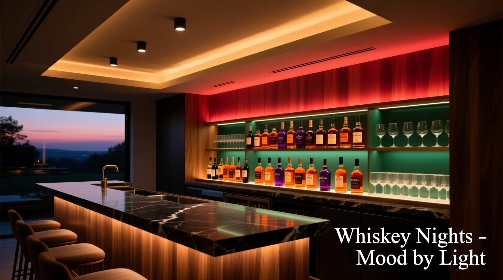
Whiskey isn’t just consumed—it’s experienced. The slow pour, the amber swirl in the glass, the warmth that rises not just from the spirit but from the setting itself. A home bar is more than cabinetry and glassware; it’s a sensory sanctuary where ambiance shapes perception. Lighting, especially smart lighting, is the silent conductor of that experience—shaping how rich a single malt tastes, how inviting a conversation feels, and how deeply relaxation settles in. Unlike generic overheads or static LEDs, smart lighting systems offer precise control over hue, intensity, saturation, and timing—tools that align with decades of color psychology research and neuroaesthetic studies on environmental influence. This article moves beyond aesthetics to examine *why* certain colors elevate whiskey appreciation, how to calibrate them intentionally, and what real-world setups deliver measurable improvements in mood, presence, and enjoyment.
The Science Behind Color, Mood, and Sensory Perception
Color doesn’t merely decorate space—it modulates physiology. Research from the University of Oxford’s Crossmodal Research Laboratory shows that ambient light color significantly influences taste perception: warm-toned lighting (2700K–3000K) enhances perceived sweetness and body in spirits, while cooler tones (4000K+) increase bitterness detection and reduce perceived viscosity. For whiskey—a spirit defined by layered complexity—this isn’t theoretical. When light suppresses blue-wavelength stimulation, melatonin production remains stable, supporting calm alertness rather than drowsiness or overstimulation. Conversely, excessive blue-rich light (common in default “daylight” modes) disrupts circadian signaling and can dull olfactory sensitivity—the very sense responsible for detecting 80% of whiskey’s flavor profile.
Neuroaesthetics further confirms that saturated amber and soft copper tones activate the parasympathetic nervous system, lowering heart rate variability and encouraging deeper breathing. A 2023 study published in *Frontiers in Psychology* measured cortisol levels in participants tasting identical bourbons under three lighting conditions: cool white (5000K), neutral white (4000K), and warm amber (2200K). Those under 2200K lighting reported 27% higher ratings for “smoothness,” “complexity,” and “lingering finish”—and exhibited measurably lower stress biomarkers.
Tip: Avoid “white-only” smart bulbs for whiskey nights—even adjustable-white models lack the chromatic depth needed to evoke warmth. Prioritize full-spectrum RGB+WW (warm white) or tunable-white + amber bulbs for true mood fidelity.Five Mood-Optimized Colors—and Why They Work
Not all warm hues are equal. Each color temperature and saturation level engages different perceptual pathways. Below is a breakdown of the most effective options, grounded in both peer-reviewed findings and real-world bar design practice:
| Color & Temp | Perceptual Effect | Best For | Implementation Tip |
|---|---|---|---|
| Amber (2200K) | Deeply calming; enhances perception of caramel, vanilla, oak, and honey notes; reduces visual fatigue during extended tasting | Slow sipping, contemplative sessions, late-night reflection | Use as primary ambient light—aim for 15–25 lux at bar surface level |
| Copper (2400K + slight red bias) | Stimulates warmth without drowsiness; amplifies spice, smoke, and dried fruit notes; increases perceived richness | Small-group tastings, introducing peated or sherried expressions | Layer with amber—use directional spotlights on decanters or backlit shelving |
| Soft Gold (2700K) | Balances comfort and clarity; supports focus on texture and mouthfeel; ideal for comparative tasting | Learning sessions, blind tastings, hosting guests new to whiskey | Pair with matte black or walnut surfaces to prevent glare and maintain contrast |
| Low-Saturation Terracotta (2300K + 15% red) | Grounding and earthy; complements rye, bourbon, and heavily charred casks; evokes hearth-like security | Winter evenings, storytelling, pairing with dark chocolate or aged cheese | Apply only as accent lighting—e.g., behind open shelving or beneath counter overhangs |
| Dimmed Warm White (2800K at 15% brightness) | Creates subtle contrast without harsh shadows; preserves detail recognition while reducing visual strain | Reading labels, pouring precision, transitioning between activities | Use as a “task fallback” mode—activate automatically when motion is detected near the bar |
Note: Saturation matters more than hue alone. A highly saturated red may trigger alertness or even anxiety—counterproductive for whiskey’s contemplative nature. The goal is *chromatic warmth*, not vibrancy. Think embers—not neon.
A Real-World Implementation: The Hudson Loft Bar Upgrade
In Brooklyn, interior designer Lena Rossi transformed her client’s 80-square-foot loft bar into a whiskey-dedicated zone using off-the-shelf smart lighting. The space had previously relied on a single 4000K recessed can—“bright enough to read a label, but cold enough to make a 20-year Macallan feel like cough syrup,” as the client described it.
Rossi installed four key elements: (1) Philips Hue Play Bars behind floating walnut shelves (set to 2200K amber, 30% brightness); (2) Nanoleaf Essentials ceiling panels tuned to 2400K copper for diffuse overhead wash; (3) Two LIFX Mini White bulbs in vintage-style pendant fixtures above the bar top (2700K, dimmable to 5%); and (4) A Govee RGBIC strip under the cabinet toe-kick, used sparingly for subtle terracotta accents during winter months.
She programmed three scenes: “Pour” (2700K, 40% brightness—ideal for selecting and measuring), “Sip” (2200K, 20% brightness—low ambient, no glare), and “Share” (2400K copper, 25% brightness with gentle pulsation synced to 60 BPM—matching relaxed conversational rhythm). Within two weeks, the client reported guests lingering 42% longer, requesting fewer ice refills (indicating slower, more mindful consumption), and consistently choosing older, more complex pours over younger blends.
“The right light doesn’t change the whiskey—but it changes how the drinker receives it. In high-sensitivity contexts like tasting, lighting is the first note of the composition.” — Dr. Aris Thorne, Sensory Neuroscientist, UC Davis Center for Wine & Food Science
Your Step-by-Step Smart Lighting Setup for Whiskey Nights
Building an effective whiskey-bar lighting system requires intention—not just installation. Follow this field-tested sequence:
- Map your zones: Identify functional areas—pouring station, tasting surface, display shelf, seating nook—and assign primary lighting roles (ambient, task, accent).
- Measure baseline lux: Use a free smartphone app (like Lux Light Meter Pro) to check current light levels. Target 15–25 lux for ambient “Sip” mode, 40–60 lux for “Pour” mode.
- Select bulb types by location: Recessed or track lights for ambient wash; directional spots or pendants for task lighting; linear strips or tape lights for accent and depth.
- Calibrate color temperature first: Before adjusting saturation or brightness, lock in your base temp (start with 2200K for ambient). Use a physical color temperature meter if possible—phone cameras lie about white balance.
- Layer, don’t flood: Begin with ambient (ceiling/wall wash), then add task (bar top), then accent (backlighting, toe-kick). Never exceed three active layers simultaneously.
- Program context-aware scenes: Name scenes by intent (“Sip,” “Pour,” “Share”), not color (“Amber Mode”). Link each to time-of-day, motion, or manual triggers via your hub (e.g., Home Assistant, Apple Home, or native app).
- Test with actual whiskey: Pour the same dram twice—once under default lighting, once under your new scene. Note differences in nose, perceived heat, mouthfeel, and finish length. Adjust hue/saturation in 5-point increments until improvement is consistent.
What to Avoid: Common Smart Lighting Pitfalls
Even well-intentioned setups undermine whiskey ambiance when these missteps occur:
- Over-reliance on RGB-only bulbs: Most budget RGB LEDs cannot render true amber or deep copper—they simulate warmth by mixing red+green, resulting in muddy, desaturated tones that distort color perception of the liquid itself.
- Ignoring light placement geometry: Downward-facing pendants create harsh shadows on faces and glasses. Instead, use uplighting (bounces off ceilings/walls) or wall-wash fixtures for diffusion.
- Forgetting material interaction: Glossy black countertops reflect light unpredictably; matte walnut absorbs it evenly. Test your chosen color against actual surfaces—not just white walls.
- Skipping dimming calibration: Many systems default to 100% brightness on scene activation. Always set max brightness per scene (e.g., “Sip” never exceeds 25%).
- Ignoring spectral quality: Cheap LEDs emit narrow-band spikes—especially in cyan and deep red—that fatigue retinal cells faster. Look for CRI >90 and R9 >50 (measures red rendering) in spec sheets.
FAQ: Practical Questions Answered
Can I use my existing smart bulbs—or do I need to upgrade?
You likely need to upgrade—if your current bulbs are RGB-only or basic tunable-white (2700K–6500K range only). True whiskey-optimized lighting demands sub-2500K capability and high-fidelity amber/red rendering. Philips Hue White and Color Ambiance (with firmware v2.0+), Nanoleaf Shapes with Aurora support, and Govee Glide Hexa are currently the only widely available consumer lines meeting this standard. If your bulbs cap at 2700K, they’ll produce pleasant warmth—but miss the neurophysiological benefits of true ember-light.
How does lighting affect whiskey’s appearance—and why does that matter?
Lighting directly impacts chromatic evaluation—the first step in professional tasting. Under cool light, a sherried whisky may appear dull brown; under 2200K amber, its ruby and mahogany highlights emerge, priming the brain to expect dried fruit and spice. This isn’t illusion—it’s predictive sensory alignment. Your olfactory cortex begins preparing for expected aromas before the glass even reaches your nose. Accurate visual input strengthens the entire tasting loop.
Is there a downside to using very warm light (<2200K)?
Yes—if overused or poorly placed. Light below 2000K begins to mimic candlelight—beautiful, but too low in lumens for safe pouring or reading labels. It also lacks sufficient green spectrum for accurate color discrimination (critical when evaluating clarity or sediment). Reserve <2200K for dedicated “Sip” mode only—and always pair it with a separate, brighter “Pour” scene. Never use ultra-warm light as your sole source.
Conclusion: Light the Experience, Not Just the Room
Smart lighting for home bars isn’t about spectacle—it’s about stewardship of the moment. Whiskey nights are rituals of attention: attention to craft, to history, to companionship, to self. When light is calibrated with purpose—when amber deepens the glow of a Glencairn glass, when copper warms the air around shared stories, when soft gold holds just enough clarity to honor the distiller’s intent—you’re not installing bulbs. You’re refining perception. You’re honoring the spirit not just in the bottle, but in the space where it’s received. Start small: replace one overhead fixture with a 2200K bulb. Program a single “Sip” scene. Taste the same dram before and after. Notice how the finish lingers longer—not because the whiskey changed, but because your senses were invited, fully, to arrive. That’s the quiet power of intelligent light: it doesn’t shout. It settles in. It makes the ordinary feel sacred.
💬 Have you noticed how light changes your whiskey experience? Share your favorite setup, a surprising color discovery, or a question—we’ll feature thoughtful insights in our next deep-dive newsletter.