There’s a quiet power in the handwritten word—especially when it adorns a gift. A personalized tag isn’t just identification; it’s the first tactile impression of thoughtfulness, care, and intention. When executed with refined calligraphy and luminous metallic ink, that impression becomes unforgettable: subtle yet opulent, traditional yet contemporary, intimate yet polished. Yet many hesitate—not from lack of desire, but from uncertainty about tools, technique, or how to avoid common pitfalls like smudging, bleeding, or uneven letterforms. This isn’t about achieving perfection on the first try. It’s about cultivating a repeatable, confident practice grounded in material knowledge, deliberate motion, and mindful execution.
Why metallic ink and calligraphy elevate gifting
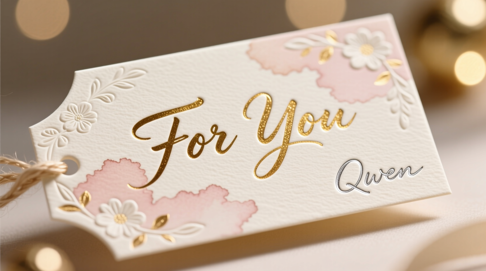
Calligraphy transforms names and messages into visual rhythm—each stroke carrying weight, direction, and breath. Metallic ink adds dimension: gold, silver, copper, or rose-gold inks catch light differently than flat pigments, creating depth and a sense of occasion. Together, they signal that the gift wasn’t assembled—it was composed. Psychologically, recipients register handwritten, metallic-tagged gifts as more personal and higher in perceived value. A 2023 consumer behavior study by the Institute for Design Psychology found that 78% of recipients recalled the tag’s handwriting before the wrapping, and 64% associated metallic ink with “intentional celebration” rather than routine gifting.
This elegance isn’t reserved for weddings or luxury brands. It belongs equally to a birthday card for a colleague, a holiday tag for a teacher, or a handmade ornament for a neighbor. What separates amateur attempts from polished results isn’t innate talent—it’s understanding how paper, ink, nib, and pressure interact. Once those variables are mastered, consistency follows.
Essential tools—and why substitutions fail
Not all pens, papers, or inks behave the same. Substituting based on availability often leads to frustration: feathering, skipping, or dull metallic sheen. Here’s what works—and why:
| Tool | Recommended Specification | Why It Matters |
|---|---|---|
| Nib | Oblique holder + Nikko G or Brause EF66 nib (medium-flex) | Oblique holders align the nib at the optimal angle for right-handed writers; Nikko G offers reliable flow without excessive flex that causes ink pooling on thin strokes. |
| Ink | Dr. Ph. Martin’s Iridescent Ink (gold, silver) or Winsor & Newton Gold Leaf Ink | These are pigment-based, not dye-based—critical for opacity and metallic shimmer. Dye-based inks (like most fountain pen inks) fade, bleed, or appear translucent on dark paper. |
| Paper | 300 gsm cotton rag tag stock (e.g., Strathmore 400 Series Watercolor Paper, cut to 2\"x3\") | Heavy, textured cotton fibers hold metallic pigment without absorption, preventing dulling. Smooth papers (like standard cardstock) cause ink to sit on the surface and flake; coated papers repel ink entirely. |
| Prep Tool | Lightbox or window + 2H pencil + ruler | Faint guidelines ensure consistent x-height and baseline alignment—non-negotiable for legible, elegant script. Skipping this step guarantees uneven spacing and drifting baselines. |
A step-by-step guide to flawless metallic calligraphy tags
Elegance emerges from process—not improvisation. Follow these seven stages precisely, especially when starting out:
- Design & Plan: Sketch your phrase lightly in pencil on scrap paper. Count letters, note ascenders/descenders (“b”, “g”, “y”), and decide on layout (centered, justified left, or stacked). Avoid cramming—leave ¼ inch margin on all sides.
- Prepare the Tag: Place your tag on the lightbox. Trace faint horizontal lines: one baseline, one waistline (x-height), and one ascender line. Use a 2H pencil—soft leads smudge and resist ink adhesion.
- Load the Nib Correctly: Dip only the lower third of the nib into ink. Wipe the back of the nib once with a lint-free cloth to remove excess—too much ink causes blobs; too little causes dry starts.
- Write Slowly—Then Slower: Metallic ink dries slower than standard inks. Maintain steady, downward pressure on downstrokes; release completely on upstrokes. Pause for 2–3 seconds between letters if needed. Rushing creates skipped strokes and uneven sheen.
- Dry Flat, Not Stacked: Lay tags face-up on a clean, non-porous surface (glass or ceramic tile). Do not stack or touch drying tags—metallic pigment remains delicate for 15–20 minutes. Humidity extends drying time; use a dehumidifier in damp climates.
- Inspect & Refine: Hold the tag at a 45-degree angle to natural light. Look for gaps in strokes, uneven spacing, or dull patches. Touch-ups are possible *only* within 5 minutes of writing using the same nib and ink—after that, new ink won’t bond seamlessly.
- Final Seal (Optional but Recommended): Once fully dry (minimum 2 hours), apply one light coat of Krylon Crystal Clear Acrylic Spray (matte finish) from 12 inches away. This prevents smudging during handling and enhances metallic reflectivity without yellowing.
Troubleshooting common metallic calligraphy failures
Even experienced practitioners encounter hiccups. Here’s how to diagnose and resolve them—before they become habits:
- Feathering (ink spreading into paper fibers): Caused by paper that’s too absorbent or too thin. Solution: Switch to 300 gsm cotton rag. Never use printer paper or matte-finish cardstock.
- Skipping (intermittent ink flow): Usually due to dried ink residue on the nib slit or insufficient ink load. Clean nibs after every session with warm water and a soft toothbrush. Soak stubborn residue in rubbing alcohol for 2 minutes, then rinse thoroughly.
- Dull or patchy metallic sheen: Indicates pigment settling. Stir ink gently before each use. If sheen remains weak, your paper may be too smooth—try lightly sanding the writing surface with 600-grit sandpaper to increase tooth.
- Smudging when handling: Often mistaken for “wet ink,” but usually caused by touching the tag before full polymerization (which takes up to 24 hours for maximum durability). Always handle by edges until fully cured.
“Metallic calligraphy isn’t about forcing brilliance—it’s about partnering with the materials. The ink reveals its luster only when the paper accepts it, the nib releases it evenly, and the hand moves with patience. That pause between strokes? That’s where elegance lives.” — Lena Torres, Hand-Lettering Artist & Educator, author of The Quiet Line
Real-world application: A holiday tag project
Consider Maya, a small-batch candle maker preparing 120 holiday orders. Her standard kraft tags looked rustic but lacked distinction amid competitors. She invested in Nikko G nibs, Dr. Ph. Martin’s gold ink, and 300 gsm ivory cotton tags. Initially, she averaged 8 flawed tags per hour—mostly smudges and uneven spacing. After implementing the step-by-step guide above—including mandatory guideline tracing and 20-second drying pauses between tags—her success rate jumped to 97% in under three days. More significantly, her customer feedback shifted: “The tag felt like part of the gift,” wrote one recipient. “I kept it on my mantel.” Maya now includes a photo of her calligraphed tag in every social post—turning craftsmanship into brand equity. Her secret? She doesn’t write faster. She writes fewer words per tag: “To Sarah” instead of “For our wonderful friend Sarah”—elegance thrives in restraint.
Do’s and Don’ts for lasting elegance
| Do | Don’t |
|---|---|
| Test ink flow and drying time on scrap paper from the same batch before starting your tags | Use metallic ink in fountain pens—most aren’t designed for heavy pigment and will clog irreparably |
| Store unused metallic ink bottles upright in a cool, dark cabinet (light degrades pigment) | Write tags the night before gifting and assume they’re safe to handle—full cure requires 24 hours |
| Pair gold ink with deep navy or charcoal tags; silver with burgundy or forest green for sophisticated contrast | Combine multiple metallic inks (e.g., gold + copper) on one tag—they rarely dry at the same rate and can muddy visually |
| Cut tags with a rotary cutter and metal ruler for crisp, uniform edges—jagged cuts undermine refined handwriting | Use calligraphy markers for “quick” metallic effects—they lack precision, fade rapidly, and produce flat, untextured lines |
FAQ
Can I use metallic ink on dark paper?
Yes—but only with opaque, pigment-based inks like Dr. Ph. Martin’s or Winsor & Newton. Test first: some “metallic” inks labeled for dark paper are actually translucent pearlescent inks that require a white underlayer. True metallics contain ground metal particles and will appear vibrant on black or navy cotton stock without priming.
How do I fix a mistake without ruining the tag?
Once dry, metallic ink cannot be erased. Your best option is strategic correction: use a fine-tip white gel pen (Sakura Gelly Roll White) to carefully overline a flawed letter, then retrace the corrected form with fresh ink once the gel is dry (5 minutes). For major errors, repurpose the tag—cut it into a decorative bookmark or gift topper. Perfection is less valuable than authenticity.
Is left-handed calligraphy feasible with metallic ink?
Absolutely—with adjustments. Left-handers should use an oblique holder rotated 15 degrees clockwise (for natural slant), write with a slight upward tilt to avoid smearing wet ink, and consider a left-oblique holder for optimized angle. Most importantly: allow extra drying time between strokes and use a barrier sheet (like parchment paper) under your hand to prevent contact with wet ink.
Conclusion: Your handwriting is already elegant—now refine its voice
You don’t need a calligraphy degree or a studio full of tools to begin. You need one reliable nib, one trusted metallic ink, and paper that honors both. You need the willingness to slow down—to trace guidelines, to pause, to inspect, to accept that the first ten tags are practice, not product. Elegance in gift tags isn’t about extravagance. It’s about the quiet confidence of a steady hand, the intention behind choosing gold over black, the respect embedded in writing a name slowly and well. Every tag you complete becomes a small act of resistance against disposable culture—a declaration that some things deserve attention, care, and light-catching detail.
Start today—not with fifty tags, but with three. Choose a name you love. Trace your lines. Breathe between strokes. Watch how the gold catches the afternoon sun as it dries. That moment, when pigment settles into paper and meaning settles into gesture—that’s where true elegance begins.
💬 Your turn: Try one tag this week using the step-by-step guide. Share your experience—or your favorite metallic ink tip—in the comments below. Let’s build a community where thoughtful handwriting thrives.