For decades, holiday decor has swung between extremes: all-silver minimalist trees, candy-colored maximalist displays, or strictly traditional red-and-green schemes. But today’s most compelling Christmas trees—and mantels, wreaths, and tabletops—tell a richer story. They merge the warmth of jewel-toned glass baubles with the luminous depth of metallics: antique gold, brushed brass, matte copper, and even unexpected gunmetal or rose gold. Done well, this combination feels intentional, luxurious, and deeply personal. Done poorly, it reads as chaotic, dated, or unintentionally gaudy. The difference lies not in budget or brand, but in intentionality—understanding proportion, light behavior, material hierarchy, and color psychology. This isn’t about following trends; it’s about curating a visual language that reflects your taste while honoring the season’s inherent warmth and celebration.
1. Start with a Strategic Metallic Foundation
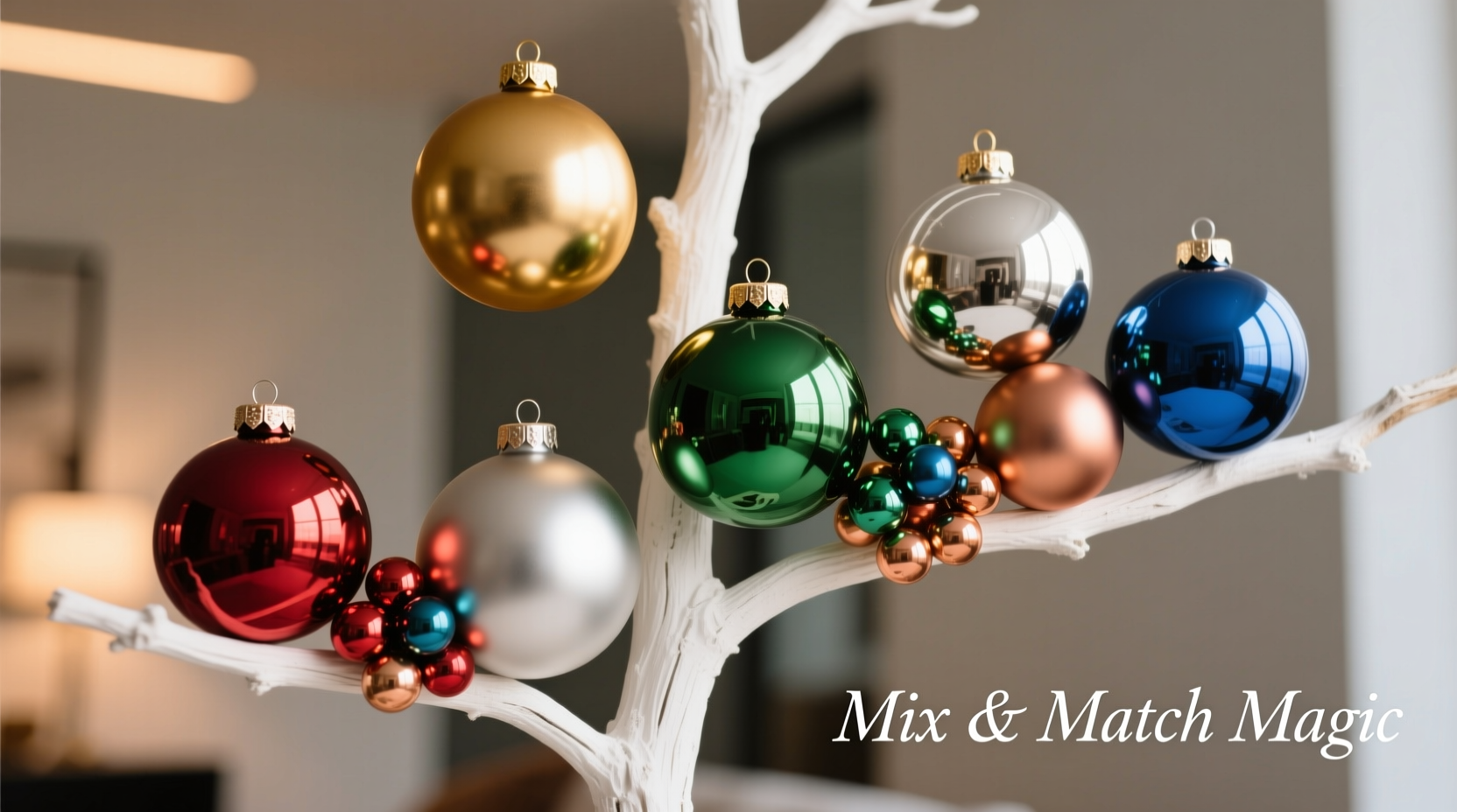
Metallic ornaments are not mere accents—they’re structural anchors. Think of them as the “bones” of your arrangement: they define shape, catch ambient light, and provide continuity across varied colors. Begin by selecting one dominant metallic tone—not two or three—and commit to it across at least 60% of your metallic pieces. Gold remains the most versatile (especially antique or satin gold, which avoids the harshness of bright chrome), but brushed brass offers earthy warmth, while matte pewter introduces modern coolness. Avoid mixing polished silver and brushed gold on the same tree unless you’re intentionally creating high-contrast drama—and even then, limit it to one focal zone (e.g., the top third).
Tip: Use metallics to reinforce your tree’s silhouette—place larger metallic balls at branch tips and mid-levels to draw the eye outward, while reserving smaller metallics for inner branches to add depth without clutter.The key is consistency in finish. A single matte copper ornament amid seven glossy gold ones will look like an oversight, not an accent. If you own mixed metallics, group them intentionally: create a “brass cluster” on one side of the tree and a “gold cluster” on the other—but keep each cluster visually unified in sheen and scale. Reserve mixed finishes for standalone decorative objects (a brass candleholder beside a gold-trimmed book) rather than integrated ornament arrangements.
2. Choose Your Color Palette with Purpose—Not Just Preference
Color selection is where many well-intentioned mixes falter. Throwing together cobalt blue, lime green, tangerine, and lavender alongside gold creates visual noise—not harmony. Instead, adopt a disciplined palette framework. There are three proven approaches:
- Monochromatic + Metallic: Select one base hue (e.g., deep emerald) and use three tonal variations—forest, sage, and moss—then layer in antique gold or copper. This delivers richness without competition.
- Analogous + Metallic: Choose two adjacent colors on the wheel (e.g., burgundy and plum) plus one complementary neutral (cream or charcoal) and anchor with brass or pewter. The metallic becomes the unifying bridge.
- Triadic Accent + Metallic: Use one dominant color (navy), one supporting color (mustard), and one small-pop accent (terracotta), all grounded by warm gold. Here, the metallic tempers the vibrancy and prevents the triad from feeling jarring.
Avoid “rainbow scattering”—placing every color randomly. Instead, cluster colors deliberately. Group three ruby-red ornaments with two gold finials and one copper star on a single branch. Repeat that grouping rhythmically around the tree. This repetition builds rhythm and coherence, turning variety into intention.
3. Master Scale, Texture, and Dimension
Ornament mixing fails most often when scale and texture are ignored. A tree overloaded with identical 3-inch glass balls—regardless of color or metal—feels flat and monotonous. Introduce hierarchy through deliberate variation:
- Scale: Use at least three sizes—large (4–5 inches) for anchor points, medium (2.5–3.5 inches) for volume, and small (1–1.75 inches) for detail and fill.
- Texture: Pair smooth glass with ribbed mercury glass, hammered metal, velvet-wrapped spheres, or hand-blown glass with subtle bubbles. Texture catches light differently—matte copper reflects softly, while faceted crystal throws sharp highlights—creating visual interest without adding color.
- Dimension: Incorporate 3D shapes beyond spheres: teardrops, stars, geometric polyhedrons, and organic forms like pinecones wrapped in gold leaf. These break up visual repetition and guide the eye vertically and diagonally.
| Ornament Type | Ideal Role | Metallic Pairing Tip |
|---|---|---|
| Large Smooth Glass Ball (4\") | Anchors branch ends; establishes color tone | Use metallic version as primary anchor; match color tone (e.g., navy ball + navy-mirrored gold ball) |
| Medium Ribbed Mercury Glass | Adds vintage depth and diffuse glow | Pair with matching metallic finish—antique gold ribbing with antique gold ornaments |
| Small Velvet-Wrapped Sphere (1.25\") | Fills gaps; adds tactile luxury | Choose metallic thread embroidery (e.g., gold-stitched cranberry velvet) |
| Geometric Brass Wire Frame | Provides modern contrast and negative space | Fill interior with one small colored ornament (e.g., brass octahedron holding a crimson glass bead) |
4. Real-World Application: The Harper Family Tree Reimagined
Consider the Harper family in Portland—a couple who inherited a box of 1970s gold and silver glass balls, added handmade ceramic ornaments in burnt sienna and slate blue over the years, and recently bought a set of matte copper wire stars. Their tree had long felt “busy but bland”: too many colors competing for attention, with metallics scattered haphazardly like afterthoughts.
They began by sorting ornaments into piles: dominant metallic (antique gold—32 pieces), secondary metallic (silver—14 pieces), color group A (slate blue ceramics and glass—18), color group B (burnt sienna—15), and texture group (velvet, wood, and wire—11). They decided to elevate antique gold as their sole metallic foundation and relegate silver to storage—using only three intentionally placed silver pieces as “cool-toned punctuation” near the tree’s base.
Next, they grouped ornaments by branch: each major limb received one large gold ball (4\"), two medium slate blue glass balls, one medium burnt sienna ceramic, three small gold-finial pinecones, and one matte copper star tucked near the trunk. They strung garlands of dried orange slices and cinnamon sticks—warm neutrals that bridged the colors and metallics organically. The result? A tree that felt cohesive, layered, and quietly sophisticated—inviting closer inspection rather than overwhelming at first glance. As Sarah Harper noted in her holiday newsletter: “We stopped asking ‘What else can we add?’ and started asking ‘What does this branch need to feel complete?’ That shift changed everything.”
5. Step-by-Step Ornament Mixing Process
Follow this sequence before hanging a single ornament. It takes 20 minutes—but saves hours of rearranging later.
- Define Your Metallic Anchor: Choose one finish (e.g., antique gold) and gather all matching ornaments. Set aside others unless they’re essential heirlooms.
- Select Your Core Color(s): Pick one or two dominant hues. Pull all ornaments in those colors—even if finishes vary. Discard or store outliers.
- Assess Scale & Texture Balance: Lay out your chosen ornaments. Do you have at least three sizes? At least two textures (e.g., glass + wood)? If not, swap in alternatives now.
- Create Mini-Clusters: Group 4–5 ornaments per cluster: 1 large metallic, 1–2 medium color, 1 small texture piece, 1 dimensional accent (e.g., star or teardrop). Make 8–10 clusters.
- Hang with Rhythm, Not Randomness: Starting at the trunk, place clusters every 8–12 inches along major branches—alternating sides, varying height slightly. Leave 3–4 inches between clusters. Finish with garland draped *over* (not under) clusters to unify.
“The most elegant ornament mixes don’t shout—they whisper cohesion. Metallics are the grammar; color is the vocabulary. Get the grammar right, and your vocabulary will shine without chaos.” — Lena Cho, Interior Designer & Holiday Stylist, featured in Architectural Digest Holiday Edition
6. Common Pitfalls & How to Avoid Them
Even seasoned decorators stumble here. These are the five most frequent missteps—and precise fixes:
- Pitfall: Using metallics only as “sparkle,” not structure.
Solution: Assign metallics functional roles—large ones for shape definition, small ones for depth. Never hang metallics solely for “glitter.” - Pitfall: Matching metallics to ornament colors (e.g., silver with blue, gold with red).
Solution: Let metallics serve as neutral bridges. Gold harmonizes with blue, red, green, and plum equally—it’s the warmth, not the hue, that matters. - Pitfall: Overloading the lower third of the tree with heavy ornaments.
Solution: Place largest/heaviest ornaments higher up (mid-to-top third) where branches are sturdier. Use lightweight metallics (foam, thin metal) or small colored ornaments below. - Pitfall: Ignoring your lighting environment.
Solution: In rooms with warm incandescent lights, lean into gold/brass/copper. Under cool LED white light, matte pewter or gunmetal reads more naturally. Test clusters under your actual tree lights before committing. - Pitfall: Forgetting the backdrop.
Solution: Your wall color, trim, and furniture influence perception. A navy wall makes ruby ornaments pop but swallows gold—so increase gold density. A white wall needs deeper metallic tones (antique gold > bright gold) to avoid looking sterile.
FAQ
Can I mix matte and glossy metallics on the same tree?
Yes—but only if they share the same base tone (e.g., matte gold + glossy gold) and are distributed with clear intent. Use matte for background depth (inner branches) and glossy for focal points (branch tips). Never mix matte gold with glossy silver—that creates tonal dissonance, not texture contrast.
How many colors is too many?
Three is the practical maximum for visual harmony: one dominant, one supporting, one accent. If using more, ensure at least two are neutrals (cream, charcoal, olive, rust) or metallics. True “colored” ornaments should be limited to two distinct non-neutral hues—e.g., sapphire and amethyst, not sapphire, lime, tangerine, and violet.
What if my ornaments are all different sizes and shapes already?
Embrace the eclecticism—but impose order. Sort by finish first (all gold-tone items together), then by dominant color family. Then build clusters using the “rule of three”: three varying sizes, two textures, one dimension. Irregularity becomes charm when anchored by consistent materials and rhythm.
Conclusion
Mixing metallic and colored Christmas ornaments isn’t about accumulating more—it’s about editing with confidence, understanding how light interacts with surface, and trusting that restraint creates resonance. A single antique gold ball placed with intention speaks louder than ten mismatched ornaments crammed onto a branch. When you choose a metallic foundation, commit to its finish. When you select colors, honor their relationship—not just their individual beauty. When you hang, think in clusters, not singles; in rhythm, not randomness.
Your tree is more than decoration. It’s a reflection of how you hold complexity with grace—balancing warmth and shine, tradition and personality, abundance and ease. This year, let your ornaments tell that story clearly. Gather your pieces, apply these principles, and hang with purpose. Then step back—not to critique, but to receive the quiet joy of a space that feels both celebratory and deeply, unmistakably yours.
💬 Share your signature ornament mix! Did you find the perfect balance of copper and cranberry? Gold and forest green? Tell us your winning combination in the comments—we’ll feature standout examples next holiday season.