Cocktails are more than beverages—they’re sensory experiences that anchor a moment in time. When the color of a drink harmonizes with its surroundings, it deepens immersion: a frosty silver-gray gin fizz beside winter pine boughs feels intentional; a sun-drenched peach spritz on a terracotta patio radiates summer ease. Yet most hosts treat drink selection and decor as separate tasks—choosing a “pretty” drink first, then arranging flowers or linens around it. The more refined approach is inversion: begin with your seasonal palette, then build drinks whose hues, textures, and even temperatures reinforce it. This isn’t about rigid matching—it’s about chromatic resonance, where color becomes a quiet thread connecting glass, table, wall, and mood.
Why Color Harmony Matters Beyond Aesthetics
Color psychology confirms what experienced hosts intuitively know: environment shapes perception of flavor. A 2023 study published in Food Quality and Preference found participants rated identical citrus-forward cocktails as 22% “brighter” and “more refreshing” when served in amber-tinted glassware against warm-toned linens versus cool-blue backdrops. Why? Our brains process visual context before taste—color primes expectation. A deep burgundy blackberry shrub served in a matte crimson coupe amid dried pampas grass and rust-hued velvet cushions doesn’t just look cohesive; it signals richness, warmth, and intentionality before the first sip. Conversely, a vibrant chartreuse basil gimlet presented on stark white marble during a crisp November dinner can feel jarringly dissonant—not wrong, but emotionally unmoored from the season’s hushed, earthy cadence.
This alignment also elevates guest experience beyond novelty. When every element—from napkin fold to garnish stem—speaks the same chromatic language, attention shifts from surface decoration to presence. The drink becomes part of the room’s rhythm, not an interruption.
Seasonal Palettes: From Nature to Glass
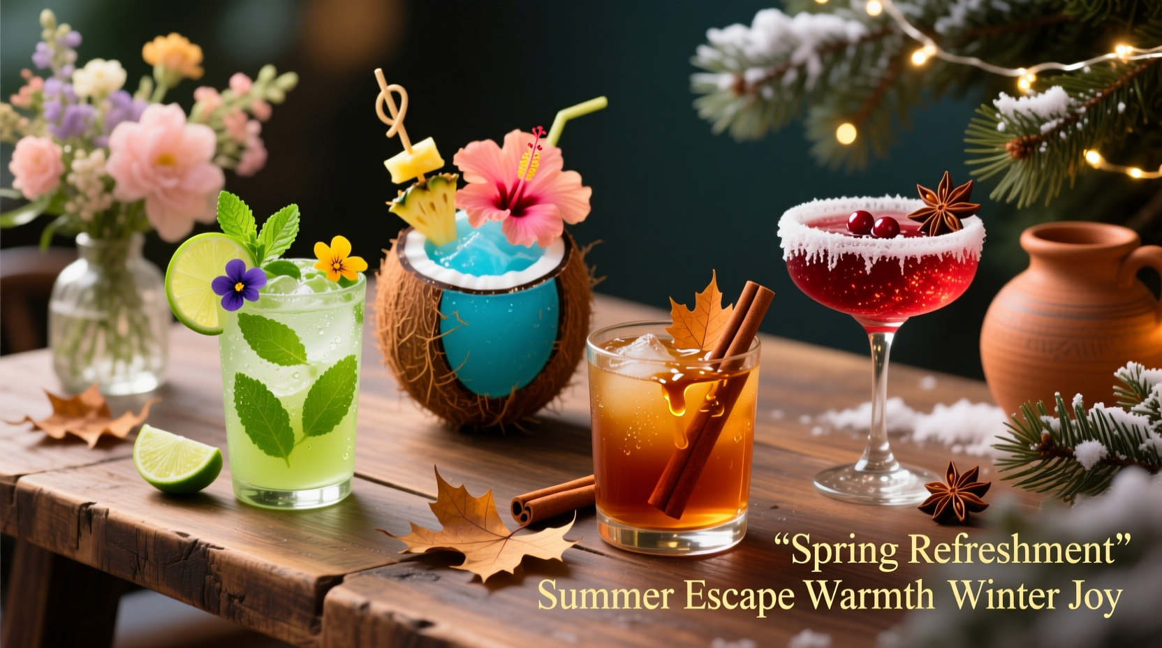
Seasonal palettes aren’t arbitrary trends—they’re distilled observations of light, flora, and atmospheric shifts. Matching cocktails begins with grounding in these natural references:
- Spring: Not pastel clichés, but the luminous clarity of dawn light—think pale celadon (new beech leaves), petal-pink (dogwood at first bloom), and chalky limestone white. These reflect renewal without saccharine sweetness.
- Summer: High-saturation, high-contrast tones: sun-bleached coral, sea-glass turquoise, and the almost-neon green of basil grown in full sun. These colors vibrate with heat and humidity.
- Autumn: Layered, complex neutrals—burnt umber (fallen oak leaves), dried saffron yellow, and slate gray (pre-storm skies). Depth matters more than brightness.
- Winter: Not monochrome black-and-white, but mineral-rich tones: iron-oxide red (hematite), frosted silver (lichen on stone), and deep evergreen (not pine-green, but the near-black of yew at dusk).
These aren’t paint swatches to replicate—but emotional anchors to interpret through ingredients, technique, and presentation.
Tip: Before finalizing your menu, step outside at the same time of day as your event. Note three dominant colors in the landscape—and use them as your primary palette reference, not a design magazine.Ingredient-Driven Color Strategy (Not Just Food Dye)
Authentic seasonal cocktail color comes from botanicals, fruits, and ferments—not artificial additives. Each ingredient carries inherent pigment, texture, and temperature cues that align with seasonal energy:
| Season | Key Pigment Sources | Color Outcome & Sensory Role | Example Application |
|---|---|---|---|
| Spring | Chlorophyll-rich herbs (nettle, spinach), young rhubarb, white strawberries, elderflower | Pale jade, blush pink, cloud-white—light, translucent, slightly vegetal | Nettle-infused gin shaken with lemon and honey syrup; served up in a chilled coupe with a single edible violet |
| Summer | Ripe heirloom tomatoes, blood oranges, fresh basil, butterfly pea flower (with acid adjustment), grilled pineapple | Vibrant coral, electric blue, sun-warmed gold—opaque, juicy, high-contrast | Blood orange–basil shrub with tequila, topped with soda and a charred pineapple wedge |
| Autumn | Blackberries, roasted beets, walnut liqueur, dried hibiscus, apple cider vinegar | Deep plum, oxidized copper, dusty rose—matte, layered, slightly tannic | Blackberry-beet shrub with rye whiskey, stirred and strained over a large ice cube; garnished with a dehydrated apple slice dusted with cinnamon |
| Winter | Evergreen tips (spruce, Douglas fir), blackstrap molasses, pomegranate molasses, activated charcoal (food-grade), roasted chestnuts | Frosted silver, hematite red, deep forest—glossy or velvety, often with subtle smoke or earth notes | Spruce tip–infused aquavit with pomegranate molasses and lemon; served in a rocks glass with a single frozen cranberry and a whisper of activated charcoal rim |
Note: Seasonal color isn’t just about hue—it’s about opacity and texture. Spring drinks should feel delicate and translucent; winter drinks, substantial and rich. A spring cocktail shouldn’t be syrupy; a winter one shouldn’t be effervescent unless intentionally contrasted (e.g., a sparkling pomegranate granita float).
A Step-by-Step Framework for Cohesive Execution
Matching cocktail color to decor isn’t improvisation—it’s a deliberate sequence. Follow this five-step framework:
- Analyze your space’s dominant seasonal tones. Identify the three strongest colors in your existing decor (wall paint, upholstery, rugs, art). Ignore accent pieces—focus on foundational elements.
- Select your primary cocktail color anchor. Choose one hue from your decor palette to serve as the drink’s dominant tone (e.g., if your dining room features sage walls and oatmeal linen, choose sage green as your anchor).
- Source pigmented ingredients that naturally yield that tone. Prioritize whole foods over extracts. For sage green: cucumber juice + matcha + lime (avoid food dye). For hematite red: blackberry reduction + pomegranate molasses.
- Adjust saturation and value using technique. To mute a vibrant beet juice: stir instead of shake; add a touch of walnut liqueur; serve over clear ice. To intensify hibiscus: reduce it into a syrup and layer it beneath a lighter spirit.
- Extend the color story through vessel and garnish. Match glassware finish (matte vs. glossy) and garnish texture (crisp herb leaf vs. dried flower) to your decor’s material language (linen vs. velvet vs. ceramic).
This method ensures drinks don’t just “fit” the room—they deepen its narrative.
Mini Case Study: The Maple-Leaf Dinner Party (Autumn)
When Toronto-based host Maya Chen planned her annual maple-leaf dinner—a gathering centered on fallen foliage, woodsmoke, and late-harvest apples—she began with her dining room’s existing palette: matte charcoal walls, raw-edge walnut table, and burnt-orange wool runner. Her instinct was to serve a classic bourbon sour, but its bright yellow lemon juice clashed with the room’s muted depth.
She pivoted using the framework: First, she identified charcoal and burnt orange as her anchors. Next, she sourced blackstrap molasses (deep brown-black) and roasted apple puree (caramelized amber). She combined them with aged rum and a touch of smoked maple syrup, then stirred the mixture with crushed ice to create a silky, opaque pour. Served in heavy, matte-black ceramic coupes (echoing her wall tone), each drink was garnished with a single dehydrated apple fan dusted with ground cinnamon—its warm orange hue mirroring the runner. Guests didn’t remark on “the drink” or “the decor”—they commented on how the entire evening felt “like stepping into an autumn painting.” The cocktail wasn’t decorative; it was atmospheric architecture.
Expert Insight: The Role of Light and Reflection
“The most overlooked factor in cocktail color harmony is ambient light—not what you see, but how it moves across surfaces. A drink’s true seasonal resonance emerges only when its hue interacts with the quality of light in the room. In winter, use low, directional lighting to highlight the gloss of a pomegranate molasses float. In summer, embrace direct sunlight to make a basil-infused gin sparkle like dew. Never assume color reads the same under LED, candlelight, or noon sun.” — Lena Dubois, Beverage Director & Spatial Design Consultant, *The Chromatic Bar Collective*
Dubois’ insight reframes color as dynamic, not static. A cocktail’s appearance shifts with illumination—so test your final presentation at the actual event time, not midday in a brightly lit kitchen.
Common Pitfalls and How to Avoid Them
Even seasoned hosts misstep when bridging beverage and decor. Here’s what to watch for:
- The “Theme Trap”: Forcing drinks into literal seasonal stereotypes (e.g., peppermint mojitos for winter). Instead, interpret seasonality through texture and weight—winter drinks benefit from viscosity and umami, not candy flavors.
- Overlooking Glassware Finish: A glossy martini glass reflects light sharply, clashing with matte-textured fall linens. Opt for hand-blown, slightly textured glass or ceramic for autumn/winter; sleek, polished crystal for spring/summer.
- Garnish Dissonance: A vibrant mint sprig on a winter cocktail reads as “unseasonal,” not “fresh.” Swap for rosemary (woody, resinous) or toasted coriander seed (earthy, warm).
- Ignoring Temperature Contrast: A room at 20°C (68°F) makes a frosty drink feel colder—and visually sharper—than in a 25°C (77°F) space. Adjust dilution and ice size accordingly to maintain mouthfeel harmony.
FAQ
Can I use non-alcoholic ingredients to achieve seasonal color without compromising sophistication?
Absolutely. Seasonal color integrity depends on pigment source, not alcohol content. Blackberry shrubs, roasted carrot juice, hibiscus infusions, and cold-brewed matcha deliver rich, nuanced hues and complex flavor profiles. The key is treating them with the same respect as spirits—reducing, clarifying, or fat-washing to deepen character, not just adding color.
My decor is mostly neutral—how do I choose a seasonal cocktail color?
Neutrals are your greatest asset. They’re not voids—they’re tonal canvases. If your space leans warm (cream, taupe, caramel), lean into autumnal and winter palettes: burnt sienna, hematite red, forest green. If it’s cool-toned (greige, dove gray, slate), emphasize spring’s celadon and summer’s sea-glass. Neutrals allow your cocktail to become the intentional focal point—so choose one bold, seasonally resonant hue and let it sing.
What if my guests have dietary restrictions? Will that limit my color options?
Not at all—in fact, it expands them. Plant-based milks (oat, cashew) create elegant ivory and latte-toned layers. Natural sweeteners like date syrup and yacon root syrup contribute deep amber and copper tones. Even allergen-free gels (agar-based) can suspend seasonal florals or herb oils in stunning suspended-color effects. Restriction breeds creativity—and often, more authentic seasonal expression.
Conclusion
Matching cocktail colors to seasonal decor is less about decoration and more about dialogue—between land and glass, light and liquid, host and guest. It asks you to observe deeply, source thoughtfully, and execute with quiet confidence. You don’t need rare ingredients or expensive glassware. You need attention: to the way morning light hits your kitchen counter in March, the scent of damp earth after the first October rain, the weight of a walnut in your palm on a December afternoon. Let those sensations guide your choices—not trends, not templates, but the living pulse of the season itself.
Start small. Next time you host, choose one seasonal hue from your space and build a single drink around it—not as an accessory, but as an extension of your home’s voice. Stir it slowly. Serve it deliberately. Watch how color, when rooted in authenticity, transforms hospitality from transactional to transcendent.
💬 Your turn: Which seasonal cocktail color has surprised you most—by how deeply it anchored a moment? Share your story, your favorite natural pigment source, or your go-to winter garnish in the comments. Let’s build a living library of color wisdom, one season at a time.