Modern interior design thrives on intentionality—not ornamentation for its own sake, but objects and images that carry narrative weight, refined aesthetics, and personal resonance. Liquor-themed art sits at an intriguing intersection: it evokes craft, history, ritual, and global culture—but risks veering into barroom cliché when handled without discernment. Done well, it becomes a quiet signature element: a nod to connoisseurship, travel, or even familial tradition—expressed through minimalist typography, abstract distillation motifs, or archival photography. This isn’t about neon martini signs or oversized bourbon barrel stencils. It’s about curating art that respects the sophistication of contemporary space while honoring the layered symbolism of spirits—from the geometry of copper stills to the patina of aged oak barrels.
1. Reframe the Narrative: From Bar Cliché to Cultured Symbolism
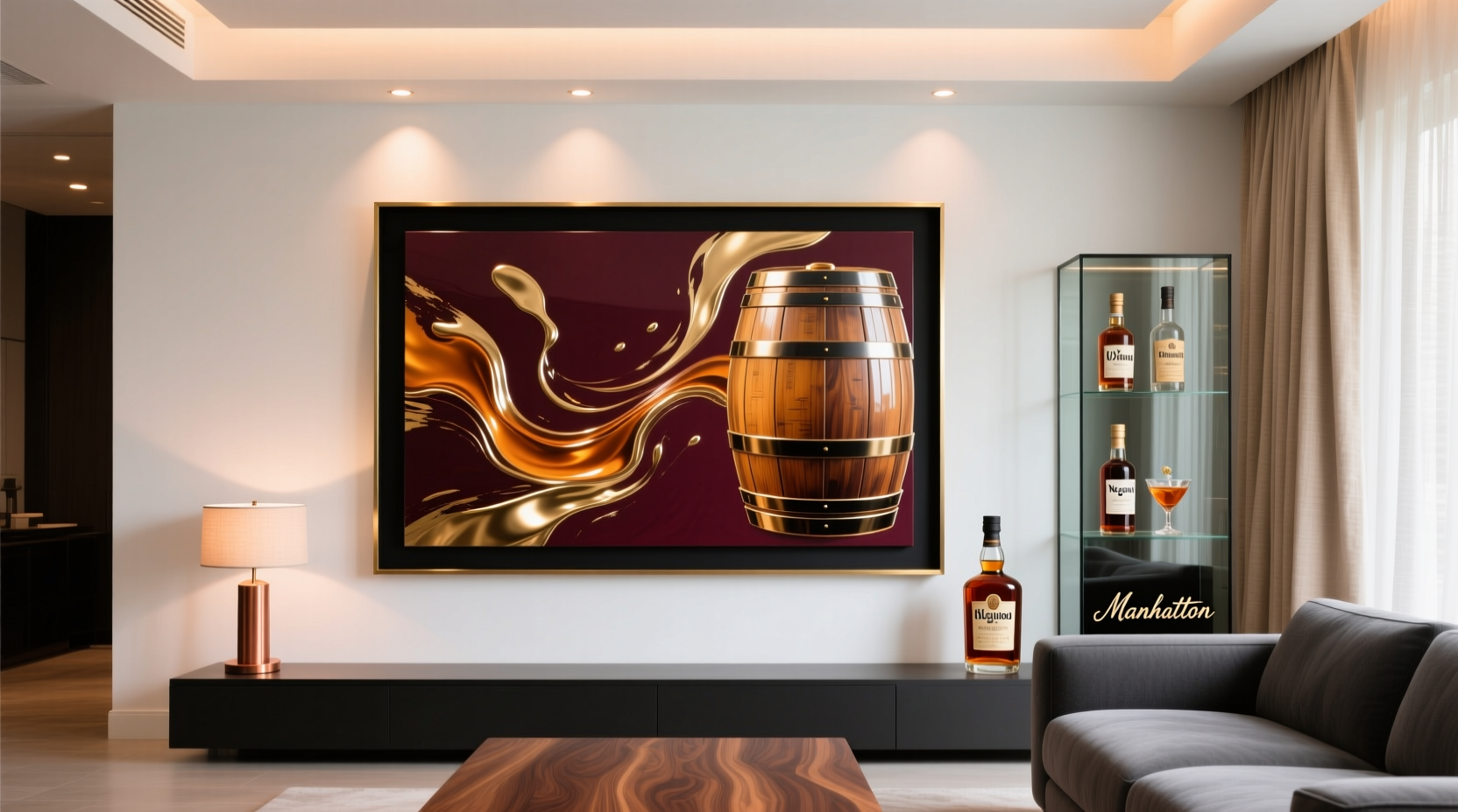
Liquor-themed art often fails not because of subject matter, but because of context collapse. A vintage Campari ad feels electric in a Milanese espresso bar but jarring beside a B&B Italia sofa and floor-to-ceiling neutral linen drapery. The fix begins with redefining what “liquor-themed” means. Move beyond literal bottles and cocktail glasses. Consider instead:
- Process-driven imagery: High-resolution macro shots of grain fermentation, copper coil condensers, or the slow drip of single-estate tequila from clay stills;
- Material studies: Abstract compositions focused on the texture of charred oak staves, the iridescence of spirit vapors under controlled light, or the precise geometry of modular gin botanicals laid out like scientific specimens;
- Typography as artifact: Framed original 1930s apothecary labels, hand-lettered Japanese sake brewery seals, or minimalist sans-serif prints quoting distillery founding dates or regional terroir descriptors (e.g., “Highland Peat • 1897”);
- Cultural documentation: Black-and-white documentary photographs of traditional mezcal palenques, Kyoto sake breweries in winter mist, or pre-Prohibition American distilleries—treated with restrained tonal grading and ample white matting.
This shift elevates the work from decorative accessory to cultural artifact. It invites conversation not about hangovers or partying, but about agricultural stewardship, metallurgical precision, or centuries-old fermentation science.
Tip: Before acquiring any piece, ask: “Does this reflect craftsmanship, geography, or history—or just alcohol as a prop?” If the answer leans toward the latter, pause and reconsider.2. Scale, Placement, and Visual Weight: Strategic Integration
Modern interiors rely on negative space, rhythm, and calibrated visual hierarchy. Liquor-themed art must obey these principles—not disrupt them. A large-scale print of a bourbon barrel head works powerfully above a low-profile sectional—if treated as a textural monolith, not a novelty item. Conversely, a cluster of three small botanical etchings feels cohesive on a narrow hallway wall when aligned with architectural lines and spaced precisely 3 inches apart.
Key placement guidelines:
- Avoid the “bar zone” default: Resist hanging liquor art only near built-in bars or wet bars. Instead, anchor it where daily gaze lingers: flanking a fireplace, centered on a dining room accent wall, or as the sole focal point above a streamlined console table.
- Respect sightlines: Hang artwork so the center falls between 57–60 inches from the floor—the average human eye level. In rooms with high ceilings or dramatic furniture, adjust upward slightly, but never let the bottom edge rise above seated eye height.
- Balance saturation: If your palette is grounded in warm greys, oat, and blackened steel, a single muted sepia print of a 19th-century cognac cellar adds depth without chromatic competition. Introduce color deliberately: one vibrant lithograph of Andalusian sherry bodegas against cool-toned plaster walls creates intentional contrast.
3. Materiality and Framing: The Silent Design Language
In modern interiors, framing isn’t neutral—it’s part of the composition. A thick, dark walnut frame on a matte-finish gin botanical print reads as warm and tactile; a slim, anodized aluminum frame around a digital still-life of crystal decanters reinforces precision and clarity. The substrate matters equally: museum-grade cotton rag paper conveys archival seriousness; brushed aluminum mounting lends industrial restraint; hand-torn deckled edges on a whiskey label reproduction add subtle organic tension.
Consider these framing pairings for maximum cohesion:
| Art Type | Ideal Frame | Matting Recommendation | Why It Works |
|---|---|---|---|
| Vintage distillery blueprint (blue-line) | Matte black aluminum, ¾\" width | None — float-mounted on white gesso panel | Emphasizes technical precision and archival neutrality |
| Abstract charcoal study of barrel charring | Warm walnut, 1¼\" width, beveled edge | Double mat: outer oat linen, inner off-white cotton | Grounds the rawness of charcoal in warmth and tactility |
| Contemporary photo of agave fields at dawn | Brushed brass, ½\" width, no glass | Single ivory cotton rag mat, 2.5\" width | Reflects light subtly; mat provides breathing room for expansive sky |
| Minimalist typographic print (“Islay • 1825”) | Matte charcoal grey wood, ⅝\" width | None — edge-mounted with micro-gap reveal | Reinforces typography-first rigor; avoids visual distraction |
4. Real-World Integration: A Case Study in Brooklyn Loft Living
When interior designer Lena Ruiz redesigned a 1,400-square-foot converted textile warehouse in Williamsburg, her client—a sommelier-turned-craft-spirits importer—requested “a quiet homage to liquid culture” without “feeling like a speakeasy.” The space featured exposed brick, poured concrete floors, and floor-to-ceiling windows facing the Manhattan skyline.
Ruiz rejected obvious choices: no backlit bottle displays, no reclaimed barrel coffee tables. Instead, she commissioned three custom pieces:
- A 48\" × 72\" vertical photograph of a single copper pot still at Islay’s Kilchoman Distillery, shot at dawn with mist clinging to the coils. Printed on Hahnemühle Photo Rag Baryta, framed in matte black aluminum, hung alone on the longest wall opposite the sofa;
- A trio of 12\" × 12\" archival pigment prints—each showing a different stage of Japanese koji fermentation under controlled lab lighting—mounted on rigid white acrylic and arranged in a tight vertical column beside the entryway mirror;
- A single 8\" × 10\" original 1928 French absinthe label, conserved and floated in a deep shadow box with charcoal linen backing and a thin brass lip.
The result? Guests consistently comment on the “serene, almost meditative quality” of the space—not the spirits themselves, but the reverence for process, patience, and material integrity. As Ruiz notes:
“The most powerful liquor-themed art doesn’t shout ‘drink me.’ It whispers ‘this took time, land, fire, and human attention.’ That’s the language modern design understands.”
5. Avoiding Pitfalls: A Curator’s Checklist
Even with strong intent, missteps can undermine cohesion. Use this actionable checklist before finalizing purchases or installations:
- ☑️ Is the color palette harmonious? Does the artwork’s dominant hue complement (not compete with) your primary wall color and upholstery fabric? Test by holding a physical swatch beside a high-res digital preview.
- ☑️ Does it pass the “3-second rule”? Stand across the room for three seconds. Does your eye land naturally on the piece—or does it feel visually aggressive, overly busy, or oddly isolated?
- ☑️ Is the provenance authentic or respectfully sourced? Avoid mass-produced “vintage-style” prints mimicking real distillery archives. Seek artists who collaborate directly with producers or use ethically licensed historical assets.
- ☑️ Is the scale proportionate to adjacent architecture? A 30\" wide print feels lost beside a 10-foot window; a 60\" wide piece overwhelms a 6-foot-wide fireplace surround. Measure twice, visualize once.
- ☑️ Does it reflect your actual relationship to spirits? If you’ve never tasted a single Japanese whisky, a wall of Suntory memorabilia will read as costume, not conviction. Choose art that mirrors lived experience—not aspiration.
6. Expert Insight: The Designer’s Perspective on Meaningful Curation
Maria Chen, principal of Studio Lumen and author of *Material Narratives: Designing with Intention*, has integrated liquor-themed elements into over 40 residential projects since 2018. Her philosophy centers on authenticity over aesthetic convenience:
“Clients often arrive thinking ‘I love whiskey’ equals ‘I need a whiskey wall.’ But meaning emerges from specificity—not category. The difference between ‘bourbon art’ and ‘a 1947 photograph of the first female master distiller at Buffalo Trace, printed on handmade abaca paper’ is the difference between decoration and dignity. Modern spaces reward restraint, research, and resonance. When you choose art rooted in real people, places, and processes, it stops being about alcohol—and starts being about legacy.” — Maria Chen, Interior Designer & Material Historian
7. FAQ: Addressing Common Concerns
Won’t liquor-themed art make my living room feel like a bar or restaurant?
Only if executed with commercial shorthand—neon, clichéd iconography, or oversaturated branding. Modern liquor art succeeds when it prioritizes form, material, and story over function. A stark black-and-white photo of a Shaoxing rice wine fermentation vat reads as sculptural abstraction, not beverage promotion.
Can I mix liquor-themed art with other themes—like travel or botany?
Yes—and it’s encouraged. The strongest integrations layer narratives: a print of Oaxacan agave fields alongside a map of mezcal appellations and a close-up of traditional clay pots (ollas) creates geographic, botanical, and cultural continuity. Just ensure consistent tonal treatment (e.g., all matte finishes, unified matting, aligned framing profiles).
What if I don’t drink alcohol? Can this art still be meaningful?
Absolutely. Many collectors acquire liquor-themed art for its industrial design (copper stills as kinetic sculpture), agricultural significance (heirloom grain varieties used in distillation), or historical value (Prohibition-era ephemera as social documentation). Focus on the craft, landscape, or archive—not the consumption.
Conclusion: Design With Depth, Not Decor
Incorporating liquor-themed art into a modern living room isn’t about adding a theme—it’s about deepening your space’s narrative intelligence. It’s choosing a photograph that captures the exact moment vapor condenses inside a century-old still, not because it’s “about whiskey,” but because it reveals how heat, metal, and time collaborate to transform grain into something transcendent. It’s selecting a hand-drawn label from a family-run pisco distillery in Peru because its typography embodies generations of resilience—not because it looks “rustic.” When curated with the same rigor you’d apply to selecting a Josef Albers print or a Dieter Rams radio, liquor-themed art earns its place not as decoration, but as dialogue: with history, with craft, with the quiet poetry of human ingenuity.
Your living room doesn’t need more objects. It needs fewer, better ones—each carrying weight, whispering context, and standing confidently within the calm syntax of modern design. Start with one piece that moves you beyond the surface. Research its origin. Understand its making. Then hang it not as a statement about drinking—but as a testament to what happens when attention, tradition, and material meet.
💬 Have you successfully integrated unexpected thematic art into a minimalist space? Share your approach, challenges, and lessons learned in the comments—we’ll feature thoughtful insights in our next design roundtable.