Gaming setups have evolved far beyond functional workstations—they’re personal theaters, creative studios, and curated expressions of identity. Among the most distinctive emerging trends is the “alcohol-themed” aesthetic: not about consumption, but about evoking the visual language of craft cocktails, premium spirits, and apothecary-inspired design through lighting, materials, and ambient cues. Think amber-hued gradients reminiscent of aged bourbon, cool cyan pulses like chilled gin & tonic, or deep ruby glows echoing a glass of Cabernet. When paired with programmable RGB lighting, this theme transforms a desk into a dynamic, mood-responsive environment. But executing it well demands more than slapping on red LEDs and calling it “whiskey mode.” It requires intentionality around color theory, thermal management, electrical safety, and cohesive design rhythm. This guide walks through how to build an alcohol-themed RGB setup that’s immersive, technically sound, and genuinely refined—no gimmicks, no hazards, just elevated atmosphere.
Understanding the Alcohol-Themed Palette (Beyond Stereotypes)
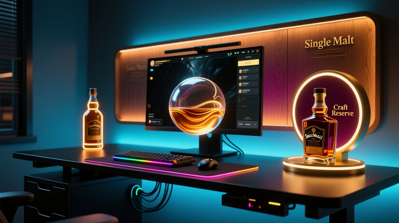
“Alcohol-themed” doesn’t mean neon beer logos or flashing martini glasses. It refers to a sophisticated chromatic vocabulary drawn from real-world beverage characteristics: hue, clarity, viscosity, temperature, and presentation. A well-executed palette respects these physical properties:
- Bourbon/Scotch: Warm ambers (hex #D4A017), burnt siennas (#8B4513), and deep mahoganies (#4A230F)—not flat orange. These colors should pulse slowly, like liquid swirling in low light.
- Gin/Vodka: Crisp, clean blues (#2E5A88) and icy teals (#6CB4EE), often with subtle white highlights to mimic condensation or frost. Timing should be precise and airy—short fades, not sluggish transitions.
- Red Wine: Rich, saturated crimsons (#7C0A02) and plum violets (#5D3A5D), layered with gentle micro-pulsations to suggest depth and movement in the glass.
- Champagne/Cocktails: Effervescent golds (#F9D71C), pale pinks (#FADADD), and pearlescent whites (#F8F9FA) with rapid, randomized twinkles—like bubbles rising in a flute.
This isn’t arbitrary color selection. It’s grounded in perceptual psychology: warm tones lower perceived ambient noise and encourage focus during long sessions; cool tones enhance alertness and visual acuity for competitive play; and rhythmic, organic patterns reduce eye strain compared to aggressive strobing.
Tip: Use a physical reference—pour water into a clear glass, add food-safe coloring drops matching your target spirit, and observe how light interacts with the liquid at different angles. That’s your true baseline for RGB calibration.Hardware Selection: Prioritizing Safety, Control & Cohesion
Not all RGB gear is built for thematic integration. Cheap LED strips lack consistent color rendering, flicker under PWM dimming, and overheat when run at full brightness behind acrylic or wood. Worse, many “plug-and-play” controllers ignore voltage drop across longer runs—causing color shifts (e.g., amber fading to yellow at the far end of a strip). For alcohol-themed accuracy, prioritize components with:
- High CRI (Color Rendering Index) ≥ 90 for accurate amber and crimson reproduction
- Individually addressable LEDs (WS2812B or SK6812 chips) for pixel-level control
- Separate 5V power injection points every 1–1.5 meters on strips >2m long
- Controllers supporting HSV (Hue-Saturation-Value) input—not just RGB sliders—for intuitive color tuning
Strategic placement matters as much as hardware. Avoid embedding LEDs directly under glass surfaces without diffusers—this creates hotspots that ruin the “liquid glow” illusion. Instead, use edge-lit acrylic panels, backlit frosted glass shelves, or recessed channels lined with matte white silicone diffuser tape.
| Component | Recommended Spec | Why It Matters for Alcohol Themes |
|---|---|---|
| LED Strip | SK6812 RGBW (adds dedicated white channel) | Enables true warm-white amber (not RGB-mixed) and crisp, non-washed-out wine reds |
| Controller | WLED firmware on ESP32-based board | Supports advanced effects like “liquid flow,” “bubbling,” and custom HSV palettes via web UI |
| Power Supply | Mean Well HLG-60H-5 (60W, 5V, IP67-rated) | Prevents voltage sag during deep crimson or amber saturation—colors stay consistent |
| Diffuser | 3mm frosted acrylic + 0.5mm opal diffusion film | Eliminates pixelation; creates smooth, volumetric light like liquid in a decanter |
Step-by-Step: Building Your First Alcohol-Themed Zone
Start small. Choose one zone—your monitor bezel, keyboard tray, or desk riser—and execute it flawlessly before expanding. Here’s how:
- Map the zone: Measure length and note obstructions (cable ports, mounting brackets). Sketch where light should emanate *from*, not where LEDs sit.
- Select base color: Decide the spirit category (e.g., “Old Fashioned” = amber + burnt umber). Use a color picker tool to capture exact hex values from high-res spirit photography (avoid stock images).
- Install with thermal awareness: Mount strips on aluminum channels with thermal adhesive. Never glue directly to wood or plastic—heat buildup degrades LED phosphors and shifts color over time.
- Configure WLED: In the web interface, create a new preset. Set Hue: 38° (amber), Saturation: 85%, Value: 70%. Enable “Smooth Transition” (500ms) and “Random Start” for organic variation.
- Add secondary layer: On a separate controller channel, add a slow-moving “liquid wave” effect using the “Lava Lamp” effect at 15% intensity—this mimics the subtle motion of liquid settling.
- Test in context: Run the setup at night with room lights off. Adjust Value (brightness) until the glow feels like ambient bar lighting—not stage lighting.
This method ensures each element serves the theme rather than competing with it. A single, well-tuned amber zone feels more authentically “bourbon” than ten mismatched red zones shouting for attention.
Real-World Integration: The “Barrel & Bitter” Setup Case Study
When designer Marcus R. renovated his 12’x10’ home office in Portland, he wanted his gaming rig to reflect his side hustle: crafting small-batch bitters. His goal wasn’t “bar-themed”—it was “apothecary-meets-distillery.” He began by replacing his black desk mat with a custom walnut slab featuring a routed channel along the front edge. Into it, he embedded a 2m SK6812 strip with integrated 5V power injection. Using WLED, he programmed three synchronized layers:
- A base glow of #8B4513 (saddle brown) — representing oak barrel staves
- A slow, vertical “rising bubble” effect in #F9D71C (gold) — evoking citrus oil infusion
- Occasional 2-second pulses in #7C0A02 (wine red) — timed to coincide with his “bitter drop” audio cue in-game
He added a second zone behind his monitor: a 30cm frosted acrylic panel lit by a narrow strip set to #2E5A88 (gin blue), pulsing at 0.8Hz—matching his breathing rate during intense matches. The result? A setup that calms pre-game nerves yet sharpens reaction time. “It’s not about drinking,” Marcus notes. “It’s about translating the ritual, the patience, the craftsmanship—into light I can feel in my peripheral vision.” His rig now appears in two feature articles on ergonomic workspace design, praised for its “biophilic rhythm” and intentional restraint.
“The strongest themed lighting doesn’t shout its concept—it whispers it through behavior, timing, and texture. An alcohol theme works because it’s rooted in real sensory experiences: warmth, chill, effervescence, depth. Copy the physics, not the label.” — Lena Torres, Lighting Designer & Co-Author of Atmosphere Engineering for Interactive Spaces
What to Avoid: Critical Safety & Aesthetic Pitfalls
Alcohol-themed RGB is uniquely vulnerable to missteps that undermine both safety and sophistication. These aren’t minor tweaks—they’re hard boundaries:
- Never use non-UL/CE-certified power supplies near wood or fabric surfaces. A failed 12V adapter can ignite sawdust residue or melt cable sheathing. Always use switching supplies with over-current, over-voltage, and short-circuit protection.
- Don’t mix LED types in one zone. Combining 5050 and 3535 chips—even from the same brand—creates visible color banding. Stick to one model per circuit.
- Avoid “spirit-colored” gels or filters over white LEDs. They absorb >60% of light, forcing LEDs to overdrive and overheat. They also fade within 3 months under sustained use.
- Never program rapid strobes (<100ms) in amber or red. These wavelengths trigger stronger photosensitive responses than blue. For accessibility and eye health, minimum fade time must be ≥300ms.
Also resist the urge to literalize the theme. A USB-powered “martini glass” lamp beside your mousepad breaks immersion—it’s a prop, not part of the atmospheric system. True cohesion comes from light that feels *inherent* to the space, not tacked-on.
FAQ
Can I use alcohol-themed lighting if I’m sensitive to flashing lights?
Yes—responsibly. Alcohol themes thrive on slow, organic motion: gentle fades (500–1200ms), subtle pulsations (0.3–0.7Hz), and fluid gradients. Avoid strobing, scanning, or sudden jumps entirely. WLED’s “Breath” and “Fire Flicker” effects (set to ultra-low intensity) offer safe, dynamic alternatives that still evoke liquid movement.
Will amber/crimson LEDs damage my eyes during long sessions?
No—when properly implemented. Unlike blue-rich cool-white LEDs, warm ambers and deep crimsons emit minimal high-energy visible (HEV) light. In fact, studies show amber light (590–620nm) supports melatonin regulation better than neutral white. Just ensure brightness stays below 15 lux at eye level—use a smartphone light meter app to verify.
How do I match RGB lighting to actual bottles on my shelf?
Don’t try to match bottle labels. Match the *liquid inside*. Photograph a bottle backlit by a neutral gray card, then use a color picker on the brightest mid-tone area of the liquid (avoid reflections or highlights). Convert the hex to HSV in a tool like RapidTables, then replicate those HSV values in your controller—not RGB. This bypasses screen gamma distortion.
Conclusion
Your gaming setup is more than hardware—it’s your sanctuary, your command center, your daily ritual space. Alcohol-themed RGB accents, when approached with technical rigor and aesthetic intelligence, elevate that space beyond utility into something resonant and human: the warmth of aged wood, the clarity of distilled water, the quiet fizz of anticipation. This isn’t about novelty—it’s about creating an environment that responds to you, breathes with you, and supports your focus, creativity, and calm. You don’t need ten zones or a $300 controller. Start with one strip, one hue, one intentional pulse. Tune it until it feels like light you’d reach for after a long day—not just light you tolerate. Then build outward, layer by thoughtful layer. Because the most memorable setups aren’t defined by brightness or speed. They’re defined by presence. By authenticity. By the quiet confidence that every glow has earned its place.
💬 Share your own alcohol-themed lighting breakthrough—or your biggest “aha” moment while tuning a hue. Drop it in the comments. Let’s refine this craft, together.