A speakeasy-inspired living room isn’t just about dark walls and velvet sofas—it’s a carefully orchestrated sensory experience: the hush of heavy drapery, the warm glow of brass fixtures, the tactile richness of leather and aged wood, the quiet confidence of understated luxury. But before you order custom cabinetry or commission a backbar, you need clarity—not just aesthetics, but *intention*. That’s where a purpose-built mood board becomes indispensable. Unlike generic Pinterest collages, a strategic mood board for a speakeasy living room serves as both compass and contract: it aligns your vision with practical constraints, reveals hidden contradictions (e.g., “moody” clashing with “bright, airy lighting”), and transforms abstract longing into buildable reality. This isn’t decoration—it’s narrative interior design.
Why a Speakeasy Mood Board Demands Rigor—Not Just Romance
The speakeasy aesthetic is widely misunderstood. It’s often reduced to “dark + gold + cocktails,” leading to spaces that feel like themed restaurants rather than lived-in sanctuaries. Authentic speakeasy energy comes from tension: secrecy versus welcome, opulence versus restraint, history versus modern comfort. A strong mood board surfaces these dualities early. Interior designer Lena Torres, who reimagined The Velvet Vault in Chicago—a residential project widely cited for its layered speakeasy sensibility—explains:
“Clients arrive saying ‘I want a 1920s bar vibe.’ What they actually need is a room that feels like a whispered conversation at midnight—warm, grounded, slightly mysterious, but never cold or theatrical. The mood board is where we kill the clichés and find the soul.”Without this discipline, you risk expensive missteps: glossy black paint that reads as sterile instead of sultry; overly ornate moldings that compete with clean-lined furniture; or lighting that casts harsh shadows instead of amber halos. Your mood board must answer not just *what* looks good, but *how* each element contributes to atmosphere, function, and emotional resonance.
Your 5-Phase Mood Board Creation Process
Building a meaningful mood board isn’t linear—it’s iterative. Follow this proven sequence to avoid overwhelm and ensure cohesion:
- Anchor with Narrative & Non-Negotiables: Define the core story (“a writer’s den where jazz plays softly after midnight”) and list 3 non-negotiable functional needs (e.g., “must seat six for impromptu gatherings,” “no exposed cords,” “pet-friendly upholstery”).
- Gather Raw Sensory Fragments: Collect *unfiltered* references—textures (a swatch of cracked leather), sounds (a 78 rpm recording of Bessie Smith), scents (cedarwood + bergamot notes), even food (smoked olives, rye whiskey). Prioritize physical samples over digital images.
- Cull & Contrast: Eliminate anything that doesn’t serve the narrative or violates a non-negotiable. Then deliberately pair opposites: a rough-hewn oak table leg beside polished brass drawer pulls; matte charcoal plaster next to high-gloss lacquered cabinetry.
- Test Lighting & Scale: Print key color swatches at 4x6 inches and hold them under your room’s actual light at 7 p.m. and 10 p.m. Measure furniture dimensions against your floor plan—never rely on “it’ll fit.”
- Finalize the Triad: Select exactly three anchor elements that define the space’s identity (e.g., “aged brass bar rail,” “deep emerald green velvet sofa,” “exposed brick wall with recessed sconces”). All other choices must harmonize with or intentionally contrast these three.
Essential Elements: What Belongs on Your Speakeasy Mood Board (and Why)
A successful speakeasy mood board balances historical authenticity with contemporary livability. Below are the five non-negotiable categories—and what to prioritize within each:
| Category | Must-Have Elements | Common Pitfalls to Avoid |
|---|---|---|
| Walls & Surfaces | Textured plaster, limewash, or reclaimed brick; deep, complex neutrals (charcoal with blue undertones, olive green with gray base); subtle metallic accents (copper leaf, oxidized brass) | Flat matte black paint (lacks depth); uniform wallpaper patterns (breaks speakeasy intimacy); glossy finishes on large wall areas (feels commercial) |
| Furniture | Low-profile, wide-arm sofas in rich textiles (velvet, bouclé, top-grain leather); curved silhouettes; mixed wood tones (walnut + bleached oak); built-in banquettes with tufted backs | High-back chairs (disrupts flow); matching sets (feels hotel-like); plastic or glass coffee tables (breaks warmth) |
| Lighting | Layered sources: recessed warm LEDs (2700K), adjustable wall sconces with fabric shades, a single sculptural floor lamp (brass or blackened steel), candlelight simulation | Overhead pendant clusters (too bright, too literal); cool-white bulbs (kills warmth); unshielded bulbs (creates glare, not ambiance) |
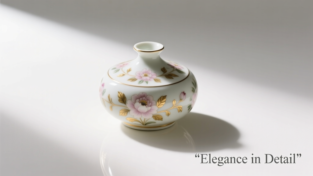
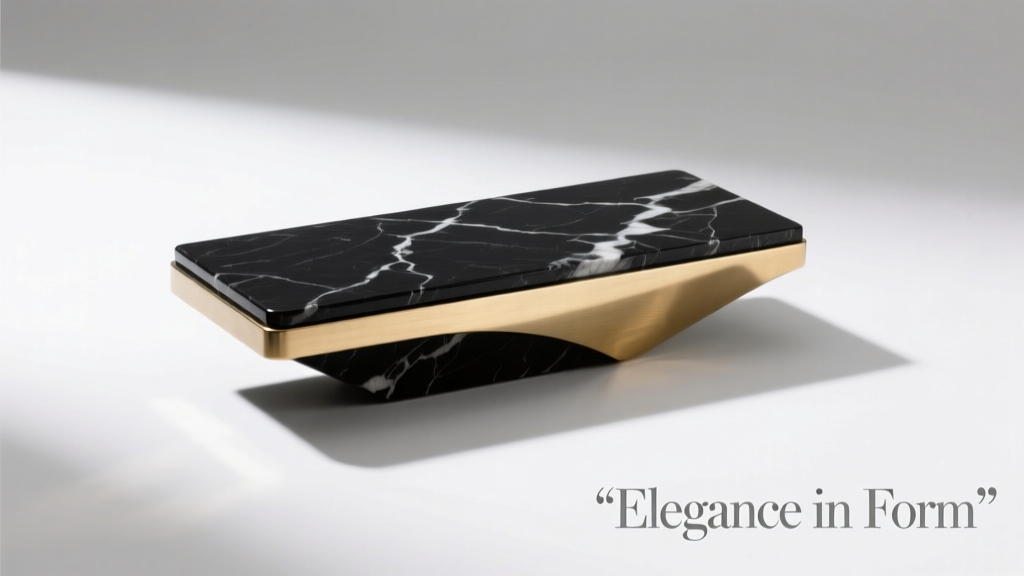
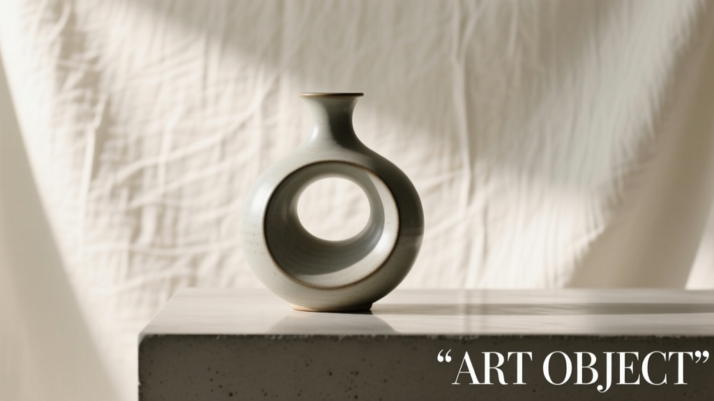
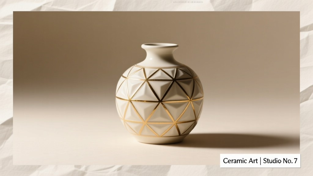
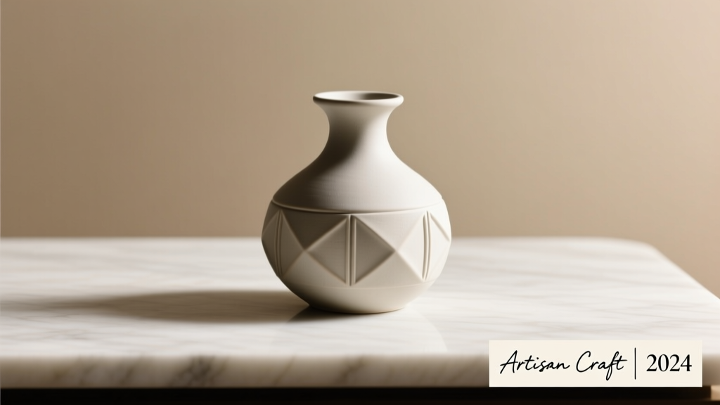
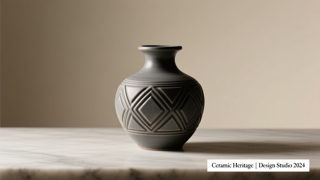
| Materials & Textures | Contrasting tactility: nubby wool rugs, smooth marble side tables, brushed brass hardware, cracked leather ottomans, matte ceramic vases | Uniform textures (e.g., all velvet or all wood); synthetic “faux” materials (breaks authenticity); excessive shine (undermines intimacy) |
| Accents & Details | Curated objects: vintage cocktail shakers, leather-bound books, smoked glass trays, dried botanicals in apothecary jars, monogrammed bar tools | Themed kitsch (e.g., “Prohibition” signs, cartoon flappers); overcrowded shelves; mismatched metals without intention |
Mini Case Study: The Brooklyn Brownstone Transformation
When Maya R., a graphic designer in Brooklyn, inherited her grandparents’ 1912 brownstone, she envisioned a living room that honored its pre-Prohibition origins while serving as her creative studio and social hub. Her initial Pinterest board had 200+ images—mostly glamorous bars and moody hotel lobbies—but felt disjointed. Working with a spatial strategist, she rebuilt her mood board using the 5-phase process above.
Phase 1 revealed her true non-negotiables: “must support my drafting table,” “needs sound-dampening for late-night calls,” and “no open shelving (clutter triggers anxiety).” Phase 2 shifted focus from images to sensation: she collected a sample of her grandfather’s worn leather armchair, a piece of original plaster from the basement, and a vintage phonograph record sleeve. In Phase 3, she culled aggressively—removing all gold-leaf references (too opulent) and replacing them with hand-rubbed brass. Phase 4 testing showed her chosen “Midnight Slate” paint looked muddy under north light, so she switched to “Storm Cloud” with a satin finish for depth.
The final triad anchored everything: (1) a custom walnut-and-brass media console (doubling as a bar cabinet), (2) a low-slung sofa upholstered in charcoal bouclé with deep button-tufting, and (3) a single, oversized wall-mounted sconce with an amber fabric shade. Every subsequent choice—from the acoustic felt panels disguised as art frames to the smoked oak flooring—was measured against those three. Result? A room that feels simultaneously historic and utterly current, where the whisper of jazz blends seamlessly with the hum of her laptop.
Do’s and Don’ts: Building Your Board with Integrity
- Do include at least one physical texture sample (fabric, wood, metal) in your final board—even if digital, scan it at 300dpi with natural light.
- Do annotate every image: “This brass finish has visible tool marks—adds authenticity, not polish.”
- Do note lighting conditions: “Photo taken at 8:30 p.m. with only sconce + candlelight—this is the target ambiance.”
- Don’t use stock photos labeled “luxury living room”—they lack specificity and often feature unrealistic proportions.
- Don’t include more than three font examples—speakeasy typography is minimal: one serif (for book spines), one clean sans (for subtle signage), one handwritten script (for chalkboard menus).
- Don’t ignore acoustics—add a note: “Rug must be 9' x 12' wool pile to absorb 60% of mid-frequency noise.”
FAQ
How many images should my speakeasy mood board contain?
Aim for 12–18 highly curated images—not more. Each must serve a clear purpose: one for wall texture, two for furniture scale, three for lighting layers, etc. Overcrowding dilutes intent. If you can’t articulate why an image belongs, remove it.
Can I use digital tools—or is physical better?
Digital tools (like Milanote or Notion) work well for collaboration and iteration, but always output a physical version before finalizing. Print your board at 24” x 36”, tape it to your wall, and live with it for 72 hours. You’ll spot dissonance (e.g., a “warm” wood tone that reads cold next to your rug sample) no screen reveals.
What if my budget doesn’t allow for all the luxe materials I love?
Focus on where texture and light intersect. A $200 matte black paint job on textured plaster reads richer than $2,000 glossy paint on drywall. Prioritize lighting (recessed LEDs + quality sconces) and one hero textile (e.g., a $400 velvet pillow cover instead of $1,200 sofa fabric). The speakeasy ethos thrives on suggestion—not excess.
Conclusion: Your Board Is the First Sip of the Experience
Your mood board is more than a collection of pretty things. It’s the first act of curation—the moment you choose which stories your space will tell, which emotions it will hold, and which parts of yourself it will invite to linger. A speakeasy living room succeeds not because it looks like a period film set, but because it feels like a promise kept: a vow to slow down, to savor, to gather with intention. Every swatch you select, every light temperature you test, every contradiction you resolve on paper is a quiet rebellion against disposable design. So don��t rush the board. Sit with it. Revise it. Let it evolve as your understanding deepens. When you finally hang that first sconce or lay that first rug, you won’t be installing decor—you’ll be welcoming guests into a world you’ve already lived inside your imagination.
💬 Ready to begin? Start today with Phase 1: Write your narrative and list your three non-negotiables—then share them in the comments. Let’s build something unforgettable, together.