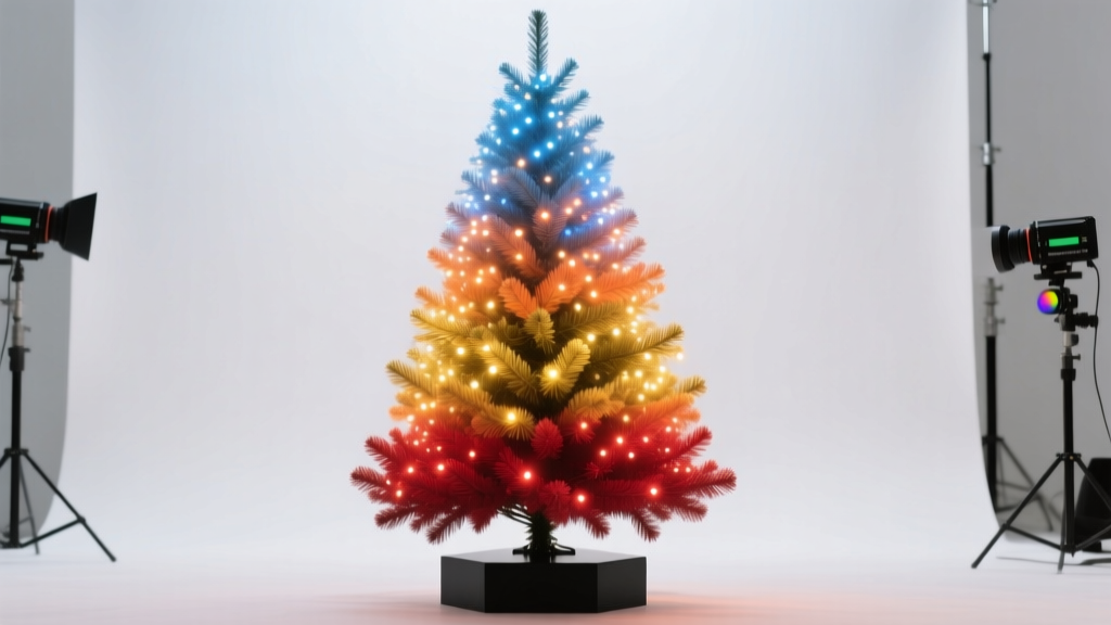
A gradient Christmas tree transforms a seasonal tradition into a curated design moment. Unlike monochrome or random multicolor displays, a thoughtfully executed light gradient evokes depth, rhythm, and intention—reminiscent of twilight skies, frosted pine boughs, or vintage holiday illustrations. Achieving this effect isn’t about buying the most expensive lights; it’s about understanding color theory in three dimensions, respecting the tree’s natural architecture, and applying consistent, repeatable technique. This guide distills over a decade of professional holiday styling experience—including work with interior designers, retail visual merchandisers, and heritage home decorators—into actionable, tested methods. No assumptions, no shortcuts that compromise longevity or safety—just clear, grounded advice you can apply to any real or artificial tree, regardless of height or density.
Understanding Gradient Theory for Vertical Surfaces

On a flat canvas, gradients flow predictably: left to right, top to bottom, or radially. A Christmas tree is neither flat nor uniform—it’s a conical, layered, asymmetrical volume with varying branch density, angles, and light diffusion properties. A successful gradient must account for three spatial realities:
- Vertical progression: Human eyes perceive color differently at eye level versus overhead. Warm tones (reds, golds, ambers) appear richer and more grounded near the base; cool tones (blues, silvers, lavenders) recede visually when placed higher, enhancing the illusion of height and airiness.
- Radial layering: Each branch tier—from inner trunk to outer tips—acts as a distinct “ring” of light. A true gradient requires intentional placement across *all* layers, not just the perimeter.
- Light interaction: Incandescent bulbs emit warmer, softer light with less directional intensity; LED strings vary widely in color temperature (measured in Kelvin), CRI (Color Rendering Index), and beam angle. A 2700K warm white LED behaves very differently from a 6500K cool white—even if both are labeled “white.”
Ignore these variables, and your gradient will flatten, clash, or disappear under ambient room lighting. Respect them, and the result feels organic—not engineered.
Tip: Test your bulbs in the actual room where the tree will stand—after sunset—using a simple cardboard tube (like a paper towel roll) as a viewfinder. This eliminates peripheral distraction and reveals how colors interact in context.Step-by-Step Gradient Installation Process
Follow this sequence precisely. Skipping steps or reversing order leads to rework, tangled wires, and uneven saturation. Allow 90–120 minutes for a standard 7.5-foot tree.
- Prep & Plan (15 min): Measure your tree’s height and approximate branch circumference at three levels—base (12\"), midsection (48\"), and crown (12\"). Sketch a simple vertical diagram with zones labeled A (bottom third), B (middle third), C (top third).
- Select & Sort Bulbs (20 min): Choose bulbs with identical base type (E12 candelabra), voltage (120V), and wattage/LED equivalent. Group by hue *and* brightness—not just name. For example: “Crimson” and “Burgundy” may share similar RGB values but differ in luminance. Use a light meter app (free on iOS/Android) to verify consistency.
- Anchor the Base Layer (25 min): Start at the trunk, working outward. Wrap warm-toned lights (e.g., amber, copper, deep red) tightly around inner branches first—this creates a luminous “core” that glows through outer layers. Use 3–4 strands per tier, staggering connection points to avoid visible gaps.
- Build Mid-Tone Transition (25 min): Introduce intermediate hues (rose gold, soft peach, muted teal) in Zone B. Place these *between* warm and cool layers—not mixed within the same strand. Alternate strands: one row warm-to-mid, next row mid-to-cool. This prevents banding and encourages optical blending.
- Finish the Crown (15 min): Reserve the coolest, most saturated tones (icy blue, violet, silver-white) for Zone C—but place them *only* on outermost tips and uppermost branches. Avoid inner crown wiring; it creates visual “noise” and competes with the star or topper.
This method ensures light builds dimensionally: warmth anchors, midtones bridge, coolness elevates. It also aligns with how the human eye scans vertically—starting low, rising, then settling at the focal point (the topper).
Choosing the Right Bulb Palette: Beyond “Red & Green”
Traditional holiday palettes often default to high-contrast combinations (bright red + lime green), which disrupt gradient continuity. Instead, build gradients using analogous or split-complementary schemes anchored in nature. The table below compares proven palettes by mood, best-use scenario, and bulb compatibility:
| Mood & Use Case | Recommended Hue Sequence (Base → Crown) | Bulb Type Notes |
|---|---|---|
| Heritage Elegance (Victorian homes, antique ornaments) |
Antique Gold → Burnt Sienna → Deep Plum → Silver-White | Use warm-white LEDs (2200–2700K) with matte-finish bulbs. Avoid cool whites—they fracture the vintage warmth. |
| Winter Forest (Modern cabins, minimalist decor) |
Frosted Pine Green → Slate Blue → Icy Teal → Arctic White | Requires high-CRI (≥90) LEDs. Standard “blue” LEDs often render purple; test with a gray card to confirm true cyan bias. |
| Twilight Romance (Urban apartments, romantic lighting) |
Rose Gold → Dusty Mauve → Lavender → Pale Violet | Use dimmable strings only. Non-dimmable violet LEDs often flicker or shift hue at low power—verify compatibility with your dimmer switch. |
| Golden Hour (Families with young children, warm ambiance) |
Amber → Honey Gold → Buttercream → Soft White | Incandescent or warm-dim LED recommended. Avoid “daylight” whites—they introduce clinical harshness inconsistent with the palette. |
Crucially: never mix incandescent and LED strings on the same circuit. Their differing resistances cause uneven current draw, leading to premature burnout or tripped breakers. If mixing bulb types for aesthetic reasons (e.g., vintage-style filament LEDs with traditional LEDs), use separate outlets and timers.
Real-World Application: The Henderson Family Tree
In December 2022, the Hendersons—a family of four in Portland, Oregon—struggled with their 8-foot Fraser fir. Previous attempts at “gradient” lighting resulted in a garish striped effect: red at the bottom, white in the middle, blue on top. The bands were stark, disconnected, and visually exhausting. They consulted stylist Maya Lin, who observed two critical issues: first, they’d wrapped lights only on outer branches, ignoring the trunk’s role as a luminous spine; second, they used three different brands of “cool white” LEDs, each with distinct color temperatures (5000K, 6500K, and 7500K), creating unintentional chromatic vibration.
Lin implemented the step-by-step process above, adding one key refinement: she replaced all white bulbs with a single batch of 4000K LEDs (a neutral midpoint between warm and cool) for the transition zone, then introduced true 2700K amber and 8000K icy blue only at the extremes. She also added 20% more lights to the inner trunk layer than the outer perimeter—creating a soft, radiant core. The result? A tree that appeared deeper, calmer, and more cohesive. Neighbors reported it looked “like something from a magazine”—not because it was expensive, but because every decision served the gradient’s integrity.
“Gradient lighting fails when treated as a paint-by-numbers color swap. It succeeds when understood as *light choreography*: guiding the eye, honoring scale, and letting physics do the blending. The tree isn’t a canvas—it’s a collaborator.” — Maya Lin, Certified Holiday Lighting Designer & Author of *Luminous Interiors*
Common Pitfalls & How to Avoid Them
Even experienced decorators encounter these issues. Recognizing them early saves hours of frustration.
- The Banding Effect: Visible horizontal stripes instead of smooth transitions. Cause: wrapping entire tiers in one color before moving up. Fix: Use the “staggered strand” method—alternate warm/mid/cooled strands *within each tier*, not between tiers.
- Washed-Out Top: Crown appears dim or washed out compared to the base. Cause: Overloading lower sections with lights while skimping on the crown, or using low-lumen bulbs at the top. Fix: Allocate 35% of total lights to the base, 40% to the midsection, and 25% to the crown—even though the crown is smaller in volume, its position demands higher perceived brightness.
- Color Bleed Under Ambient Light: Gradient vanishes when room lights are on. Cause: Using bulbs with poor color saturation or low CRI (<80). Fix: Prioritize CRI 90+ bulbs and dim room lighting during display. A gradient reads best in controlled contrast.
- Heat Buildup in Inner Layers: Incandescent bulbs near the trunk cause needle browning or fire risk. Cause: Ignoring manufacturer spacing guidelines. Fix: For incandescent, maintain ≥3\" between bulb and branch; for LED, ≥1\". Never wrap lights directly around dry wood trunks—use heat-resistant conduit sleeves.
FAQ
Can I create a gradient with battery-operated lights?
Yes—but with limitations. Battery strings typically lack consistent voltage output across their lifespan, causing color shift (especially in warm tones) as batteries deplete. Use lithium batteries (not alkaline) for stable voltage, and replace them every 48 hours during peak display. Limit gradient complexity to two zones (e.g., amber base + cool white crown) rather than three or four.
How many lights do I need for a smooth gradient?
For seamless transitions, use 100 lights per vertical foot *per color zone*. So a 7.5-foot tree needs ≈750 lights minimum—250 for base, 250 for mid, 250 for crown. Skimping below 70 lights per foot per zone guarantees visible gaps and banding. Density enables optical blending.
Will a gradient work on a slim or pencil tree?
Yes—and it often works *better*. Slim trees have less radial depth, so vertical progression dominates perception. Focus on precise vertical zoning and use narrower-beam bulbs (15°–25°) to avoid spilling light sideways and blurring the gradient. Avoid wide-angle bulbs (≥45°), which scatter light across zones.
Conclusion
A gradient Christmas tree is more than decoration—it’s a quiet act of intentionality in a season often defined by haste and excess. It asks you to slow down, observe light and form, and make deliberate choices about how warmth and coolness converse in space. You don’t need rare bulbs, custom wiring, or design degrees. You need clarity about your goal, respect for the tree’s structure, and the willingness to install lights in layers—not lines. Start small: try a two-tone gradient (amber to soft white) on a tabletop tree this year. Notice how the light shifts as you walk around it. Feel the difference between visual noise and visual harmony. Then next year, extend the range. Add depth. Refine the transition. Let the tree teach you about light, patience, and the elegance of restraint.
💬 Your turn: Share your gradient experiment—what palette worked? Where did you stumble? What surprised you? Real stories help others learn faster. Comment below and join a community that celebrates thoughtful holiday making.