Christmas tree color choices are rarely just about personal preference—they’re an environmental decision. The same deep burgundy ornament that glows like embers under warm 2700K sconces can appear dull and muddy beneath cool 4000K recessed LEDs. Your living room’s lighting isn’t a neutral backdrop; it’s an active participant in how every hue on your tree is perceived, experienced, and emotionally received. Ignoring this relationship leads to visual fatigue, unintended dissonance, or a tree that feels disconnected from the space—even when everything else is perfectly styled. This isn’t about rigid rules or seasonal dogma. It’s about understanding how light transforms color in real time, and using that knowledge to create cohesion, calm, or celebration—on purpose.
1. Understand Your Lighting’s Color Temperature—and Why It Matters More Than Bulb Wattage
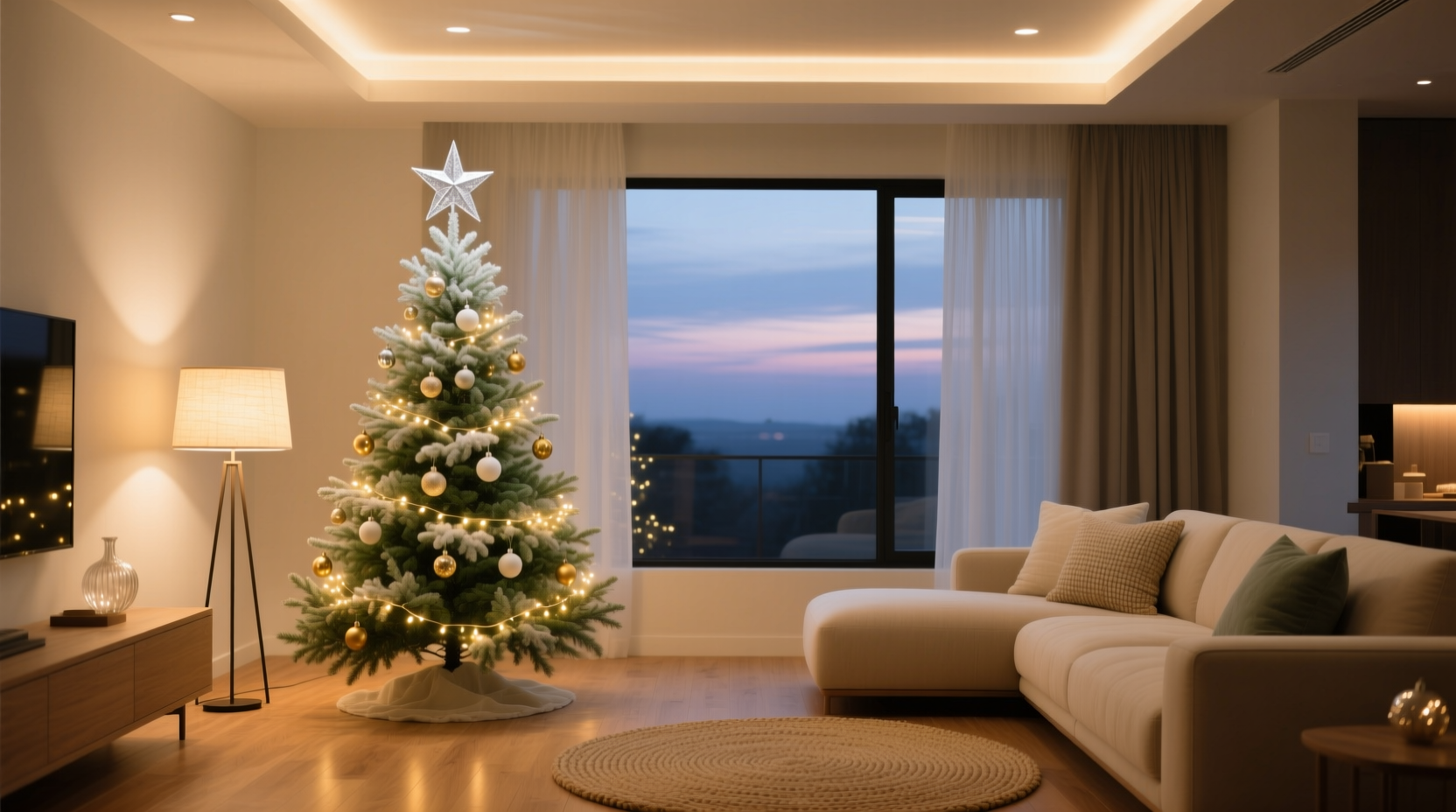
Most homeowners focus on brightness (lumens) or energy efficiency (watts), but for holiday styling, color temperature—measured in Kelvin (K)—is the decisive factor. It describes the visual “warmth” or “coolness” of white light:
- Warm white (2200K–3000K): Mimics candlelight or sunset. Soft, amber-tinged, relaxing. Common in table lamps, vintage-style pendants, and dimmable wall sconces.
- Neutral white (3500K–4100K): Balanced and clean—like midday light through sheer curtains. Often found in modern ceiling fixtures and kitchen task lighting.
- Cool white (4500K–6500K): Crisp, bluish-white, energizing. Typical of many recessed downlights, office-style floor lamps, and older LED panels.
Color temperature directly shifts how pigments reflect. A true red ornament under 2700K light retains its richness and depth; under 5000K light, it may read slightly pinkish or desaturated. Similarly, metallic gold appears luminous and warm under low-K lighting but can look brassy or flat under high-K sources. Before selecting ornaments, ribbons, or even your tree’s base skirt, identify your dominant lighting temperature—not by reading the box, but by observing how skin tones, wood grain, and neutrals render at night.
Tip: Hold a white sheet of paper under each fixture after dark. If it looks creamy or peachy, you’re at ~2700K. If it’s stark white, you’re likely above 4000K. That paper is your most accurate color temperature gauge.2. The Tree as a Light-Reflective Surface: How Needle Tone & Finish Interact With Ambient Light
Your tree itself is not a passive canvas—it’s a textured, three-dimensional light diffuser. Its species, freshness, and finish dramatically influence how ornaments and lights interact with your room’s existing illumination.
| Tree Type | Light Interaction Behavior | Best Lighting Match | Risk Under Mismatched Light |
|---|---|---|---|
| Nordmann Fir (dark green, glossy needles) | Reflects light sharply; enhances metallics and jewel tones | Warm white (2700K–3000K) | Under cool light: harsh glare, loss of depth in greens |
| Balsam Fir (blue-green, matte finish) | Softly diffuses light; ideal for layered, atmospheric effects | Neutral white (3500K–4000K) | Under warm light: muted contrast, reduced ornament sparkle |
| Artificial PVC Tree (matte green, uniform density) | Even light diffusion; highly predictable reflection | All temperatures—but requires intentional bulb selection | Under mismatched bulbs: artificial-looking “halo” effect around ornaments |
| Silver Blue Spruce (steely blue-green, stiff needles) | Strong cool-toned reflection; amplifies icy or monochromatic palettes | Cool white (4500K–5000K) or daylight-balanced LEDs | Under warm light: jarring contrast, “dirty gray” appearance |
Notice: A matte-finish tree absorbs more light, making warm ambient sources feel cozier and reducing glare. A glossy or frosted artificial tree bounces light aggressively—so if your room already has bright, cool overheads, adding reflective ornaments without adjusting those fixtures will overwhelm the space. The goal isn’t to eliminate contrast entirely, but to ensure contrast serves intention—not accident.
3. The 3-Layer Lighting Strategy for Seamless Color Integration
Instead of treating tree lights and room lights as separate systems, integrate them into one cohesive hierarchy. This prevents the “tree-is-a-lamp” effect and anchors the tree visually within the room’s architecture.
- Base Layer (Ambient): Your primary room lighting—ceiling fixtures, floor lamps, wall sconces. Set these first. Dim them to 40–60% brightness during tree viewing hours. Their color temperature sets the tonal foundation.
- Middle Layer (Task/Accent): Directional sources that highlight texture: adjustable track heads aimed at artwork or bookshelves, or uplights behind the sofa. Use bulbs matching your base layer’s Kelvin rating to maintain harmony. Avoid aiming these directly at the tree—they compete with its glow.
- Top Layer (Tree-Specific): Your tree lights. These must complement—not correct—the ambient layer. If your room runs warm, use warm-white mini LEDs (2200K–2700K). If neutral, choose 3000K–3500K. Never mix warm and cool tree lights on the same tree unless intentionally creating a gradient (e.g., warm at bottom, cool at top for “sunrise” effect).
This layered approach means your tree doesn’t shout over the room—it breathes with it. The warmth of your sconces softens the red in velvet bows; the neutrality of your pendant lets mercury glass ornaments shimmer without coldness; the coolness of your kitchen island lights gives silver tinsel a crisp, modern edge.
4. Real-World Coordination: A Case Study from Portland, OR
Maya, a graphic designer and mother of two, renovated her 1930s Craftsman living room with intention: oak floors, sage-green linen sofa, cream plaster walls, and custom brass sconces wired for 2700K LED bulbs. She loved rich, earthy holiday palettes—deep forest greens, burnt sienna, antique gold—but her first attempt at decorating felt “off.” Her Nordmann fir looked strangely flat, and her favorite copper ornaments seemed dull.
She measured her lighting (2700K confirmed) and tested her tree lights: they were 4000K cool white—designed for “brightness,” not ambiance. The mismatch created visual tension: warm walls + cool tree = spatial disconnect. She swapped to 2400K filament-style LEDs, added amber-tinted glass baubles (which absorb cool light and emit warm glow), and replaced her white tree skirt with a handwoven oat-colored wool throw—its subtle texture catching the warm light without competing.
The result? A tree that felt like a natural extension of the room—not an installation. “It wasn’t about changing my colors,” she shared. “It was about letting the light *do the work* I’d been trying to force with pigment alone.”
5. Expert Insight: The Physics Behind Perceived Warmth
Dr. Lena Cho, lighting scientist and author of Chromatic Environments: Light, Perception, and Wellbeing, explains why this coordination matters beyond aesthetics:
“Human circadian rhythm responds not just to light intensity, but to spectral composition. A tree lit with 5000K LEDs in a room otherwise bathed in 2700K light creates conflicting photoreceptor signals—especially in the evening. That discordance registers subconsciously as stress, not festivity. Coordinating color temperature across layers reduces visual noise and supports physiological ease. It’s environmental ergonomics for the holidays.” — Dr. Lena Cho, Lighting Research Lab, University of Oregon
In practice, this means a well-coordinated tree doesn’t just look better—it feels more restorative. Guests linger longer. Evening gatherings feel unhurried. The tree becomes a quiet anchor, not a visual demand.
6. Practical Coordination Checklist
Before stringing a single light or hanging an ornament, run through this actionable checklist:
- ✅ Identify dominant light source: Walk through your living room at 7 p.m. on a weekday. Which fixtures are on? Note their Kelvin rating—or test with the white paper method.
- ✅ Assess your tree’s optical behavior: Is it glossy or matte? Deep green or silvery? Fresh-cut or high-quality artificial? Match its reflective quality to your lighting’s character.
- ✅ Select tree lights by Kelvin—not “warm white” marketing: Look for exact K ratings on packaging. Avoid “vintage warm” labels unless verified (many are actually 3200K+).
- ✅ Test key ornaments under ambient light: Place 3–5 ornaments (metallic, matte, transparent) on a side table next to your main seating area. View them at night with all usual lights on. Do any look washed out, harsh, or unexpectedly dull?
- ✅ Anchor with a unifying neutral: Choose one non-reflective element—skirt, garland base, or ribbon—to match your wall or floor tone. This grounds the palette and absorbs light variance.
7. FAQ: Lighting & Tree Color Questions Answered
What if my living room has mixed lighting temperatures?
Most homes do—and that’s manageable. Prioritize your *dominant* evening lighting (where you sit, where the tree is viewed most). Dim or turn off cool fixtures during holiday hours. Install smart bulbs with schedulable color temps, or use warm-gel filters on cool fixtures temporarily. Consistency within the viewer’s field of vision matters more than whole-house uniformity.
Can I use colored lights on the tree if my room lighting is warm?
Yes—with nuance. Warm ambient light enhances reds, ambers, and deep purples but suppresses true blues and cyans. For best results, choose saturated jewel tones (ruby, sapphire, emerald) rather than pastels. Avoid cool-toned colors like mint or sky blue unless balanced with warm metallics (copper, antique brass) to bridge the temperature gap.
My tree lights are non-dimmable and too bright. What can I do?
Layering is your solution. Keep ambient lights on at low levels (even 10–20%) to provide soft fill and reduce the tree’s visual dominance. Add fabric texture nearby—a chunky knit blanket on the sofa, a linen curtain panel—to diffuse and absorb excess light. You can also install a simple inline dimmer switch on the tree light cord (ensure compatibility with LED loads).
Conclusion
Coordinating Christmas tree colors with your living room lighting mood isn’t decoration—it’s environmental design. It asks you to see your home not as a static stage, but as a dynamic interplay of light, material, and perception. When your tree’s crimson berries glow with the same warmth as your brass sconces, when mercury glass catches the same soft luminescence as your linen sofa, when the whole space feels like a single, considered gesture—you’ve moved beyond seasonal styling into sensory intentionality. That feeling of calm, of belonging, of being truly *at home* in the season—that’s what precise light-color alignment delivers. No extra budget required. No redesign necessary. Just observation, adjustment, and attention to the physics already at play in your space.
💬 Your turn: Try the white paper test tonight. Note your dominant Kelvin. Then share one lighting adjustment you’ll make before hanging your first ornament—we’ll feature thoughtful reader insights in next month’s seasonal lighting roundup.