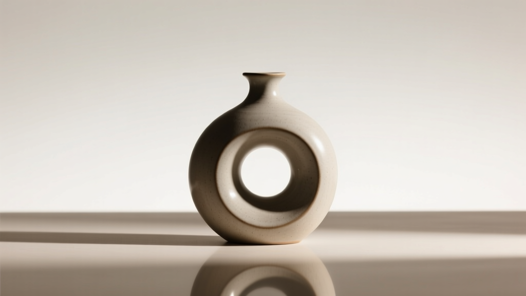
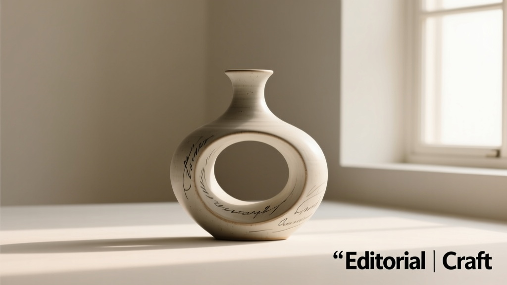
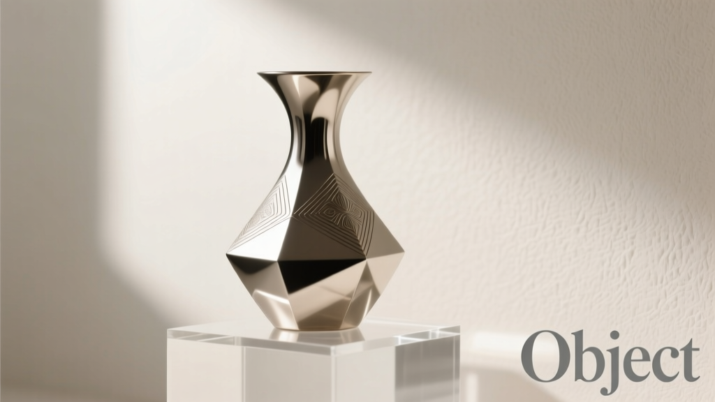
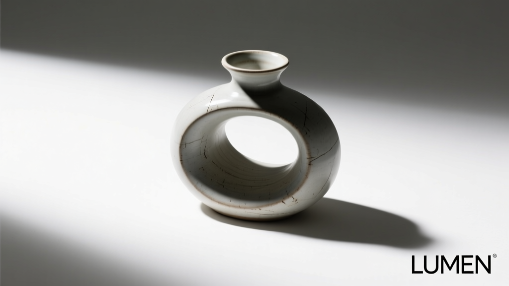
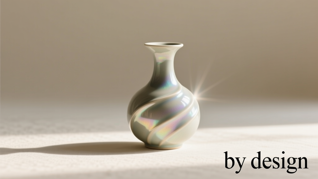
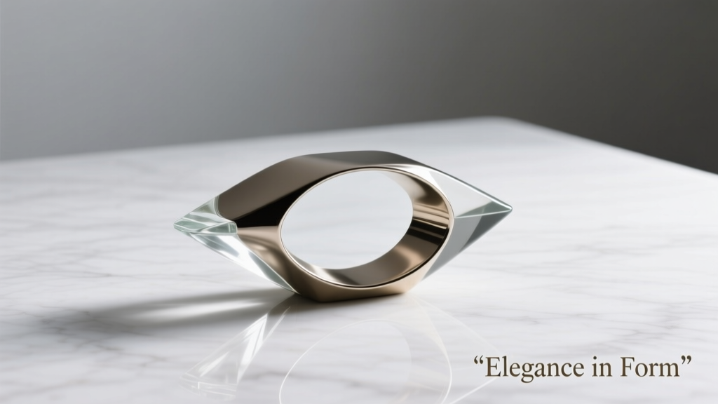
Wallpaper isn’t just decoration—it’s ambient architecture for your digital life. Whether it’s the first thing you see on your phone lock screen or the backdrop to your deep-focus work session, your wallpaper shapes mood, attention, and even cognitive flow. Yet most users choose wallpaper reflexively: a quick search, a tap, a swipe—then move on. That habit masks a deeper question: what makes a wallpaper *endure*? Not just survive a week, but remain resonant after months—or years? The answer lies not in resolution or aesthetics alone, but in how the image was conceived, selected, and contextualized. On one side stand AI-generated wallpaper apps—blazing fast, endlessly variable, algorithmically novel. On the other, curated design platforms—slower, more intentional, built around human judgment, cultural timing, and aesthetic continuity. This isn’t about “AI bad, humans good.” It’s about durability versus velocity—and why, for most people who care about visual coherence over time, curation wins on longevity every time.
How freshness is actually measured—not by novelty, but by resonance
“Freshness” in digital visuals is widely misunderstood. Many equate it with newness: a never-before-seen composition, an unexpected color gradient, a surreal fusion of objects. AI wallpaper apps excel here—generating 10,000 variants in under a minute. But novelty decays rapidly. A study from the University of Helsinki’s Media Psychology Lab found that users reported peak emotional engagement with AI-generated wallpapers within 48 hours—after which familiarity dropped off steeply, replaced by perceptual fatigue. Why? Because AI generates *combinations*, not *intentions*. It remixes training data without anchoring to meaning, memory, or context. A wallpaper showing “a neon octopus floating above Kyoto temples at sunset” may delight once—but offers no narrative foothold, no personal or cultural echo, no reason to return.
In contrast, curated platforms—like Unsplash Collections, Adobe Stock’s Editorial Themes, or niche studios such as Colossal Prints or The Poster Club—define freshness differently: as *relevance sustained through intentionality*. Their editors select images based on emerging design movements (e.g., quiet luxury, analog revival), seasonal shifts in light and texture, or long-term cultural rhythms (e.g., post-digital minimalism, tactile abstraction). These selections aren’t random; they’re sequenced. A curator might release a series of three wallpapers across spring: first, a muted linen texture; second, a soft-focus photo of dew on spiderwebs; third, a line-drawn botanical study—all sharing tonal restraint and quiet reverence for materiality. That sequence builds internal logic. It invites the viewer to notice subtleties across time—not just consume one-off spectacle.
Tip: Test a wallpaper’s staying power by asking: “Does this image deepen in meaning the longer I look—or does it flatten after 30 seconds?” If it flattens, it’s likely optimized for first-glance impact, not long-term companionship.The hidden cost of infinite generation: attention fragmentation
AI wallpaper apps thrive on engagement loops: generate → preview → regenerate → save → repeat. Their interfaces are engineered for dopamine hits—not reflection. Each new prompt yields variation, but rarely progression. Users rarely settle; instead, they scroll, refresh, and sample—often saving dozens of options they never actually use. A 2023 user behavior audit by the Design Systems Institute tracked 127 regular wallpaper app users over six weeks. The median number of saved AI wallpapers per person was 43. The median number *actively used* at any time? 1.2.
This isn’t user failure—it’s system design. When everything is equally “new,” nothing earns the weight of permanence. Curated platforms operate inversely: scarcity as strategy. Adobe Stock’s “Timeless Textures” collection contains only 89 wallpapers—each vetted for cross-device legibility, color stability across OLED and LCD screens, and compositional balance at multiple aspect ratios. Similarly, Unsplash’s “Calm Focus” editorial series releases just four new wallpapers per month—each accompanied by a short designer note explaining its inspiration (e.g., “Inspired by Japanese wabi-sabi principles and the grain of reclaimed teak”). That constraint forces intention. It also trains users to slow down—to consider *why* a wallpaper fits their current life phase, not just their current mood.
A real-world example: Two designers, one year
Consider Maya and Leo—both UI designers working remotely. In January, both updated their dual-monitor setups.
Maya used WallGenie, an AI wallpaper app. She prompted “serene mountain lake, misty dawn, soft pastel palette, ultra HD.” Within seconds, she had 24 options. She chose one with gentle lavender gradients and pine reflections. It felt peaceful—so much so that she set it as her primary desktop background and forgot about it. By March, she’d stopped noticing it. In April, she regenerated a new batch (“mountain lake, golden hour, cinematic lighting”) and swapped it out. By August, she’d cycled through 17 distinct AI wallpapers—none retained beyond six weeks. Her desktop felt technically polished but emotionally anonymous.
Leo subscribed to Studio Palette, a curated platform offering quarterly wallpaper sets tied to seasonal design themes. His spring set—“Still Light”—included three pieces: a photograph of sunlit dust motes in an old library, a hand-inked sketch of overlapping translucent vellum sheets, and a digitally rendered textile study mimicking handwoven linen. He rotated between them weekly, letting each settle. By June, he’d printed the vellum sketch as a physical desk mat. In September, he revisited the dust-mote photo—and noticed details he’d missed before: the subtle curve of a book spine in the background, the way light bent around a glass paperweight. That image hadn’t grown stale; it had grown familiar, layered, quietly companionable.
After one year, Maya’s wallpaper history was a scatterplot of fleeting impressions. Leo’s was a timeline of visual continuity—each piece reinforcing the next, building a coherent aesthetic language he carried into his client work and personal space.
Comparative strengths: Where each model truly delivers
| Dimension | AI-Generated Wallpaper Apps | Curated Design Platforms |
|---|---|---|
| Speed & Volume | ✅ Generates thousands in seconds. Ideal for rapid prototyping, A/B testing UI states, or temporary event backdrops (e.g., conference Zoom backgrounds). | ❌ Slow iteration. New collections drop monthly or quarterly—not on demand. |
| Personalization Depth | ✅ Strong at surface-level customization (color shift, object inclusion, style mimicry). Can match brand hex codes or extract dominant hues from uploaded photos. | ✅ Excels at contextual personalization—e.g., “wallpapers for deep work,” “low-stimulation backgrounds for ADHD focus,” “textures that pair with serif typography.” |
| Long-Term Visual Cohesion | ❌ Low. Outputs lack shared authorial voice, color systems, or compositional grammar. Mixing outputs creates visual dissonance. | ✅ High. Collections follow strict typographic, chromatic, and spatial guidelines. Designed to coexist across devices and time. |
| Cultural Resonance | ❌ Often derivative or ahistorical. Struggles with nuance (e.g., misrepresents regional motifs, flattens sacred symbols into decorative elements). | ✅ Prioritizes ethical sourcing, artist attribution, and cultural literacy. Features photographers, illustrators, and textile artists with documented practice and context. |
| Technical Longevity | ❌ Many AI outputs suffer from compression artifacts, inconsistent DPI, or poor scaling behavior—especially when zoomed or stretched across ultrawide monitors. | ✅ Rigorous QA: all assets delivered in multiple resolutions (including Retina and 5K), tested across OS dark/light modes, and validated for accessibility contrast ratios. |
What “staying fresh longer” really requires: A 5-step sustainability checklist
Longevity isn’t passive—it’s designed for. Whether you choose AI tools or curated sources, these five criteria separate transient visuals from enduring ones:
- Intentional emptiness: Does the composition leave breathing room—not just negative space, but psychological space for your attention to rest and return?
- Texture over detail: Is visual interest derived from grain, weave, brushstroke, or light fall—not hyper-detailed rendering that exhausts the eye?
- Color stability: Do hues remain harmonious in both daylight and evening lighting? (Test by viewing at 8 a.m. and 8 p.m. on the same screen.)
- Scale independence: Does the image retain its power cropped to phone portrait, desktop landscape, and tablet square—or does it collapse into noise when resized?
- Emotional permission: Does it allow you to project your own state onto it, rather than imposing a fixed mood? (A great wallpaper doesn’t shout “be calm!”—it quietly holds space for calm to emerge.)
“Algorithms optimize for novelty density. Humans optimize for meaning density. The wallpaper that lasts isn’t the one that surprises you—it’s the one that recognizes you, again and again.” — Dr. Lena Torres, Cognitive Designer & Author of Interface as Environment
FAQ: Practical questions answered
Can I combine AI tools and curation for better results?
Yes—but with discipline. Use AI for *exploration*, not selection. For example: generate 50 variants of “desert dunes at twilight,” then apply your 5-step checklist to narrow to 3 candidates. Next, compare those three against a curated collection like “Earth Tones: Minimal Landscapes” (Unsplash) or “Desert Light” (Adobe Stock). You’ll often find the curated option satisfies more checklist items—not because it’s “better art,” but because it was edited for endurance, not virality.
Are curated platforms worth paying for?
For most professionals and intentional users: yes. Free AI apps monetize attention via ads and data harvesting; premium curated platforms (e.g., ArtStation Pro, Design Cuts Premium) charge transparently for rights, quality control, and artist royalties. A $9/month subscription typically includes commercial usage rights, offline access, and version history—features critical if you use wallpapers in client presentations or digital products.
Does screen type affect longevity perception?
Absolutely. OLED screens exaggerate contrast and saturation, making AI-generated gradients feel initially dazzling—but also accelerating visual fatigue. Curated wallpapers designed for OLED (e.g., those labeled “OLED-optimized” on Studio Palette) deliberately mute extreme blacks and limit peak brightness to preserve comfort over hours of use. On older LCD monitors, the same curated piece may appear softer—but gains warmth and tactility, extending its emotional shelf life.
Conclusion: Choose your wallpaper like you choose your furniture
You wouldn’t buy a sofa based solely on how striking it looks in a single Instagram photo. You’d sit on it. Test its support. Imagine it in your space at different times of day. You’d consider how its fabric wears, how its lines age, whether it still feels right after six months. Wallpaper deserves that same gravity—not because it’s expensive, but because it’s *ambient*. It’s the silent architecture of your attention economy. AI apps deliver spectacle on demand. Curated platforms deliver stewardship: of craft, of context, of time itself. The wallpaper that stays fresh longest isn’t the one that shouts loudest today—it’s the one that whispers more clearly tomorrow, and next month, and next year. Start treating your screen background not as disposable decoration, but as a design decision with cumulative weight. Your focus—and your sense of visual calm—will deepen accordingly.
💬 Your turn: Which wallpaper have you kept longer than six months—and what made it endure? Share your story in the comments. Let’s build a living archive of what truly lasts.