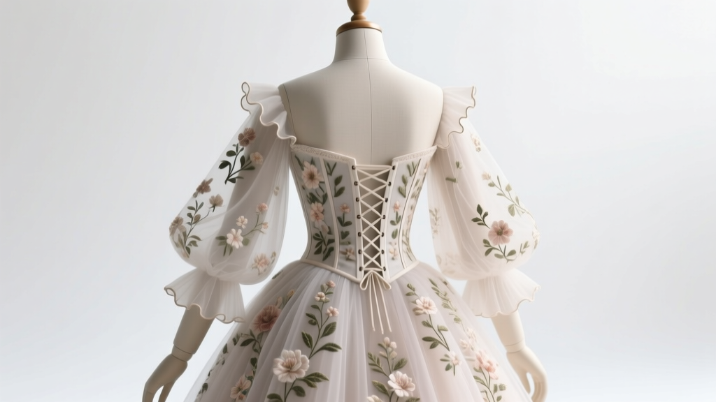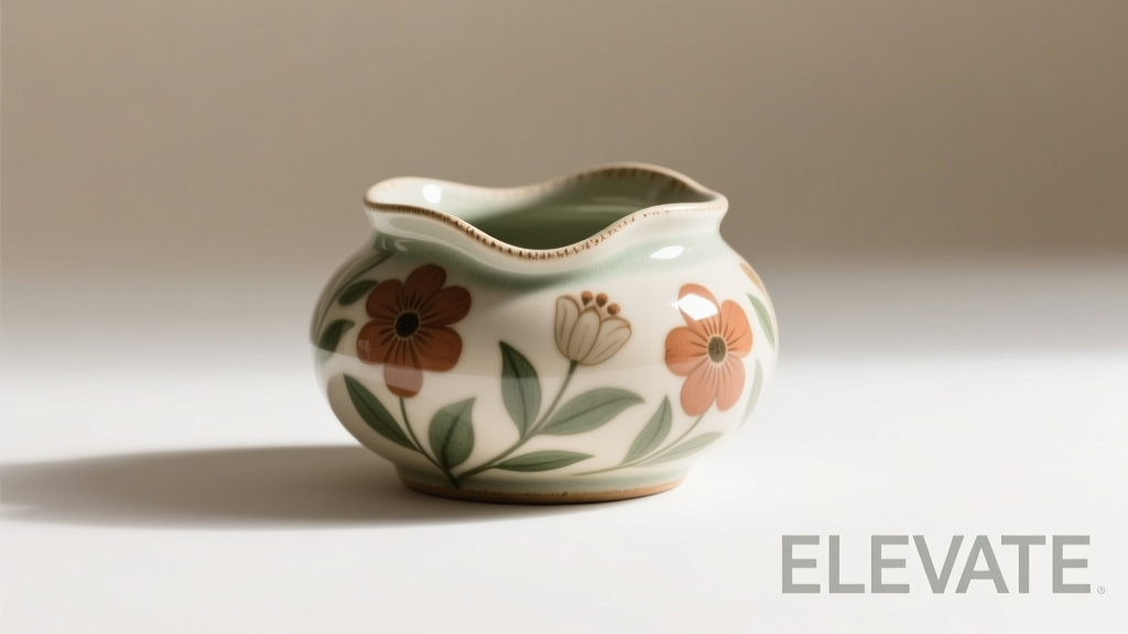
Beige floral design occupies a rare intersection of warmth and restraint—a palette that breathes quiet sophistication into living rooms, bedrooms, offices, and even entryways. Yet its subtlety is precisely what makes it deceptively complex. Unlike bold prints or saturated hues, beige florals rely on nuance: the whisper of oatmeal linen against ivory chintz, the variation in petal translucency, the balance between botanical realism and stylized abstraction. A poorly chosen set up can recede into visual silence—or worse, read as dated, washed-out, or unintentionally clinical. The right one, however, anchors a room with organic elegance, softens architectural lines, and ages gracefully over time. This isn’t about matching wallpaper to curtains; it’s about curating a cohesive sensory experience grounded in material intelligence, spatial awareness, and enduring taste.
1. Understand What “Beige Floral” Really Means—Beyond the Label
“Beige floral” is not a monolithic category. It’s a spectrum defined by three interlocking variables: base tone, floral rendering, and ground texture. Base tone ranges from cool greige (with gray undertones) to warm sand (with yellow or peach hints) to near-ivory (with faint cream or vanilla notes). Misidentifying your space’s dominant light temperature—north-facing coolness versus south-facing warmth—can make even a technically “beige” set up feel jarringly off. Equally critical is how the floral motif is executed: hand-painted watercolor blooms suggest intimacy and artistry; tightly repeated digital prints lean modern and graphic; embroidered or appliquéd florals add dimensional tactility. Finally, the ground—the background fabric or surface—must be evaluated for weave density and reflectivity. A slubbed linen ground diffuses light softly; a satin-weave cotton reflects it sharply, potentially amplifying beige’s tendency toward flatness.
Tip: Hold fabric swatches under your room’s actual daylight *and* evening lighting—not showroom fluorescents—to assess true undertone behavior. Cool light exaggerates gray; warm light deepens yellow.2. Assess Your Space’s Architectural & Environmental Context
A beige floral set up doesn’t exist in isolation. Its success hinges on dialogue with walls, flooring, ceiling height, window placement, and existing furniture silhouettes. In a low-ceilinged room with dark wood floors, a high-contrast beige floral—say, taupe blossoms on parchment—adds necessary visual lift. In a sun-drenched, minimalist loft with white oak floors and floor-to-ceiling glass, a softer, tonal approach—mushroom stems on oatmeal ground—preserves airiness without disappearing. Consider traffic flow: heavy-use areas demand tightly woven, stain-resistant grounds (like performance polyester blends), while a serene reading nook invites delicate, natural-fiber pieces like undyed cotton voile with botanical embroidery.
Acoustics matter too. Textured beige florals—especially those with raised stitching, bouclé weaves, or layered jacquards—absorb sound more effectively than smooth, printed surfaces. In open-plan homes where conversation clarity is essential, this subtle property enhances comfort beyond aesthetics.
3. Evaluate Floral Scale, Density, and Botanical Integrity
Scale is the most common point of failure. A large-scale floral (blossoms spanning 8–12 inches) overwhelms a compact sofa or narrow hallway but commands presence on a wide sectional or expansive headboard. Conversely, micro-florals (petals under 1 inch) risk looking busy or cheap in large-format applications like drapery or area rugs. Mid-scale—where individual blooms measure 2–4 inches—is the safest starting point for most residential spaces.
Density refers to how much of the ground is covered by floral elements. High-density patterns (70%+ coverage) create richness but reduce breathing room; low-density (20–35%) feels airy and contemporary but may lack visual weight. The sweet spot for balance lies between 45–60% coverage—enough to read clearly at conversational distance, yet open enough to let the ground texture shine through.
Botanical integrity—the accuracy and intentionality of the floral depiction—signals quality. Authentic references (e.g., identifiable English roses, Japanese anemones, or native prairie grasses) suggest thoughtful curation. Generic, unplaceable blossoms often indicate mass-market sourcing. Look for variation in petal shape, stem thickness, and leaf orientation—even within a repeat. Uniformity signals digital repetition; subtle irregularity suggests artisanal input or high-fidelity scanning.
| Floral Characteristic | Ideal for Intimate Spaces (e.g., Bedroom) | Ideal for Public/High-Traffic Areas (e.g., Living Room) |
|---|---|---|
| Scale | Small to mid-scale (1.5–3\") | Mid to large-scale (3–8\") |
| Density | Low to medium (25–45%) | Medium to high (45–70%) |
| Ground Texture | Natural, tactile (linen, wool, raw silk) | Performance-enhanced (stain-resistant cotton-poly, solution-dyed acrylic) |
| Botanical Style | Watercolor, sketch-like, painterly | Crisp, defined outlines; subtle embossing or texture |
4. Real-World Application: The Portland Apartment Transformation
In a 1920s brick apartment in Portland’s Alberta Arts District, interior designer Lena Ruiz faced a challenge: a north-facing living room with original fir floors, 8-foot ceilings, and abundant built-in shelving. The client loved “soft, garden-inspired calm” but recoiled at anything resembling “grandmother’s parlor.” Initial beige floral samples—mostly mass-produced chintzes with high-gloss finishes—looked cold and disconnected against the warm wood grain.
Ruiz pivoted. She sourced a custom-printed linen-cotton blend with a mid-scale, low-density pattern: pale wheat-colored peonies and fern fronds on a dry-washed oatmeal ground. Crucially, the print was intentionally *matte*, with slight variances in ink saturation mimicking hand-block printing. She paired it with solid upholstery in a slightly deeper, greige-toned wool—creating tonal depth without contrast. Drapery used the same fabric but unlined, allowing diffused light to subtly highlight the floral’s texture. The result? A space that felt both grounded and luminous, where the floral motif emerged gently only upon closer inspection—never competing with the architecture, always supporting it.
“Beige florals succeed when they act as a bridge—not a statement. They should harmonize with light, respect the rhythm of the room’s proportions, and age with dignity. If it looks ‘perfect’ in the catalog but feels anonymous in your home, it’s not the right choice.” — Lena Ruiz, Principal Designer, Hearth Studio
5. Step-by-Step Selection Protocol
Follow this sequence—not as rigid rules, but as a calibrated decision framework:
- Document your space’s non-negotiables: Measure windows, note primary light sources (direction + intensity), photograph existing fixed elements (flooring, trim, built-ins), and identify your dominant furniture silhouette (e.g., “low-slung modern,” “curved traditional,” “angular industrial”).
- Define functional thresholds: Will this set up endure spills (kids/pets)? Require frequent cleaning? Support daily napping? This dictates fiber content and finish before aesthetics enter the equation.
- Isolate your beige family: Using a physical swatch book (not screen images), compare 3–5 beige tones under your room’s actual light. Circle the one that feels most *alive*—not the lightest or most neutral, but the one that seems to vibrate quietly with the space.
- Test scale physically: Print a 12\"x12\" section of your top 2 floral options. Tape them to your wall at eye level. Live with them for 48 hours. Note which one feels integrated versus imposed.
- Verify botanical resonance: Ask: Does this flower feel native to my climate, culture, or personal memory? A coastal resident might connect deeply with sea lavender motifs; someone from the Midwest may resonate with coneflower or black-eyed Susan. Emotional authenticity trumps trend alignment.
6. Common Pitfalls & How to Avoid Them
- Mistaking “light” for “beige”: True beige contains warmth or gray complexity. Pure light gray or stark off-white lacks the organic depth needed for floral harmony. Always compare against a known beige standard (e.g., Benjamin Moore “Manchester Tan” or Farrow & Ball “String”)
- Ignoring vertical rhythm: Floral sets often fail when patterns don’t align across planes—e.g., a curtain panel’s bloom lands mid-stem at the floor, while the sofa cushion’s identical bloom cuts off at the petal edge. Insist on consistent vertical repeats across all elements in a set.
- Overlooking laundering realities: Many beige florals use reactive dyes on natural fibers. These can bleed or fade with harsh detergents or hot water. Check care labels rigorously—even if you plan professional cleaning, pre-treatment compatibility matters.
- Forgetting the “air gap”: Beige florals need visual breathing room. Pair them with solid textures (nubby wool, hammered metal, honed stone) rather than competing patterns. One floral element per zone is optimal.
7. FAQ
Can beige floral work in a modern, minimalist space?
Absolutely—if approached with precision. Choose a single, strong botanical (e.g., sculptural magnolia or monoline arum lily), rendered in high-contrast tonal beige (charcoal stems on bone ground), on a tightly woven, matte-performance fabric. Avoid busyness, sentimentality, or visible seams. Let the floral serve as intentional punctuation—not ambient filler.
How do I prevent beige floral from looking dull or lifeless?
Introduce deliberate contrast through texture and scale: pair a fine-scale floral pillow with a chunky, undyed wool throw; layer a beige floral rug beneath a glossy black coffee table. Add one unexpected accent in a closely related hue—dusty rose, olive green, or iron oxide—that appears *within* the floral’s own palette. This creates internal vitality without breaking cohesion.
Is vintage beige floral inherently better than new?
Not inherently—but vintage pieces often possess qualities hard to replicate: hand-screened inks with subtle imperfections, natural fiber degradation that softens contrast, and botanical motifs rooted in specific horticultural eras (e.g., Victorian fern mania, 1950s cottage garden revival). When buying new, seek brands that emulate these qualities intentionally—not as nostalgia, but as craft values.
Conclusion
Choosing the best beige floral set up is an act of quiet confidence. It rejects the tyranny of trend in favor of enduring resonance—between color and light, pattern and proportion, nature and nurture. It asks you to slow down: to study how morning sun catches the edge of a petal, to feel the weight of linen versus cotton, to listen to how a room breathes when a floral motif lands just right. There is no universal “best.” There is only the set up that honors your space’s truth—the one that feels inevitable, not imposed; restful, not empty; alive, not merely decorative. Your home isn’t a showroom. It’s a living archive of your sensibilities. Let your beige floral be the gentle, intelligent thread that weaves them together.
💬 Your space tells a story—what floral chapter will you write next? Share your biggest beige floral challenge or triumph in the comments. We read every one—and your insight might help someone else find their perfect bloom.