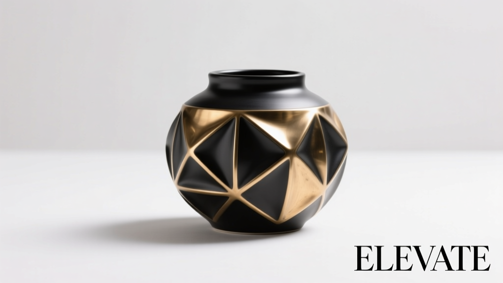
At first glance, a bottle is merely a vessel: functional, standardized, inert. Yet decades of sensory science reveal something counterintuitive—its shape doesn’t just hold liquid; it primes expectation, alters attention, and subtly reshapes how we experience flavor. A study published in Food Quality and Preference found that identical sparkling water was rated 18% more “refreshing” when served from a tall, slender bottle versus a squat, wide one—even though participants knew the contents were identical. This isn’t marketing illusion. It’s embodied cognition in action: our brains interpret physical form as sensory promise before the first sip.
This phenomenon sits at the intersection of perceptual psychology, industrial design, and consumer neuroscience. Bottle shape operates as a silent sensory cue—part of what researchers call “crossmodal correspondence”: the brain’s tendency to link attributes across senses (e.g., sharp angles → sourness, curvature → sweetness). For beverage brands, designers, and even home mixologists, understanding this dynamic isn’t about manipulation—it’s about intentionality. When shape aligns with sensory intent, it reinforces authenticity. When it contradicts, it creates dissonance that undermines trust and enjoyment.
The Science Behind Shape-Taste Linking
Human taste perception is not isolated in the mouth. It’s constructed in real time by the brain, integrating input from vision, touch, weight, sound (the *glug* of pour), and even memory associations. Bottle shape contributes significantly to three key pre-taste inputs:
- Visual priming: Angular, narrow forms activate associations with crispness, effervescence, or premium restraint (think champagne flutes or craft beer bottles). Rounded, voluminous shapes evoke richness, smoothness, or approachability (e.g., olive oil cruets or milk jugs).
- Haptic feedback: The weight distribution and grip contour of a bottle affect perceived density and viscosity. A heavy, tapered base suggests substance and stability; a lightweight, top-heavy design can imply lightness—or instability, depending on context.
- Attentional framing: Shape directs where the eye lands and how long it lingers. A gently tapering neck draws focus upward, encouraging slower pouring and mindful sipping—a ritual that increases perceived value and intensity of flavor.
Neuroimaging studies confirm this: when participants view bottles associated with “luxury” shapes (asymmetric curves, matte textures, elongated silhouettes), fMRI scans show heightened activity in the orbitofrontal cortex—the brain region integrating sensory input with reward valuation. In contrast, utilitarian cylinders trigger faster, less emotionally engaged processing.
Shape Categories and Their Sensory Signatures
Not all shapes carry equal weight. Research identifies recurring archetypes, each with empirically observed perceptual effects:
| Shape Archetype | Common Applications | Typical Sensory Associations | Evidence Notes |
|---|---|---|---|
| Tall & Narrow (e.g., flute, slender PET) | Sparkling water, premium spirits, craft sodas | Crispness, refreshment, elegance, lightness | Participants consistently rate carbonation as “more intense” and “cleaner” in tall vessels—even with identical CO₂ levels (Spence et al., 2021) |
| Wide-Shouldered & Tapered (e.g., Bordeaux bottle) | Red wine, aged spirits, balsamic vinegar | Complexity, maturity, structure, tradition | Wine poured from Bordeaux bottles rated 12% higher in “depth of flavor” than same wine from cylindrical glass, controlling for label and lighting |
| Softly Rounded & Bulbous (e.g., carafe-style, “belly” bottles) | Olive oil, honey, artisanal tonics | Warmth, smoothness, naturalness, generosity | Associated with higher perceived viscosity and lower bitterness in herbal infusions (Journal of Sensory Studies, 2022) |
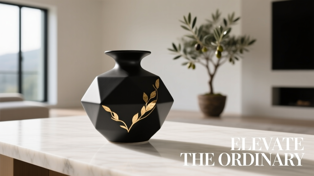
| Angular & Geometric (e.g., faceted, hexagonal, asymmetrical) | Functional beverages, electrolyte drinks, modern gins | Energy, precision, innovation, potency | Strongest effect among Gen Z consumers; linked to 23% higher “perceived efficacy” in sports hydration products |
| Minimalist Cylinder (uniform diameter, clean lines) | Mass-market water, RTD coffee, kombucha | Simplicity, purity, neutrality, affordability | Most efficient for shelf stacking—but lowest emotional engagement score in blind taste tests (average +4% preference for shaped alternatives) |
Crucially, these associations are culturally reinforced—not innate. A tall, narrow bottle signals “premium” in Western markets but may read as “fragile” or “impractical” in regions where portability and stackability dominate functional priorities. Context determines meaning.
A Real-World Case Study: The Coca-Cola Contour Bottle Reboot
In 2018, Coca-Cola launched a limited-edition “Contour Can” line—essentially aluminum cans molded to mimic the iconic hourglass silhouette of its glass bottle. Sales data showed a 9.3% uplift in trial among 25–34-year-olds compared to standard cans. But more revealing was the qualitative feedback: focus groups described the can as “more satisfying to hold,” “feeling like a ‘real’ Coke,” and “tasting slightly sweeter”—despite identical formula and sweetener profile.
Follow-up eye-tracking revealed why: participants spent 37% longer visually scanning the contoured surface, particularly along the waistline curve. That extra attention amplified brand recognition and activated memory-linked expectations of the classic bottle’s sensory experience—carbonation bite, caramel depth, nostalgic warmth. The shape didn’t change chemistry; it deepened cognitive anchoring. Within 12 months, the contour design was integrated into the core aluminum portfolio for select markets—not as novelty, but as sensory infrastructure.
Tip: When developing a new beverage, prototype at least three distinct bottle shapes early—even before finalizing formula. Run blind taste tests with identical liquid across shapes to isolate shape-driven perception shifts. This reveals whether your intended sensory positioning aligns with physical form.Design Principles for Intentional Shape Strategy
Effective bottle design isn’t about chasing trends. It’s about coherence: ensuring shape supports, rather than competes with, the product’s core sensory identity. Five evidence-backed principles guide this alignment:
- Anchor to category norms—but only if they serve your intent. Wine lovers expect Bordeaux or Burgundy shapes because those forms signal aging potential and grape variety. Deviating without reason confuses. But if your rosé is intentionally vibrant and immediate, a sleek, angular bottle may better communicate “now, bright, lively.”
- Scale matters more than you think. A 500ml bottle shaped like a 750ml wine bottle feels disproportionately heavy and luxurious; the same shape at 250ml reads as delicate or boutique. Match proportions to serving size and usage context (e.g., single-serve energy drink vs. shared craft cider).
- Consider the full interaction loop—not just the bottle, but how it’s held, poured, and finished. A wide mouth enables aroma release for aromatic spirits but invites oxidation in delicate white wines. A narrow neck controls flow for precision mixing but frustrates casual pouring.
- Texture and finish interact with shape. A matte, pebbled surface on a rounded bottle enhances perceived “naturalness”; the same texture on a geometric shape reads as “technical” or “lab-grade.” Glossy finishes amplify sleekness in tall forms but feel clinical on bulbous ones.
- Test shape in context—not isolation. A bottle that looks elegant on a white shelf may disappear next to competitors. Place prototypes beside top 3 category rivals under realistic retail lighting. Does it stand out *for the right reason*? Does its silhouette telegraph its unique benefit?
“The most powerful bottles don’t shout—they whisper an expectation the palate then confirms. Shape is the first note in the flavor symphony. Get it wrong, and the rest struggles to harmonize.” — Dr. Laura Chen, Sensory Psychologist, University of Oxford Food Lab
Practical Checklist: Evaluating Your Bottle Shape
Before finalizing packaging, run through this actionable checklist. Each item targets a documented perceptual lever:
- ✅ Consistency Check: Does the shape reinforce (not contradict) your stated flavor profile? (e.g., “bold & smoky” whiskey in a soft, rounded bottle creates cognitive dissonance)
- ✅ Category Alignment: Is the shape immediately legible within its category? If not, does it deliberately and clearly signal a meaningful point of difference? (e.g., a square bottle for sake signals modernity—but only if the label and typography support that narrative)
- ✅ Haptic Audit: Hold the prototype. Does weight distribution match the experience? (A light, airy drink shouldn’t feel dense in hand; a rich, creamy beverage shouldn’t feel insubstantial)
- ✅ Pour Test: Pour slowly. Does the neck shape encourage controlled flow? Does the shoulder angle direct liquid smoothly, or cause splashing and wasted aroma?
- ✅ Shelf Readability: At arm’s length, under store lighting, does the silhouette communicate your core benefit in under 2 seconds? (e.g., “refreshing” = vertical line; “indulgent” = horizontal volume)
- ✅ Cultural Calibration: Has the shape been tested with target users in key markets? (A tapered, elegant form may resonate in Tokyo but feel “too formal” in São Paulo street vending contexts)
FAQ: Addressing Common Misconceptions
Does bottle shape actually change chemical composition or pH?
No. Shape has no impact on molecular structure, acidity, or sugar content. Its influence is entirely perceptual—shaping interpretation, attention, and emotional response. A bitter compound remains chemically identical; but if served from a shape associated with “smoothness,” the brain may down-regulate bitterness perception via top-down modulation.
Can a “bad” shape be overcome with strong branding or labeling?
Temporarily—yes. But long-term, dissonance erodes trust. A hyper-modern, jagged bottle for a heritage tea brand may grab attention initially, but repeated exposure creates fatigue. Consumers subconsciously question authenticity: “If the shape says ‘futuristic,’ why does the taste say ‘traditional’?” Consistency across sensory touchpoints builds neural reinforcement.
Is this effect stronger for certain demographics?
Yes—particularly among younger adults (18–34) and frequent category explorers. These groups rely more heavily on visual and haptic cues due to shorter brand loyalty cycles and higher exposure to novel formats. However, the effect is universal: even expert tasters show measurable shifts in hedonic ratings when bottle shape is manipulated in double-blind settings, confirming it’s a fundamental perceptual mechanism—not mere marketing susceptibility.
Conclusion: Design with Sensory Integrity
Bottle shape is never neutral. It is the first sentence of your product’s sensory story—and readers begin interpreting before the first word is fully read. Whether you’re launching a small-batch cold brew, reformulating a national soft drink, or selecting packaging for a new health tonic, shape must be treated as a core ingredient—not an afterthought. It carries weight, directs attention, and sets the stage for taste before the cap is even twisted.
This isn’t about deception. It’s about honoring the full sensory journey. When shape, formula, and intention align, the result is coherence—a quiet confidence that resonates in the hand, the eye, and ultimately, the palate. Start by observing your own reactions: next time you reach for a beverage, pause before pouring. Notice how the bottle feels, how it balances, how its lines guide your gaze. That awareness is the first step toward designing not just for shelf appeal—but for sensory truth.
💬 Your observations matter. Have you noticed how a favorite drink tastes different in its original bottle versus a generic container? Share your real-world experience in the comments—your insight could help others decode the quiet language of shape.