At first glance, the choice between gold and silver buttons on a cardigan might seem trivial—after all, it's just a fastener, right? But in fashion, details matter. The metal tone of buttons can influence how an outfit reads, how polished it appears, and even how well it integrates with the rest of your wardrobe. While most people won’t consciously point out the hardware on your sweater, that doesn’t mean they don’t register its effect subconsciously. The truth is, the right or wrong button finish can elevate or undermine an ensemble.
This isn't about obsession over minutiae; it's about intentionality. Just as a watch, belt buckle, or eyeglass frame contributes to your overall aesthetic, so too do the buttons on your knitwear. Whether you're building a capsule wardrobe, selecting investment pieces, or simply wondering if these small choices have real-world impact, understanding the role of button finishes is worth your attention.
The Psychology of Metal Tones in Fashion
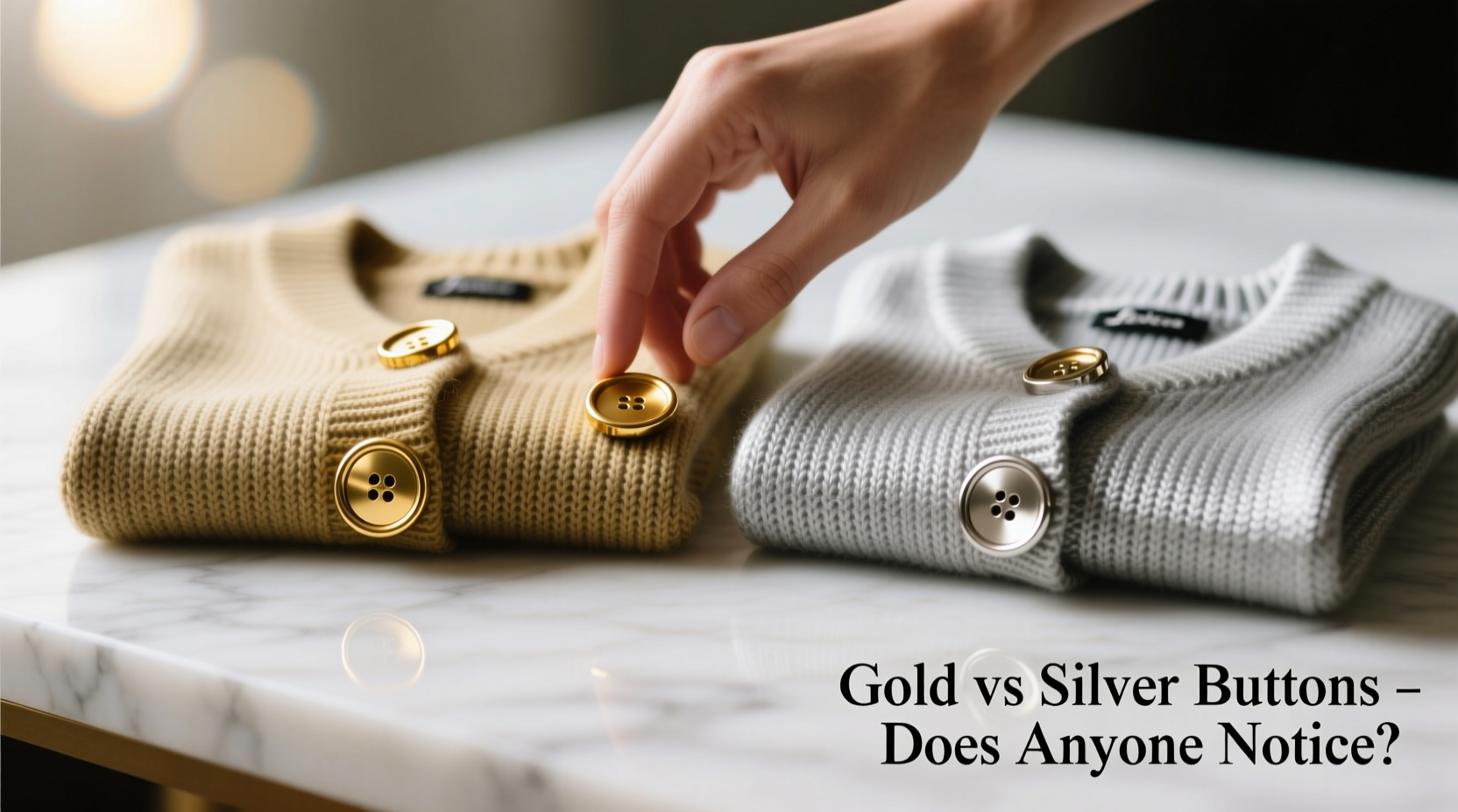
Color psychology extends beyond fabrics and dyes—it applies to metallic accents as well. Gold and silver carry distinct emotional and stylistic connotations:
- Gold evokes warmth, richness, and tradition. It pairs naturally with earth tones, warm neutrals like camel or cream, and deep burgundies or olives. Gold-buttoned cardigans often feel more classic, luxurious, or vintage-inspired.
- Silver reads as cooler, sleeker, and more modern. It complements cool grays, navy, black, and crisp whites. Silver buttons lend a minimalist or contemporary edge, making them popular in tailored or urban styles.
These associations aren’t arbitrary. A 2019 study published in the *Journal of Fashion Marketing and Consumer Behavior* found that accessories with warm-toned metals were perceived as more approachable and traditional, while cool-toned metals were rated higher for sophistication and modernity. Though the research focused on jewelry, the principles apply equally to garment hardware.
“Metallic consistency across accessories and clothing elements creates visual harmony. Even if unnoticed directly, mismatched tones disrupt cohesion.” — Lena Park, Stylist & Image Consultant
When People Actually Do Notice
Most wearers assume no one pays attention to button color. And in casual settings, they’re mostly correct—few will stop mid-conversation to critique your sweater’s placket. But there are specific situations where the difference becomes apparent:
Tip: When layering, match your button metal tone to at least one other visible accessory (watch, glasses, zipper) to create intentional cohesion.1. Professional Environments
In corporate or formal settings, subtle polish matters. A charcoal gray cardigan with silver buttons worn over a white shirt with a silver watch projects a unified, put-together image. Swap in gold buttons without adjusting other accessories, and the look may feel slightly disjointed—even if colleagues can’t pinpoint why.
2. Styled Photography or Media Appearances
Photographers and stylists obsess over tonal continuity. In editorial shoots or brand campaigns, gold buttons are deliberately paired with gold jewelry or warm lighting, while silver is matched to cool palettes. The camera captures inconsistencies the naked eye might miss.
3. Close Social Interactions
Think about a first date, job interview, or family gathering. People scan each other for cues. A mismatch—like a rose-gold necklace against silver cardigan buttons—can subtly signal carelessness, not because the combination is “wrong,” but because it lacks deliberation.
Cardigan Button Comparison: Gold vs Silver
| Feature | Gold Buttons | Silver Buttons |
|---|---|---|
| Best With | Warm tones: camel, rust, olive, cream, burgundy | Cool tones: gray, navy, black, white, ice blue |
| Vibe | Classic, elegant, timeless, slightly nostalgic | Modern, clean, minimalist, professional |
| Durability | Prone to tarnishing if low-quality alloy used | May show fingerprints or scratches more easily |
| Wardrobe Flexibility | Less versatile; best in curated, warm-dominant closets | Highly versatile; works across seasons and palettes |
| Age Perception | Can read as mature or heritage-style | Feels younger, fresher, more contemporary |
A Real Wardrobe Dilemma: Sarah’s Cardigan Conundrum
Sarah, a 34-year-old marketing manager, purchased a high-quality beige cashmere cardigan with gold buttons for winter. She loved the fit and fabric—but something felt off when she wore it to work. Her tailored navy blazers and silver watch created a clash. Colleagues didn’t comment, but she noticed her outfits lacked the sharpness of her peers’ looks.
After consulting a personal stylist, she realized the issue: the warm gold buttons pulled focus from her otherwise cool-toned wardrobe. She replaced the cardigan with a similar style featuring matte silver buttons. The change was subtle, but the feedback shifted—she was described as “put together” and “sharp.” No one mentioned the buttons. Yet the improvement in perceived professionalism was undeniable.
This case illustrates a key point: harmony in accessories doesn’t require loud statements. It’s about eliminating quiet distractions.
How to Choose the Right Button Finish
Selecting between gold and silver isn’t about rules—it’s about alignment with your lifestyle and existing wardrobe. Follow this simple decision framework:
- Assess Your Dominant Palette: Sort your go-to tops, outerwear, and accessories. Are they mostly warm (beige, brown, rust) or cool (gray, black, navy)? Match your buttons accordingly.
- Evaluate Your Accessories: What metal tone do you wear most? If your watch, rings, or eyeglass frames are predominantly silver or gold, mirror that in your cardigan buttons.
- Consider the Occasion: For office wear, silver offers broader compatibility. For weekend or creative environments, gold can add character.
- Test in Natural Light: Try on the cardigan with a typical outfit. Step outside. Does anything feel visually “off”? Often, clashing tones become obvious in daylight.
- Check Longevity: Opt for solid metal or high-quality plated buttons. Cheap finishes chip or fade, drawing negative attention over time.
Frequently Asked Questions
Does the button material affect durability?
Yes. Higher-end cardigans use genuine metal or thick-plated buttons that resist chipping and corrosion. Lower-cost versions may use painted plastic or thin coatings that wear quickly, especially with frequent washing. Always check product descriptions for terms like “metal buttons” or “horn-look resin” for better longevity.
Can I switch the buttons myself?
Absolutely. Replacing cardigan buttons is a simple DIY task. Use a needle and strong thread (buttonhole twist is ideal), and choose replacements that match the original size and shank type. Many tailors also offer this service for $5–$15 per cardigan. Just ensure new buttons are securely attached to avoid loss during wear.
Is it okay to mix gold and silver in one outfit?
Yes—but only if done intentionally. Modern styling embraces mixed metals when balanced. For example, a silver-buttoned cardigan with a single gold pendant can work if the contrast is deliberate and limited. However, scattered gold and silver elements without a unifying theme risk appearing haphazard.
Final Thoughts: Subtlety Has Weight
The question isn’t whether everyone notices gold versus silver buttons—it’s whether those details contribute to how you’re perceived. In fashion, perfection lies in the invisible seams: the alignment of textures, tones, and trims that make an outfit feel effortless. A cardigan with mismatched buttons won’t ruin your day, but choosing one that harmonizes with your style language enhances your presence.
You don’t need to audit every garment in your closet tonight. But next time you’re shopping, pause before adding that cozy knit to your cart. Flip it over, inspect the placket, and ask: does this detail support the image I want to project? That moment of consideration is where true style begins.
💬 What’s your take? Do you prioritize button finish when buying cardigans? Share your experience or wardrobe hacks in the comments below.