Collecting tiki mugs is more than a hobby—it’s a celebration of mid-century design, tropical escapism, and ceramic artistry. But as collections grow—from vintage Don the Beachcomber pieces to modern limited editions from Tiki Farm or Otto & Sons—the real challenge emerges: how to honor each mug’s personality without overwhelming your space. Clutter isn’t caused by quantity alone; it’s born from inconsistent scale, competing textures, poor lighting, and displays that prioritize accumulation over curation. The most admired tiki collections aren’t the largest—they’re the most thoughtfully edited. This article distills proven spatial principles used by interior stylists, museum exhibit designers, and longtime tiki bar owners into actionable, room-friendly solutions. No shelves groaning under weight. No dusty corners hiding forgotten mugs. Just clarity, rhythm, and joy in every piece you choose to show.
1. Curate First, Display Second
Before selecting a shelf or building a wall grid, apply a deliberate editing filter. Most collectors hold onto mugs for sentimental, aesthetic, or investment reasons—but only about 30–40% of any mature collection truly “speak” when grouped visually. Start by removing all mugs from storage and laying them on a large, neutral surface (a white sheet or light-colored rug works well). Group them by dominant visual traits: color family (e.g., cobalt blues, sunset oranges), era (1950s hand-thrown vs. 2000s studio glazes), or motif (tiki gods, flamingos, skulls). Then, ask three questions of each mug:
- Does it have strong, readable form—even at arm’s length?
- Does its glaze or texture complement at least two others in the same group?
- Would I feel disappointed if this were the *only* mug visible on my mantel?
If two or more answers are “no,” set it aside for rotation, gifting, or respectful storage—not permanent display. This step alone reduces perceived clutter by up to 60%, because it eliminates visual noise before layout begins.
Tip: Rotate your display quarterly. Keep a “reserve box” of 8–12 curated mugs not currently shown. Swap in new pieces every season—this maintains freshness, prevents dust buildup, and lets you appreciate mugs you’d otherwise overlook.2. Embrace the Power of Negative Space
Negative space—the intentional emptiness around and between objects—is the single most effective tool against cluttered perception. In tiki mug displays, negative space isn’t “wasted” area; it’s breathing room that directs attention and creates hierarchy. Designers like Sarah K. S. Lee, who styled the Mai-Kai Restaurant’s collector lounge in Fort Lauderdale, emphasize that “a mug gains presence not from what surrounds it, but from what *doesn’t*.”
Apply these spatial ratios for instant calm:
- Minimum spacing: 3 inches between mug centers (not edges) on horizontal surfaces
- Vertical breathing room: At least 4 inches above the tallest mug on open shelving
- Floor-to-display ratio: For wall grids, leave 8–12 inches of bare wall above and below the arrangement
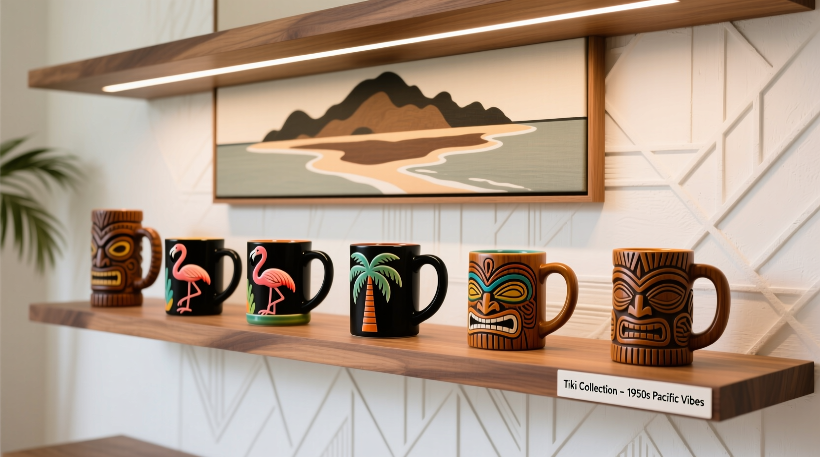
When arranging on a floating shelf, resist the urge to fill its full width. Instead, cluster mugs in a tight triad or asymmetrical quartet toward one end—and leave the remaining 40% of the shelf visibly empty. That emptiness becomes part of the composition, anchoring the eye and amplifying the impact of each mug.
3. Anchor with Architecture, Not Quantity
Clutter often arises when displays compete with their surroundings—floating shelves that clash with crown molding, mismatched brackets, or freestanding units that dominate sightlines. Instead of adding more furniture, work *with* your room’s existing architecture. Here’s how:
| Architectural Feature | Display Strategy | Why It Reduces Clutter |
|---|---|---|
| Mantelpiece | Use only 3–5 mugs arranged in a staggered line, aligned with the mantel’s front edge. Place one slightly forward as a focal point. | Uses the mantel’s inherent framing; avoids “spilling” mugs onto flanking surfaces. |
| Stair Niche | Install a recessed LED strip beneath a single shelf inside the niche. Display 1–3 mugs with directional lighting. | Turns dead space into intentional gallery; lighting draws focus, eliminating need for volume. |
| Window Bay | Mount a narrow, 24-inch floating shelf just below the windowsill. Show 2 mugs facing outward, angled slightly toward the viewer. | Leverages natural light as a spotlight; minimal footprint prevents visual competition with window views. |
| Bookshelf Gap | Remove 2–3 books from a tall bookcase. Insert a custom-cut acrylic riser (¼” thick) and place 1–2 mugs atop it, centered in the gap. | Integrates display into existing furniture; no new hardware or visual interruption. |
This approach treats your home as a collaborator—not a blank canvas to be covered. As interior architect Marcus Chen notes: “A well-placed single mug on a built-in shelf reads as confident curation. Ten mugs crammed onto a standalone unit reads as indecision.”
4. Light Strategically, Not Brightly
Lighting transforms clutter into clarity. Harsh overhead lighting flattens ceramic texture and casts distracting shadows across crowded shelves. Soft, directional light, however, sculpts form, deepens glaze richness, and isolates each mug as a distinct object. You don’t need professional fixtures—just intentionality.
Here’s a step-by-step lighting sequence for any shelf or wall display:
- Assess ambient light: Turn off all lights. Observe where natural light falls during peak viewing hours (e.g., 6–8 p.m.). Note shadows and glare zones.
- Add accent light: Use a single adjustable LED picture light (3000K warm white, 80+ CRI) mounted above the shelf. Aim it at the center mug’s shoulder—not the base—to create gentle highlights and subtle shadow definition.
- Layer depth: If displaying on a deep shelf (12\"+), add a low-wattage puck light (1–2W) aimed upward at the back wall behind the mugs. This lifts them visually off the shelf and adds atmospheric warmth.
- Eliminate spill: Use black foam tape to mask any light bleed onto adjacent surfaces. Clutter hides in uncontrolled light.
A real-world example: When Honolulu-based collector Lena M. redesigned her lanai display, she replaced a fluorescent under-cabinet strip with two focused LED spots. Her 14-mug shelf instantly felt lighter and more intentional—even though no mugs were removed. “The light didn’t make the mugs smaller,” she explains. “It made the *space between them* feel generous and purposeful.”
5. Build Narrative Collections, Not Alphabetical Ones
Organizing tiki mugs by manufacturer, year, or size may satisfy archival instincts—but it rarely satisfies the eye. Clutter emerges when unrelated visual languages collide: a glossy, cartoonish 1970s Trader Vic’s mug next to a matte, earth-toned contemporary piece by ceramicist Koa Wong. Instead, build small, story-driven groupings—each telling a micro-narrative that invites pause and reflection.
Try these narrative frameworks (limit each to 3–5 mugs):
- The Color Dialogue: Three mugs sharing one dominant hue (e.g., deep sea green), but varying in saturation, texture (glossy vs. crackle glaze), and silhouette (tall tiki, squat mug, wide-rimmed).
- The Craft Evolution: One vintage mug (1950s–60s), one mid-era (1980s–90s), and one contemporary piece—all depicting the same motif (e.g., Moai, hula girl, or volcano).
- The Material Contrast: Pair a stoneware mug with a porcelain one and a salt-glazed piece. Let differences in weight, reflectivity, and tactile quality become the conversation.
“People remember stories, not inventories. A grouping titled ‘Ocean Spirits’—featuring a wave-carved Polynesian tiki, a coral-encrusted mermaid, and a deep-blue octopus—creates emotional resonance that 20 alphabetized mugs never will.” — Dr. Arden Ho, Curator of Pacific Arts, Bishop Museum, Honolulu
Narrative groupings also simplify rotation. When you change seasons, swap entire stories—not individual mugs. One summer, “Sunset Rituals” (mugs in tangerine, burnt sienna, and rose gold) occupies your bar cart. Come fall, “Monsoon Legends” (indigo, charcoal, and rain-slicked gray) takes its place. Each story feels complete, self-contained, and uncluttered.
6. Practical Checklist: Before You Arrange Anything
Run through this checklist *before* placing a single mug on a shelf or wall:
- ✅ All mugs are clean, dry, and free of dust residue (use a microfiber cloth dampened with distilled water)
- ✅ Shelf or mounting surface is level and securely anchored (vibrations dull glaze appearance)
- ✅ Lighting plan is tested—no glare on glaze, no dark voids behind mugs
- ✅ You’ve selected *no more than* 5 mugs for this display zone
- ✅ Each mug has at least 3 inches of clearance from its neighbors
- ✅ You’ve identified one “anchor mug”—the strongest visual piece—to position first (usually largest, most textured, or most saturated color)
- ✅ You’ve stepped back 6 feet and confirmed the arrangement feels balanced—not dense, not sparse, but quietly confident
7. FAQ
Can I display tiki mugs in a glass cabinet without it looking like a museum storage unit?
Absolutely—if you treat the cabinet as a stage, not a vault. Limit contents to 7–9 mugs max. Use a neutral backdrop (matte black or deep navy fabric liner). Add one meaningful prop: a vintage bamboo coaster, a dried orchid stem in a tiny vase, or a folded linen napkin in a complementary hue. Close the doors. The cabinet becomes a quiet, framed moment—not an inventory list.
What’s the best way to display mugs on a narrow console table where space is tight?
Go vertical and asymmetric. Mount a single, slim (2.5-inch-deep) floating shelf 12 inches above the console. Place 2 mugs there—one centered, one offset 4 inches to the right. Below, rest one mug directly on the console, angled 15 degrees toward the viewer. That’s three mugs occupying less than 18 inches of linear space—and creating layered depth without crowding.
How do I handle uneven mug heights without resorting to risers that look bulky?
Use invisible elevation. Place shorter mugs on thin, circular cork pads (1/8-inch thick, 3-inch diameter)—they add height while grounding the piece and absorbing vibration. For taller mugs, skip the pad entirely. The subtle variation in base height creates organic rhythm, and cork’s natural texture harmonizes with ceramic—no plastic or acrylic distractions.
Conclusion
Your tiki mug collection is a personal archive of joy, travel dreams, and artistic expression. It deserves to be seen—not hidden behind visual static or diluted by excess. Clarity isn’t achieved by owning fewer mugs. It’s earned through editing courage, spatial awareness, and the quiet confidence to let each piece breathe. You don’t need a dedicated tiki room or custom-built wall grid. Start tonight: pull three mugs that share a color or feeling. Place them on your bookshelf with 4 inches between centers. Add a warm LED spot above. Step back. Breathe. Notice how much more each mug says when it’s not shouting to be heard.
💬 Your turn: Which display idea will you try first? Share your before-and-after thoughts—or your favorite “anchor mug”—in the comments. Let’s inspire each other to collect with intention, not inertia.