In an era where fashion cycles spin faster than ever, where streetwear blends with high fashion and personal branding matters more than ever, the humble baseball cap remains a staple. But within that simplicity lies a quiet debate: does the pattern—striped, solid, logo-heavy, or minimalist—still carry meaning? Or has it all become background noise in a world oversaturated with style choices?
The baseball cap, originally designed for sun protection and team identity, has evolved into a cultural signifier. It’s worn by athletes, celebrities, tech entrepreneurs, and weekend hikers alike. Yet as its use has broadened, so too has the question of whether subtle distinctions like stripes versus solids still matter.
The answer isn’t a simple yes or no. Instead, it depends on context, subculture, and intention. While mainstream consumers may not consciously weigh the symbolism of a pinstripe visor, niche communities—from sneakerheads to vintage collectors—still read these details like a language.
The Cultural Weight of Cap Design
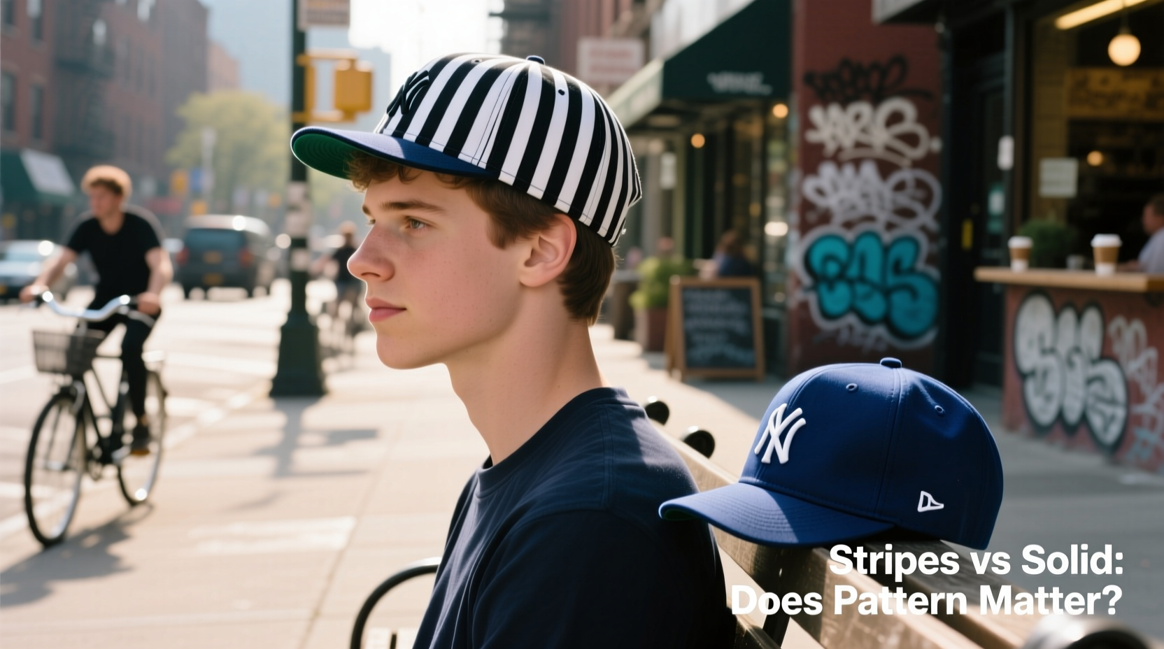
Baseball caps have never been neutral objects. From their origins in 19th-century baseball uniforms to their adoption by hip-hop artists in the 1980s and 1990s, they’ve carried identity, allegiance, and attitude. The New York Yankees’ classic navy cap with white interlocking “NY” became a global symbol not just of a team, but of urban cool. Similarly, the Los Angeles Raiders’ black-on-silver helmet-inspired design transcended sports to represent rebellion and West Coast pride.
In those cases, pattern wasn’t incidental—it was central. Stripes along the brim, contrast stitching, and even the number of eyelets (the small holes on the crown) were scrutinized by fans and fashion enthusiasts alike. For decades, wearing a five-panel cap with raw-edge seams signaled authenticity in skate and punk scenes. A clean, structured six-panel solid cap suggested minimalism or corporate casual.
“The details on a cap are like punctuation in a sentence—they don’t always change the meaning, but they shape how it’s read.” — Marcus Tran, Streetwear Historian & Curator at Urban Threads Archive
Are We in a Post-Pattern Era?
Today, many wearers choose caps based on brand recognition or comfort rather than design nuance. Fast fashion brands mass-produce generic caps in bulk, often using synthetic materials and inconsistent stitching. In this landscape, a striped versus solid distinction might seem trivial.
But look closer, and the pattern still speaks. Consider the resurgence of vintage-style caps from labels like New Era, ’47 Brand, and smaller artisans such as Brixton and Carhartt WIP. These brands emphasize construction details: wool blends, leather straps, embroidered logos, and yes—stripe variations. Limited-edition releases often feature bold side panels or tonal striping that collectors dissect online before launch day.
Social media has amplified both the visibility and the scrutiny. On platforms like Instagram and Reddit, users post “cap check” photos where every seam and logo placement is debated. A striped underbill can signal performance engineering (to reduce glare), while a solid one may suggest retro authenticity.
Tip: If you're building a capsule wardrobe, opt for a solid neutral cap (black, navy, or beige) for maximum versatility. Save patterned or striped versions for statement moments.When Pattern Still Matters: Context Is Key
Not all settings treat caps equally. In some environments, the pattern carries unspoken rules:
- Sports fandom: Die-hard fans know that certain teams release alternate caps with specific stripe patterns for special events. Wearing the wrong one can mark you as a “casual” fan.
- Fashion circles: At fashion weeks or boutique launches, a rare striped dad hat might be more valuable than a standard solid version.
- Corporate branding: Companies handing out promotional caps usually stick to solids for clean logo presentation—but startups in creative industries sometimes use stripes to appear edgy.
- Subcultures: In motorcycle clubs or regional crews, cap patterns can denote rank or territory, though these codes are rarely public.
Real Example: The Brooklyn Flea Market Incident
Last summer, a vendor at the Brooklyn Flea Market pulled a 1995 Chicago Bulls championship cap from a vintage trunk. It featured red-and-black striping across the front panel and a slightly curved brim. Within minutes, two bidders emerged—one offering $120, another $180. When asked why it was worth so much, the winning buyer explained: “It’s not just the team. It’s the exact stripe gradient used only in mid-season ’95. There are maybe three verified ones in circulation.”
This wasn’t about function. It was about precision, history, and visual language. To most passersby, it looked like any old red cap. To those in the know, it was a artifact.
A Practical Guide to Choosing Your Cap
If you’re not a collector or hardcore fan, how should you approach the stripes vs. solids dilemma? Use this step-by-step decision framework:
- Determine your primary use: Daily wear, sports events, fashion pairing, or work uniform?
- Assess your environment: Are you in a place where subtlety is valued (e.g., art galleries) or boldness rewarded (e.g., music festivals)?
- Match to your wardrobe: Solids pair easily with patterned clothing; striped caps work best with monochrome outfits.
- Consider longevity: Solid caps tend to age more gracefully. Faded stripes can look worn rather than vintage.
- Evaluate emotional connection: Do you love the energy of a bold stripe? Or the quiet confidence of a solid black?
Cap Selection Checklist
- ✅ Fits well without pinching or sliding
- ✅ Material suits climate (cotton for breathability, polyester for moisture-wicking)
- ✅ Color complements skin tone and common outfits
- ✅ Pattern aligns with intended message (bold, subtle, nostalgic, modern)
- ✅ Brand or design has personal or cultural significance (optional but meaningful)
Stripes vs Solids: A Comparative Overview
| Feature | Striped Caps | Solid Caps |
|---|---|---|
| Visual Impact | High – draws attention to face and brim | Low to medium – blends easily |
| Versatility | Moderate – works best with neutral clothing | High – pairs with almost any outfit |
| Fan Authenticity | Often higher – specific to eras or teams | Varies – basics may lack detail |
| Fashion Credibility | Strong in streetwear and vintage scenes | Dominant in minimalist and corporate styles |
| Long-Term Wear | Can show fading unevenly | Ages more uniformly |
| Collectibility | Often higher due to rarity and detail | Depends on brand, era, and condition |
Frequently Asked Questions
Does the color of the stripe matter?
Yes, especially in sports contexts. Team-specific color combinations (like the Boston Red Sox red bill or the Oakland A’s green piping) are part of official gear regulations and fan culture. Outside of sports, tonal stripes (e.g., navy on black) add depth without flashiness.
Are striped caps harder to style?
They require more intention. A bright yellow stripe on a gray cap can clash with warm-toned jackets or accessories. The key is balance: if your top half includes multiple colors, go solid. If your outfit is muted, a striped cap can be the focal point.
Do solid caps look boring?
Not inherently. A well-constructed solid cap in rich fabric—like brushed cotton or wool felt—can project quiet sophistication. It’s less about the absence of pattern and more about presence of quality.
Conclusion: Meaning Never Dies—It Just Gets Subtler
The idea that “no one cares anymore” about cap patterns misunderstands how culture evolves. Symbols don’t disappear; they shift from universal to coded. While the average person may not notice whether a cap has twin stripes or a single band, someone does—and that someone might be the gatekeeper to a community, the influencer setting trends, or the future collector preserving today’s overlooked designs.
More importantly, caring about small details isn’t about elitism—it’s about intention. Choosing a solid cap because it matches your philosophy of simplicity is just as valid as choosing a striped one because it reminds you of childhood summers at the ballpark.
In a world of algorithm-driven fashion, where trends rise and vanish in weeks, paying attention to something as small as a stitch pattern is an act of resistance. It says you see value beyond virality.
💬 What does your favorite cap say about you? Whether it’s a faded striped relic or a crisp solid beanie, share your story in the comments—because details still matter to someone.