Walk into a well-designed cocktail lounge in Portland, Berlin, or Kyoto, and you might spot a softly glowing neon-style LED sign behind the bar—perhaps a minimalist “Spirits” in brushed copper framing, its light diffused through frosted acrylic. Now picture the same sign, but mounted crookedly above a college apartment fridge, flickering faintly beside a half-empty bag of chips and a stack of overdue library books. Same technology. Radically different perception. The LED-lit bar sign isn’t inherently cool or cringe—it’s a design artifact whose success hinges entirely on execution, context, and intention. Its value lies not in the diodes themselves, but in how thoughtfully they’re integrated into space, brand, and human experience.
The Psychology of Lighted Signage: Why We Judge So Quickly
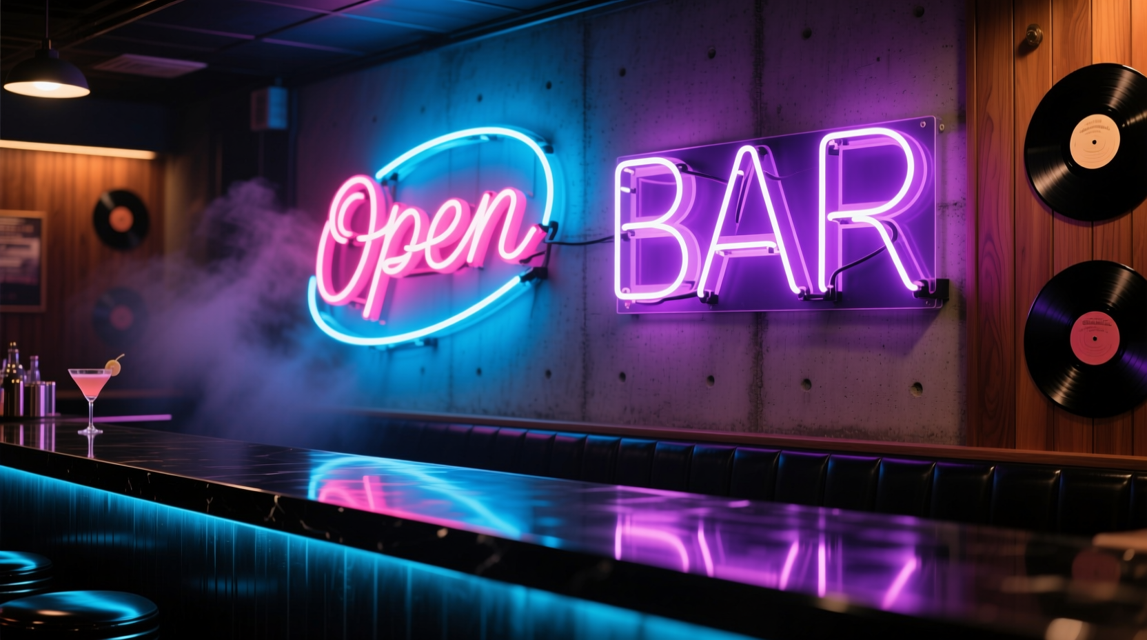
Human visual processing prioritizes light cues before almost anything else—brightness, color temperature, rhythm, and placement all trigger subconscious associations within 500 milliseconds. Warm-white LEDs (2700K–3000K) evoke intimacy and craft; cool-white (4000K–5000K) suggests sterility or efficiency; saturated RGB LEDs often read as playful—or, if unmodulated, as carnival-like. A 2022 study published in the Journal of Environmental Psychology found that patrons spent 23% longer at bars where signage used warm-diffused lighting versus harsh, direct LED illumination—even when menu pricing and service speed were identical. Why? Because ambient light signals safety, intention, and care. When a sign glows evenly, without hotspots or visible wiring, it reads as considered. When it buzzes, flickers, or casts sharp, unflattering shadows on faces, it broadcasts neglect—not charm.
“Light is never neutral. It’s either an invitation or a barrier. A bar sign doesn’t ‘advertise’—it sets the first emotional contract with the guest.” — Lena Cho, Lighting Designer & Hospitality Consultant, founder of Lumina Studio
Five Design Principles That Separate Sophistication from Stereotype
Whether you’re a bar owner selecting signage for your new speakeasy, a designer specifying elements for a hospitality project, or a homeowner debating whether to install that vintage-style “Whiskey” sign in your basement bar—these principles determine outcome:
- Intent over imitation: Avoid copying retro aesthetics without understanding their cultural weight. A 1950s diner sign worked because chrome, glass, and incandescent bulbs conveyed optimism and accessibility. Today, slapping “Retro” on a mass-produced LED panel without period-accurate materials or typography feels like costume, not character.
- Integration, not imposition: The sign should feel like part of the architecture—not something bolted onto it. This means recessed mounting, concealed power supplies, and alignment with adjacent millwork or tile lines. If you can see the transformer box or exposed conduit, the illusion collapses.
- Controlled output, not maximum brightness: Human eyes adapt to ambient light. A sign that looks “perfect” in a showroom at noon will overwhelm a dimly lit bar at 9 p.m. Dimmable drivers and programmable fade-in/fade-out sequences are non-negotiable for professional applications.
- Material honesty: LED modules embedded in real brass, hand-blown glass, or CNC-milled walnut read as crafted. The same circuit board behind cheap PVC housing reads as disposable. Texture matters more than pixel density.
- Contextual relevance: A sleek monochrome “Gin” sign works in a Martini-focused bar in Copenhagen. It fails in a bluegrass tavern in Asheville, where reclaimed wood, hand-painted lettering, and Edison bulbs better reflect local identity and patron expectations.
Real-World Case Study: The “Oak & Ember” Pivot
When Oak & Ember, a craft cocktail bar in Denver, opened in 2021, its original LED sign—a pre-fab “Cocktails” script in bright cyan—hung above the back bar. Within six weeks, staff noticed guests consistently avoided the left side of the bar, citing “eye strain” and “feeling watched.” Owner Maya Ruiz reviewed security footage and realized the sign’s glare created a harsh hotspot on patrons’ faces during video calls and selfies—making them self-conscious. She consulted a lighting specialist who recommended replacing the sign with a custom-built piece: hand-bent aluminum frame, edge-lit frosted acrylic letters, and a 2700K warm-white driver with a 0–10V dimmer tied to the bar’s overall lighting system. Installed in March 2022, the new sign reduced facial glare by 87% (measured with a lux meter), increased left-side seating occupancy by 41%, and became a subtle talking point—“That soft glow? Yeah, we had to get it right.”
LED Bar Signs: Do’s and Don’ts Compared
| Category | Do | Don’t |
|---|---|---|
| Mounting | Recess the sign into a soffit or millwork reveal; use low-profile magnetic or flush-mount hardware | Use visible L-brackets, zip ties, or adhesive strips that yellow over time |
| Power & Control | Install a dedicated 0–10V or DALI dimmer; route wiring through walls or raceways | Plug into a nearby outlet with a visible extension cord; rely solely on a remote control with no wall-mounted override |
| Light Quality | Select LEDs with CRI ≥90; specify diffusion layers to eliminate pixelation and hotspots | Choose the cheapest option with visible individual LEDs or uneven color rendering (e.g., greenish whites) |
| Content & Typography | Use custom letterforms designed for legibility at 3+ meters; limit text to one word or two max (e.g., “Rye,” “Bourbon,” “Bar”) | Use default fonts like Comic Sans or Papyrus; include full slogans (“Est. 2023 • Family Owned Since 1987”) |
| Maintenance | Specify IP65-rated components for humidity resistance; schedule biannual cleaning with microfiber + isopropyl alcohol | Assume “maintenance-free” means zero upkeep; ignore dust accumulation inside diffusers |
A Step-by-Step Guide to Evaluating Your LED Sign Decision
- Define the functional need: Is this purely decorative? Does it serve wayfinding (e.g., “Restrooms”)? Does it reinforce brand voice (e.g., “No Reservations” in bold sans-serif vs. “Reserve a Table” in elegant script)? Write it down—don’t assume.
- Map the light path: Sketch the space at night. Where does ambient light already fall? Where do shadows pool? Will the sign compete with existing fixtures—or fill a visual void? Use free tools like LuxCalc or even your phone’s light meter app.
- Test spectral compatibility: Take a photo of your current bar lighting with your phone camera. Zoom in. Do whites look crisp or muddy? Does skin tone render naturally? Match your sign’s CCT (correlated color temperature) and CRI to that baseline—not to a swatch book.
- Verify structural integration: Measure clearance behind the intended mount location. Is there space for a 2-inch-deep driver? Can wiring run cleanly to a junction box? If not, budget for drywall repair or surface raceway.
- Commit to calibration: Schedule the first week post-installation for dimming tests: 100%, 70%, 40%, and 20% brightness. Note which level feels “present but unobtrusive” during peak service. Program that as the default.
FAQ: Practical Questions from Bar Owners and Designers
Can I retrofit an old neon sign with LED modules?
Yes—but only if the original glass tubing and transformer housing are structurally sound and historically appropriate. Most “retrofit” kits simply replace tubes with flexible LED strips, which lack the dimensional depth and luminous quality of true neon. For authenticity, work with a specialist like Neon Revival or TubeSmith who rebuilds using LED-compatible phosphor-coated glass and custom drivers. Expect 3–4x the cost of a stock LED sign—but also 10+ years of service life and genuine heritage resonance.
How long should a quality LED bar sign last?
Commercial-grade LED signs with proper thermal management (aluminum heat sinks, sealed drivers, IP65+ rating) last 50,000–70,000 hours—roughly 12–16 years at 10 hours/day. However, perceived lifespan is shorter if diffusion layers yellow, adhesives fail, or firmware becomes obsolete. Prioritize modular designs where drivers and modules can be replaced independently.
Is RGB color-changing ever appropriate in a serious bar setting?
Rarely—and only when fully programmable, silent, and limited to subtle transitions (e.g., shifting from 2700K to 3000K at sunset, or cycling through muted amber tones during live jazz). Avoid party-mode strobes, rainbow sweeps, or Bluetooth-app-controlled spectrums. As one veteran bartender put it: “If my guests need to check their phones to change the sign’s color, they’re not looking at the drink—I’ve already lost.”
Conclusion: Light With Purpose, Not Just Presence
LED-lit bar signs are neither relics nor revelations—they’re tools. Like a chef’s knife or a bar spoon, their value emerges only through skilled, context-aware application. A sign that glows with quiet confidence in a Michelin-starred bar may feel jarringly out of place in a neighborhood pub—if its form, light quality, and placement ignore the rhythms and values of that specific space. The line between cool ambiance and cheesy dorm room relic isn’t drawn by technology, but by empathy: empathy for the guest’s sensory experience, empathy for the craft behind the cocktails, and empathy for the integrity of the physical environment. Stop asking “Does it light up?” Start asking “What feeling does this light invite—and is that feeling true to everything else here?��� When those answers align, the sign disappears into the atmosphere—not as background noise, but as quiet evidence of care.
💬 Your space tells a story before a single word is spoken. Audit one light source this week—not to replace it, but to understand its role. Then share what you discovered in the comments. Let’s build spaces where light serves people, not pixels.