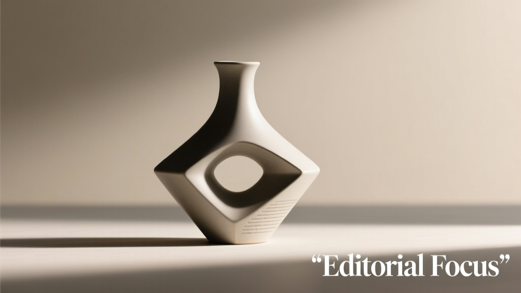
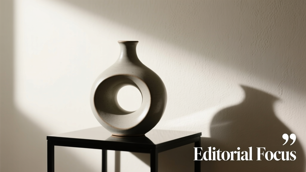
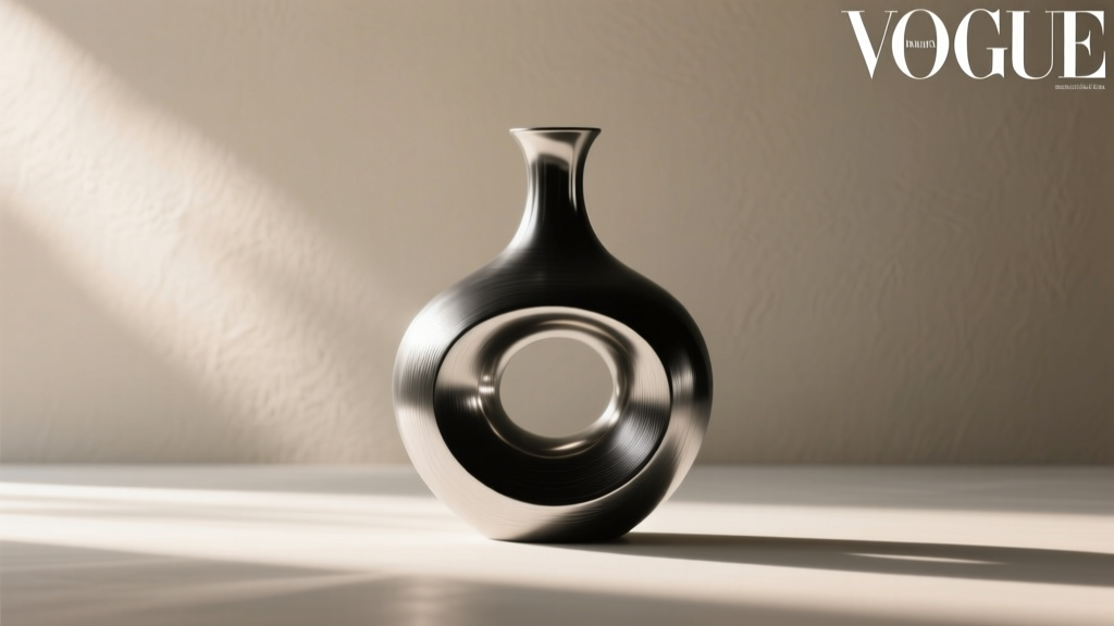
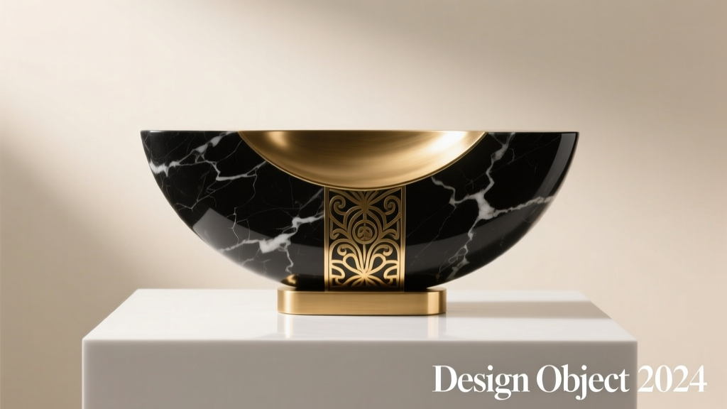
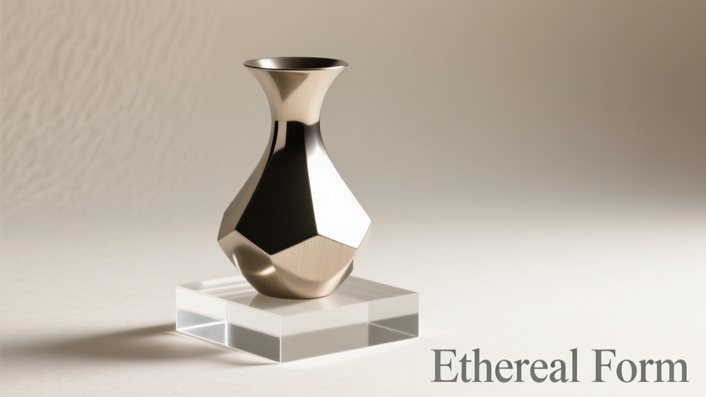
Ornamentation is more than decoration—it’s storytelling. Whether adorning a mantel, curating a centerpiece, or styling a seasonal display, the textures and finishes you choose shape the mood of a space. Metallic and matte ornaments, when paired thoughtfully, create a dynamic contrast that elevates visual appeal without veering into clutter. The key lies not in avoiding one finish in favor of another, but in understanding how they complement each other through balance, rhythm, and intentionality.
Metallic finishes reflect light and command attention. They add glamour, warmth, or modernity depending on their tone—gold evokes opulence, silver suggests crisp elegance, and copper brings earthy sophistication. Matte finishes, by contrast, absorb light. They offer softness, depth, and grounding. When combined, these two finishes can produce a layered, curated aesthetic that feels both intentional and inviting.
Understanding Finish Psychology: Light, Texture, and Mood
The way an object interacts with light determines its presence in a room. A polished brass ornament catches sunlight at 3 p.m. and throws a glint across the wall; a matte black ceramic sphere remains still, absorbing ambient glow. This interplay isn’t just physical—it’s psychological. Shiny surfaces energize; flat textures calm. In design, this means metallics often serve as accents, while matte elements provide structure.
To avoid visual fatigue, think of metallics as punctuation marks—commas, exclamation points—and matte finishes as the narrative body text. Too many shiny objects compete for attention, creating sensory overload. Too many matte pieces risk monotony. The goal is harmony: a rhythm where reflection and absorption alternate like inhale and exhale.
“Texture contrast is silent storytelling. A matte vase wrapped in a metallic ribbon doesn’t just look good—it feels considered.” — Lena Pruitt, Interior Stylist & Author of *Tactile Spaces*
Step-by-Step Guide: Building a Balanced Ornamental Arrangement
Creating visual interest isn’t about randomness—it’s about orchestration. Follow this five-step process to blend metallic and matte ornaments effectively.
- Define Your Focal Point: Choose one standout piece—a large metallic sculpture, a gilded mirror frame, or a matte-textured lantern. This becomes the anchor around which others orbit.
- Select a Base Palette: Decide on a dominant finish. For serene spaces, let matte tones dominate (70%). Use metallics sparingly (30%) to highlight. For festive or luxe settings, reverse the ratio.
- Vary Scale and Shape: Pair a small matte ceramic bird with a tall brushed gold candlestick. Contrast round matte orbs with angular metallic boxes. Diversity prevents repetition.
- Create Clusters, Not Lines: Group three to five ornaments together rather than lining them up. Odd numbers feel organic. Within each cluster, alternate finishes: matte-metal-matte.
- Test Lighting Conditions: View your arrangement at different times of day. Does the metallic piece glare under overhead lights? Does the matte element disappear in low light? Adjust positioning or swap finishes as needed.
Do’s and Don’ts: Common Pitfalls and How to Avoid Them
Even experienced decorators misstep when blending finishes. The following table outlines frequent errors and smarter alternatives.
| Do | Don't |
|---|---|
| Do: Stick to one or two metallic tones. Mixing rose gold and chrome works if balanced with neutral matte elements like stone or linen-textured ceramics. | Don’t: Combine multiple metallics without a unifying matte buffer. Gold, silver, and copper in close proximity clash unless separated by matte wood or fabric-wrapped bases. |
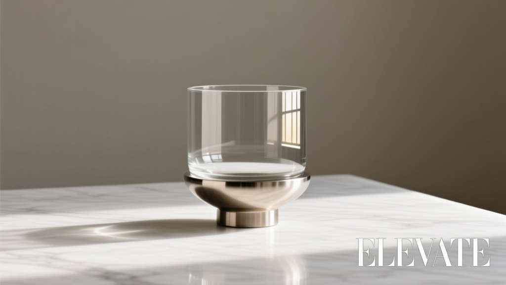
| Do: Use matte vessels to hold metallic accents. A rough-textured bowl filled with small brass pinecones grounds the shine. | Don’t: Place shiny objects directly on reflective surfaces. A metallic ball on a glass table doubles its glare, creating visual noise. |
| Do: Repeat one matte element throughout. Scatter three identical matte gray eggs across shelves to unify disparate metallic accents. | Don’t: Repeat metallics without variation. Five identical shiny stars feel kitschy; vary size or pairing with matte foliage instead. |
Real Example: Holiday Mantel Makeover
Jamila, a graphic designer in Portland, wanted her living room mantel to feel festive but not overwhelming. She began with a neutral foundation: a woven jute runner and matte white pillar candles. Her initial attempt included only glossy red and gold ornaments—visually loud and dated.
She revised using mixed finishes. She replaced half the shiny balls with matte-finish ones in deep forest green and charcoal. She added a hammered copper star (metallic but low-sheen) and nestled small matte clay deer among eucalyptus garlands. Finally, she draped a thin antique brass chain between matte ceramic vases.
The result was transformative. The matte elements absorbed excess light, allowing the metallic touches to shimmer subtly. Guests remarked on the “calm elegance” of the display. Jamila hadn’t reduced the sparkle—she’d refined it.
Tip: When in doubt, step back ten feet. If one finish dominates the view, rebalance with the opposite.Expert Checklist: Final Review Before Displaying
Before finalizing your arrangement, run through this checklist to ensure cohesion and impact.
- ✅ Have I limited metallic tones to one or two types (e.g., gold + bronze, not gold + silver + chrome)?
- ✅ Are matte elements distributed evenly, not clumped in one area?
- ✅ Does at least one matte item repeat across the space to create rhythm?
- ✅ Can I see both finishes from a seated viewpoint (e.g., from a sofa)?
- ✅ Is there enough negative space between groups to let each piece breathe?
- ✅ Have I tested the arrangement under both natural and artificial light?
- ✅ Does the combination feel intentional, not accidental?
“Great styling whispers. It doesn’t shout. A single matte-black base under a gleaming orb says more than a shelf full of glitter.” — Theo Mendez, Visual Merchandising Director at Lume Collective
FAQ: Common Questions About Mixing Finishes
Can I mix matte black and gunmetal ornaments?
Yes, and effectively so. Matte black absorbs light; gunmetal (a dark metallic) reflects it minimally. This creates subtle contrast ideal for moody, modern spaces. Just ensure texture differs—pair a smooth matte black cube with a brushed gunmetal cylinder to avoid flatness.
Is it okay to mix metallic and matte in non-holiday decor?
Absolutely. This principle applies year-round. A coffee table might feature a matte terracotta tray holding a polished brass coaster and a satin-finish book. In spring, pair matte pastel eggs with a softly glowing copper leaf. The rule isn’t seasonal—it’s textural.
How do I keep mixed arrangements from looking messy?
Limit variety. Choose no more than three object types (e.g., spheres, cylinders, figurines), stick to two metallic shades max, and use a recurring matte element as glue. Edit ruthlessly—remove any piece that doesn’t contribute to balance.
Design Beyond Decoration: Intentional Ornamentation
Mixing metallic and matte isn’t merely aesthetic—it’s a practice in mindfulness. Each object you place communicates value: this matters, this belongs. When you combine finishes deliberately, you invite viewers to pause, to notice detail, to feel the difference between gloss and grain.
Consider the emotional arc of a well-styled shelf: the eye lands on a flash of gold (surprise), drifts to a soft gray sphere (rest), then discovers a textured bronze leaf (curiosity). That journey is design as experience, not just appearance.
This approach extends beyond interiors. Event planners use mixed finishes in centerpieces to guide guest attention. Retail displays alternate matte packaging with metallic signage to highlight premium products. Even digital creators mimic this contrast in mockups—glossy watch faces against muted backgrounds.
Tip: Use matte finishes to slow the eye; metallics to accelerate it. Place shiny items near areas you want emphasized—entryways, artwork, conversation zones.Conclusion: Create With Confidence
You don’t need a decorator’s budget to achieve a decorator’s eye. By understanding how metallic and matte ornaments interact—through light, texture, and proportion—you gain the power to transform any space with nuance and confidence. Start small: restyle a bookshelf, refresh a console, or rethink a holiday vignette. Apply the principles of balance, repetition, and focal hierarchy.
Remember, perfection isn’t the goal—intention is. A single mismatched ornament won’t ruin a room, just as one thoughtful pairing can elevate it. Trust your instincts, refine through iteration, and above all, enjoy the process of making beauty that feels lived-in and authentic.
💬 What’s your favorite metallic-matte combo? Share your go-to pairing or a recent styling win in the comments—let’s build a community of intentional decorators together.