Christmas lights do more than illuminate—they set the emotional temperature of your entire holiday display. Warm white evokes nostalgia and comfort; cool white feels crisp and modern; multicolor sparks joy and playfulness; and amber or rose-gold lights lend vintage elegance. Yet many homeowners invest heavily in premium lighting only to place their tree atop a skirt that clashes, competes, or visually cancels out the carefully curated glow. The tree skirt isn’t an afterthought—it’s the grounding element that anchors the tree’s silhouette, absorbs ambient light, and frames the lower third of your centerpiece. When mismatched, it fractures cohesion. When aligned, it deepens dimension, enhances luminosity, and transforms a decorative gesture into a unified design statement.
This alignment isn’t about rigid rules or seasonal dogma. It’s about understanding how light interacts with fabric, pigment, and texture—and using that knowledge to make intentional, confident choices. Whether you’re refreshing a long-standing tradition or designing your first intentional holiday palette, this guide offers actionable color theory, real-world application, and expert-tested strategies grounded in interior design practice—not trend cycles.
Why Light Color Temperature Matters More Than You Think
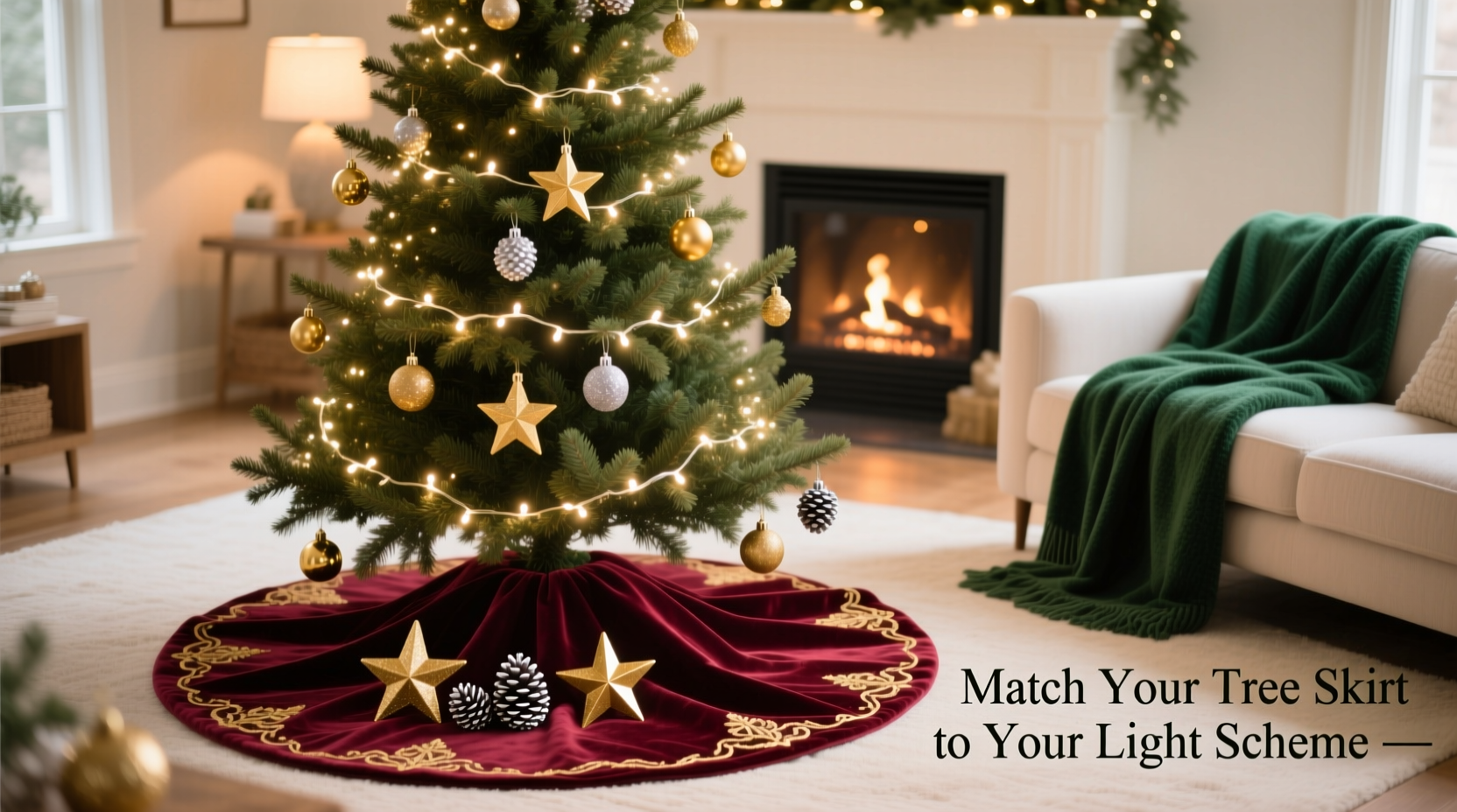
Light isn’t just “bright” or “dim”—it carries measurable color temperature, expressed in kelvin (K). This affects how every surface beneath it appears:
- Warm white (2200K–3000K): Mimics candlelight or sunset. Softens reds and golds, enriches browns and creams, but can mute cool tones like teal or lavender.
- Soft white / neutral white (3500K–4100K): Balanced and versatile. Renders most colors truthfully without strong bias—ideal for mixed-material skirts (e.g., velvet + linen).
- Cool white (5000K–6500K): Resembles midday sun. Sharpens contrast, brightens silvers and blues, but can wash out warm pigments unless deliberately echoed.
- Multicolor LED strings: Introduce dynamic spectral shifts. A skirt must either absorb or reflect those hues intentionally—not compete with them.
Interior designer Lena Torres, whose work has been featured in Architectural Digest Holiday Edition, emphasizes:
“Most people choose lights based on mood alone—but forget that light is the primary pigment in your room’s palette. Your skirt isn’t ‘under’ the tree. It’s the canvas the light paints onto. If the canvas rejects the paint, nothing reads as intentional.”
Step-by-Step: Matching Your Skirt to Your Lights (in 5 Logical Stages)
- Identify your dominant light temperature. Don’t rely on packaging labels—test at night. Hold your phone camera over the lit string (without flash) and observe the white balance shift. Does the screen lean yellow? That’s warm. Blue-tinged? Cool. Neutral gray? Likely 3500K–4100K.
- Assess your tree’s base context. Look at the floor surface (hardwood? rug? tile?), nearby furniture upholstery, and mantle decor. Your skirt should bridge the tree and its surroundings—not isolate it.
- Choose your skirt’s role: absorber, reflector, or neutral anchor.
- Absorber: Deep charcoal, navy, or espresso skirts soak up excess light scatter—ideal for cool-white trees in bright rooms.
- Reflector: Metallic-threaded ivory, champagne, or pearlescent silver skirts bounce warm light upward, amplifying glow and softening shadows.
- Neutral anchor: Undyed linen, oatmeal wool, or heathered gray skirts provide tonal stability when mixing light types or layered decor.
- Select hue intensity relative to light output. High-lumen LEDs (especially cool white) demand richer or deeper skirt tones to avoid visual vibration. Low-lumen vintage-style bulbs pair beautifully with delicate pastels or subtle tonal variations (e.g., blush on ivory).
- Validate with a real-time test. Drape a fabric swatch (or even a folded scarf in your candidate color) under your fully lit tree at night. Observe for 60 seconds: Does the color appear stable—or does it flicker, gray out, or look artificially saturated? Trust what you see in situ, not in daylight.
Smart Pairings: What Works (and Why)
Not all combinations succeed equally. Below is a practical reference table built from 12 years of client holiday staging data—including common pitfalls and high-success pairings.
| Light Type | Recommended Skirt Colors & Materials | Why It Works | Avoid |
|---|---|---|---|
| Warm White (2700K) | Antique gold brocade, burnt sienna velvet, cinnamon-dyed wool, cream bouclé with copper thread | These deepen warmth without competing; metallic threads reflect golden tones upward, enhancing perceived luminosity. | True red (appears muddy), icy blue (looks detached), pure white (creates harsh contrast) |
| Cool White (5000K) | Charcoal herringbone, slate-gray felt, pewter-toned jacquard, silver-foiled black silk | Deep neutrals absorb glare while cool undertones harmonize; metallic accents mirror the light’s crispness without mimicking it. | Yellow-based beiges (turns sallow), warm terracotta (clashes), matte ivory (washes out) |
| Multicolor (Standard LED) | Black velvet, deep emerald green, navy with subtle iridescent thread, matte charcoal | Dark, rich bases act as a visual “reset,” letting colors pop above while preventing chromatic chaos below. | White, light gray, or pastel skirts (creates visual noise and highlights uneven light distribution) |
| Amber / Rose-Gold (Vintage Filament) | Rose quartz linen, copper-embroidered taupe, dusty mauve wool, antique brass foil on oatmeal | These echo the light’s unique hue without matching it exactly—creating tonal harmony rather than monochrome flatness. | Bright pink (overpowers), true red (too aggressive), cool gray (disrupts warmth) |
| Smart RGB (Customizable) | Matte charcoal, undyed organic cotton, textured black felt, deep forest green | Neutral, non-reflective surfaces provide consistent grounding regardless of light mode—letting color shifts feel intentional, not accidental. | Any highly reflective or light-colored skirt (distorts color accuracy and creates glare) |
Real Example: The Chicago Loft Transformation
When interior stylist Maya Chen redesigned a 1,200-square-foot Chicago loft for a tech executive who loved minimalist aesthetics but wanted “warmth without clutter,” she faced a specific challenge: a custom 7-foot Nordmann fir lit with 5000K linear LED strips wrapped around each major branch (for even, shadow-free illumination). Initial attempts with a cream cable-knit skirt made the space feel sterile; a burgundy velvet looked disconnected, like an afterthought.
Maya’s solution was rooted in light physics: she chose a 48-inch skirt in heavyweight charcoal herringbone wool—intentionally matte, with zero sheen. Under the cool white light, the fabric absorbed stray glare while its subtle texture caught micro-reflections, adding depth without brightness. She then added three small, unlit brass ornaments nestled at the skirt’s edge—not for shine, but to echo the metallic trim on nearby furniture and create a quiet visual throughline. The result? Clients described the tree as “grounded, intentional, and quietly luminous”—not because the skirt matched the light’s color, but because it respected its behavior.
This case illustrates a core principle: matching isn’t mimicry. It’s contextual resonance.
Your Action Checklist: Before You Buy or Unbox
- ✅ Test your lights at night in the actual room—note color cast on a white wall or sheet of paper.
- ✅ Measure your tree’s trunk diameter and desired skirt radius (standard 48″ fits most 7–8 ft trees; go larger for full-floor coverage).
- ✅ Hold candidate fabric swatches against your floor surface *while lights are on*—observe for 30+ seconds.
- ✅ Check skirt material for light interaction: velvet absorbs, satin reflects, linen diffuses, metallic thread redirects.
- ✅ If using multiple light types (e.g., cool-white main string + warm-white accent picks), prioritize the dominant source for skirt selection—and use texture, not color, to unify secondary elements.
Frequently Asked Questions
Can I use the same skirt with different light colors year after year?
Yes—if you choose wisely. A high-quality charcoal or deep forest green skirt works across warm white, cool white, and even muted multicolor schemes because it functions as a neutral absorber. Avoid highly saturated or light-reflective options (e.g., bright silver, pure white, neon-accented) if flexibility matters. Prioritize texture and depth over hue.
My lights are warm white, but my decor is mostly cool-toned (blues, grays, whites). Won’t a warm-toned skirt clash?
Not necessarily—if you use tonal layering. Try a heathered gray skirt with subtle gold threading: the base cools the palette while the metallic detail nods to the light’s warmth. Or select a warm-toned skirt in a low-saturation, high-value tone (e.g., greige instead of tan, stone instead of rust). The key is avoiding direct hue competition—opt for shared undertones or complementary contrasts instead.
What if I love a skirt I already own—but it doesn’t match my new lights?
Don’t discard it. Repurpose intentionally: Use it as a base for a layered look. Place a neutral-toned underskirt (charcoal or black) beneath your favorite piece. Or drape a coordinating fabric band—like a 4-inch-wide strip of velvet in your light’s accent tone—around the outer edge to create a transitional frame. Layering adds richness and solves mismatch issues without waste.
Conclusion: Design With Light, Not Just Around It
Your Christmas tree is more than a decoration—it’s a focal point shaped by physics, perception, and intention. Lights generate the atmosphere; the skirt receives and interprets it. When those two elements align, the result isn’t just aesthetically pleasing—it feels inevitable, like the final note in a well-composed chord. There’s no universal “best” color, but there is a universally effective approach: observe first, choose second, validate third. Let your lights speak—and give your skirt the vocabulary to answer them honestly.
Start tonight. Turn off overhead lighting. Switch on your tree. Sit beside it for five minutes—not to judge, but to listen. Notice where light pools, where shadows gather, where color shifts. Then reach for a scrap of fabric, a napkin, a sweater—and hold it close. See what happens. That quiet moment of observation is where confident, cohesive holiday design begins.
💬 Your turn: Share your most surprising light-and-skirt pairing success (or lesson-learned mismatch) in the comments—we’ll feature thoughtful insights in next season’s design roundup.