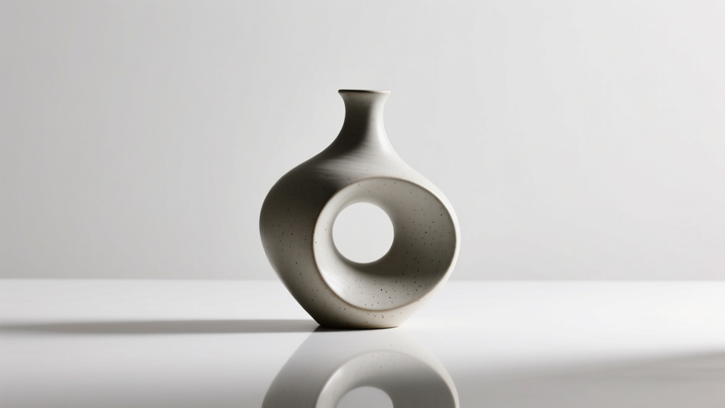
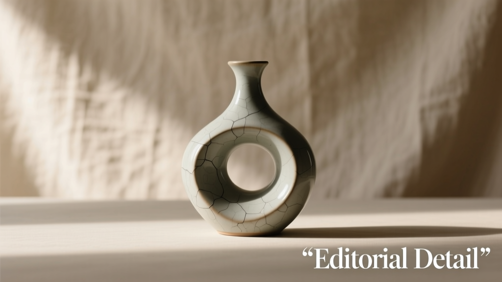
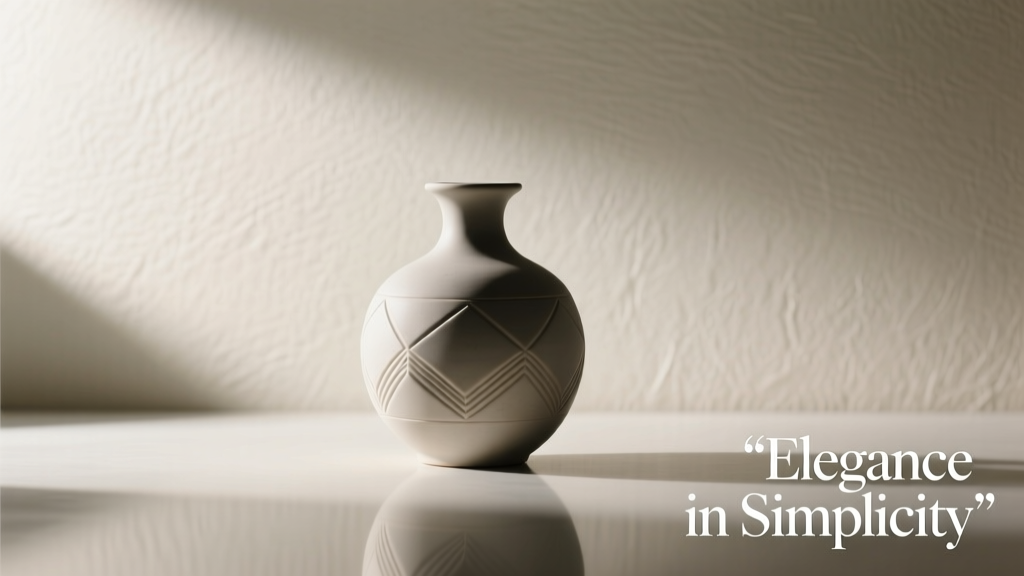
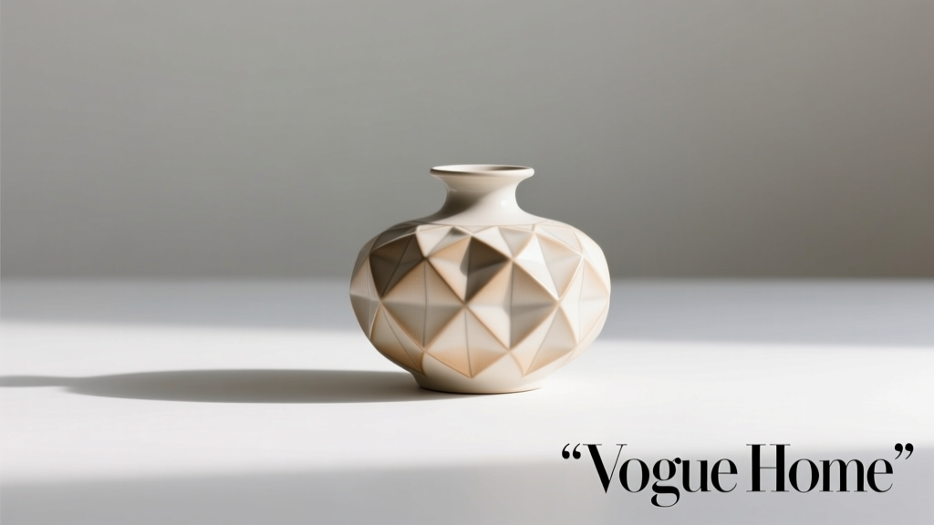
Wedding favors are more than tokens of gratitude—they’re silent storytellers. When thoughtfully chosen, they extend your wedding’s visual narrative beyond the ceremony and reception, becoming functional accents that soften tablescapes, anchor centerpieces, and echo your color palette, textures, and personality. Yet too many couples default to generic trinkets that clutter guest bags or gather dust on shelves. The most memorable favors don’t just sit beside place cards—they belong in the design. They harmonize with linens, complement florals, and contribute to atmosphere. This requires intentionality: aligning sentiment with aesthetics, practicality with poetry, and budget with impact. Below is a grounded, experience-informed approach—not theory, but what works when real venues, real timelines, and real guests are involved.
1. Start with Design Intent, Not Just “What’s Cute”
Before browsing Etsy or visiting wholesale catalogs, define how the favor will function *visually* in your space. Ask: Will it sit on the plate? Rest inside a napkin fold? Anchor a floral arrangement? Hang from a chair? Its placement dictates scale, weight, material, and finish. A delicate porcelain bird may shatter if tucked into a linen napkin folded tightly; a heavy glass candle risks toppling a narrow bud vase centerpiece. Design intent also includes continuity: if your palette features sage, clay, and ivory, avoid metallic gold favors unless they’re matte, brushed, or antique-finished—shiny brass clashes with earthy tones. Likewise, if your décor leans minimalist (clean lines, negative space, restrained florals), oversized favors with ornate ribbons overwhelm rather than enrich.
Tip: Print your wedding mood board and physically sketch where the favor will appear on each surface—plate, charger, side table, lounge area. If it doesn’t fit visually in three distinct contexts, reconsider its form or scale.2. The Dual-Purpose Filter: Meaning + Material Harmony
The strongest wedding favors satisfy two criteria simultaneously: they carry personal resonance *and* reinforce your décor’s tactile language. Resonance isn’t limited to monograms or dates—it’s found in shared memories (a local honey variety from where you had your first date), cultural tradition (hand-poured soy candles wrapped in indigo-dyed cloth for a Japanese-American couple), or values (native-seed packets for eco-conscious hosts). Material harmony means choosing substances that echo other key elements: linen-wrapped soaps mirroring napkin textures; terracotta pots echoing ceramic dinnerware; frosted glass bottles reflecting crystal stemware. Avoid juxtapositions that feel accidental—like glossy acrylic favors beside raw wood tables or plastic-wrapped chocolates at a rustic vineyard.
“Favors should feel like an extension of the invitation suite—not an afterthought. When guests see the same paper stock, ink tone, or botanical motif repeated in the favor packaging, it signals cohesion, not coincidence.” — Lena Torres, Wedding Designer & Creative Director, Oak & Ember Studio
3. Practical Integration Checklist
Even the most beautiful favor fails if it disrupts flow, damages surfaces, or confuses vendors. Use this checklist *before* finalizing your choice:
- Weight & Stability: Does it sit flat without sliding? Will it tip over during service or wind exposure on an outdoor terrace?
- Surface Safety: Is it non-staining (no bleeding dyes, no oily residues) on white linens, marble tabletops, or velvet lounge furniture?
- Vendor Compatibility: Have you confirmed with your caterer that favors won’t interfere with plating sequences or buffet setup? With your florist that they won’t block water tubes or destabilize arrangements?
- Guest Accessibility: Are they easy to handle for elderly guests or those with limited dexterity? (e.g., twist-top jars > sealed wax-dipped tins)
- Weather Resilience: For outdoor weddings: Will chocolate melt? Will paper labels curl in humidity? Will untreated wood warp in dew?
4. Comparison Table: Top Favor Categories by Decorative Impact & Real-World Viability
| Favor Type | Decorative Strengths | Logistical Risks | Best For |
|---|---|---|---|
| Mini Potted Plants (Succulents, herbs, native wildflowers) |
Adds organic texture, height, and living color; doubles as escort card holder or centerpiece filler; biodegradable packaging options. | Soil spillage on linens; watering needs pre-event; fragile leaves bruise during transport; not ideal for multi-hour seated dinners. | Garden weddings, spring/summer events, eco-focused couples, venues with ample outdoor space for staging. |
| Artisan Candles (Soy or coconut wax, custom vessels) |
Provides ambient glow pre-dinner; vessel doubles as votive or keepsake; scent reinforces mood (e.g., lavender for calm, citrus for energy); customizable vessel shape/color. | Wax pooling on tables if lit prematurely; vessel breakage risk; fragrance sensitivity among guests; flame safety near drapery or florals. | Evening receptions, indoor venues with controlled airflow, modern or romantic themes, couples prioritizing multisensory experience. |
| Edible Favors (Local jam, spiced nuts, shortbread in custom boxes) |
Warm, inviting, nostalgic; packaging can mirror menu typography or dessert station design; natural textures (kraft paper, twine, foil stamping) enhance rustic or vintage looks. | Perishability (especially dairy/chocolate); allergen labeling requirements; crumb/drip mess on fine china or fabric; inconsistent sizing affects uniform table layout. | Fall/winter weddings, destination resorts with kitchen access, foodie couples, venues with strong local partnerships. |
| Custom Coasters (Cork, marble, ceramic, laser-etched wood) |
Functional, reusable, and highly decorative; anchors drink placement; material choices align with bar décor; doubles as place card or escort card base. | Weight may limit stacking efficiency for catering staff; fragile materials (marble) require careful packing; small size risks getting lost in table cleanup. | Cocktail-focused receptions, industrial or coastal themes, urban venues with lounge seating, couples wanting long-term utility. |
5. Step-by-Step Timeline: From Concept to Tabletop Integration
Timing prevents last-minute compromises. Follow this sequence—starting 6 months out—to ensure favors elevate, not undermine, your décor:
- Month 6–5: Audit your décor plan. Note dominant materials (wood, stone, metal, linen), primary colors, and structural elements (low vs. high centerpieces, open vs. draped tables). Circle 2–3 tactile qualities you want the favor to echo.
- Month 4: Source 3–5 candidate favors matching those qualities. Order physical samples. Test them on actual table linens and under lighting similar to your venue’s (e.g., warm LED vs. daylight fluorescent).
- Month 3: Present samples to your planner, florist, and caterer. Ask: “Where would this go? What could go wrong?” Adjust based on their operational feedback—not just aesthetics.
- Month 2: Finalize packaging (boxes, wraps, tags). Ensure all branding elements (fonts, icons, color codes) match your invitation suite. Print 5 test labels and attach them to sample favors on a mock table setting.
- Month 1: Confirm delivery timeline with vendor. Schedule arrival at venue 2 days pre-wedding. Assign one person (not the couple) to oversee unpacking, quality check, and placement coordination with the venue team.
Mini Case Study: The Terracotta & Linen Solution
Maya and David planned a late-summer wedding at a converted barn with exposed beams, burlap runners, and dried pampas grass centerpieces. Early concepts included mini champagne bottles—but they clashed with the earthy, unpolished vibe and posed breakage risks. Their planner suggested shifting focus to texture and warmth. They chose hand-thrown terracotta cups (unglazed, matte finish) filled with locally roasted coffee beans, wrapped in undyed linen drawstring bags stamped with a simple sun motif. The cups echoed the barn’s clay floor tiles and ceramic dishware; the linen matched the runners and napkins; the sun motif appeared subtly on invitations and cake toppers. During rehearsal dinner, they placed five cups on a test table—no slipping, no staining, and the raw texture added depth beside the soft pampas. At the reception, the cups sat nestled in linen folds beside each plate, doubling as tiny vases for single sprigs of lavender. Guests kept them; the venue reported zero breakage or spills.
FAQ
How many favors do I really need—and do children get them too?
Provide one favor per guest, including children aged 3 and up. Infants and toddlers typically don’t receive individual favors, but consider a family-friendly option (e.g., a larger jar of cookies to share) if your guest list includes many young families. Never skip favors for kids—doing so signals exclusion and undermines the gesture’s purpose.
Can I use favors as part of my photo backdrop or lounge area styling?
Absolutely—and it’s highly effective. Stack unused favors (e.g., wrapped soaps, mini books, ceramic vessels) on side tables or shelves behind lounge seating. Arrange them by color or height to create rhythm. Use favor boxes as risers for framed photos or greenery. Just ensure they’re secured and won’t topple during guest interaction.
What’s the most common mistake couples make with decorative favors?
Overcomplicating the assembly. Hand-tied ribbons, custom calligraphy on every tag, and multi-layered packaging look beautiful in photos—but they’re unsustainable at scale. One couple spent 47 hours tying 120 silk bows, only to have half loosen during transport. Simpler, repeatable finishes (e.g., consistent knot placement, pre-cut twine lengths, sticker seals instead of wax) preserve quality without sacrificing charm.
Conclusion
Your wedding favors are not an add-on. They are design elements with purpose—carrying warmth, reinforcing identity, and completing the sensory journey you’ve crafted for your guests. When chosen with intention—anchored in your décor’s language, tested against real-world constraints, and aligned with your story—they become quiet ambassadors of your love, long after the last dance ends. Don’t settle for “cute enough.” Choose what belongs. Choose what balances beauty with belonging. Choose what makes your tables feel whole.
💬 Share your own favor success—or lesson learned. What helped your favors feel like part of the design, not apart from it? Comment below and inspire others to choose with confidence.