Curtain tie backs are more than just functional—they’re a finishing touch that can define the character of a room. While often overlooked, the choice between black and neutral tie backs influences everything from visual balance to stylistic cohesion. Whether you're refreshing a living room, dressing up a bedroom, or elevating a dining space, selecting the right tie back color is a subtle yet powerful design decision. The contrast isn’t just about shade; it’s about how each option interacts with light, fabric, furniture, and overall decor.
Black tie backs deliver bold definition and modern edge, while neutrals—like beige, taupe, cream, or gray—offer soft harmony and timeless versatility. Understanding when and where each shines allows you to enhance your space intentionally, not by accident.
The Role of Tie Backs in Interior Design
Tie backs serve both practical and aesthetic functions. Functionally, they hold curtains open to let in natural light and provide an unobstructed view. Aesthetically, they add rhythm, symmetry, and detail to window treatments. Their placement draws the eye upward, emphasizing ceiling height and architectural lines.
The color of a tie back affects how it integrates—or contrasts—with the rest of the room. A well-chosen tie back complements the curtain fabric, wall color, and furnishings without competing for attention. Conversely, a poorly matched one can disrupt visual flow or appear jarring.
Interior designers often treat tie backs as accessories akin to jewelry in fashion. Just as a statement necklace can elevate an outfit, a thoughtfully selected tie back can transform a window from ordinary to intentional.
Black Tie Backs: Bold Contrast and Modern Appeal
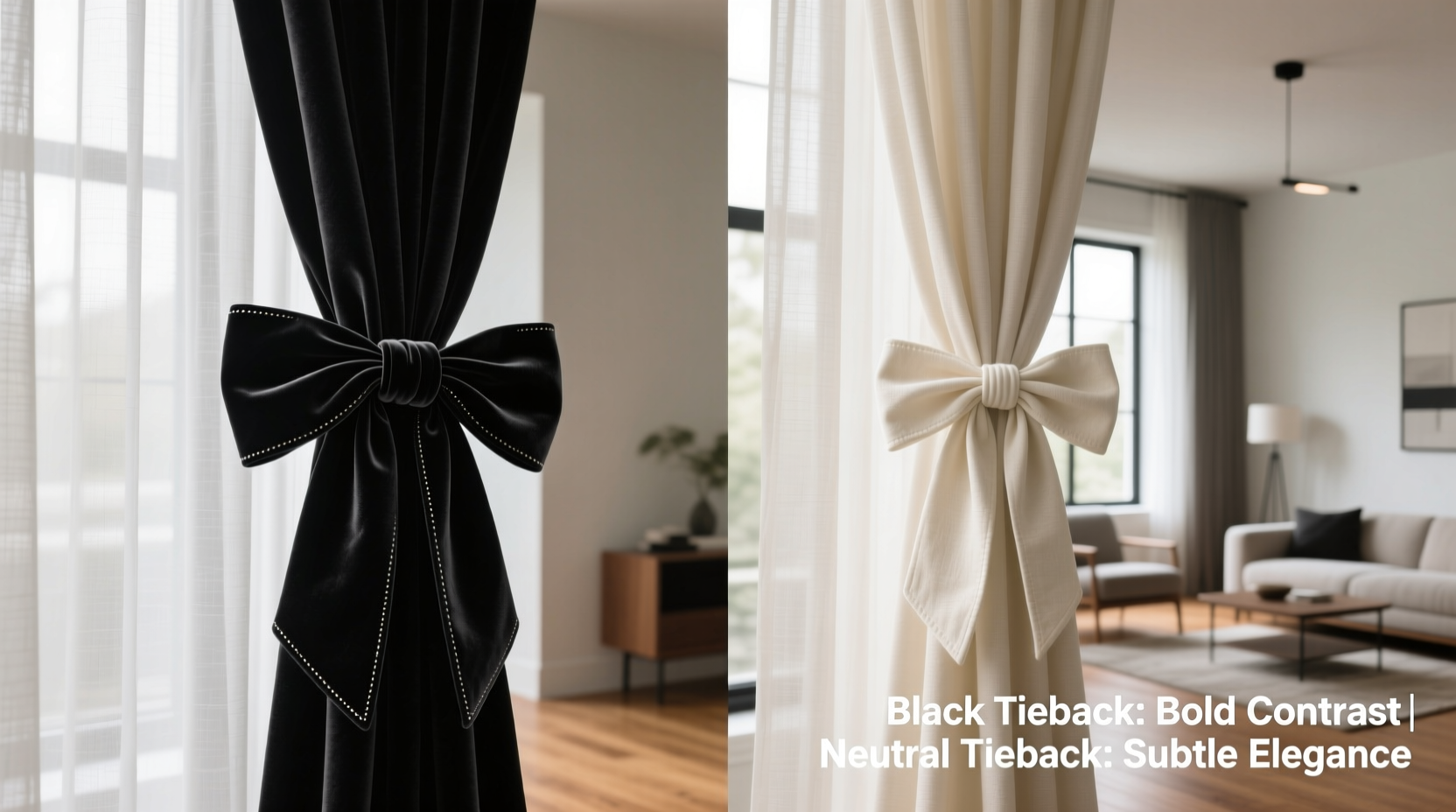
Black tie backs create strong visual contrast, especially against light-colored or patterned curtains. This contrast adds drama and definition, making windows stand out as focal points. In contemporary or minimalist interiors, black accessories ground the space and reinforce clean, structured lines.
They work particularly well in rooms with monochromatic schemes or high-contrast palettes. For example, pairing black tie backs with white linen curtains on charcoal-gray walls creates a sleek, editorial look. The sharp delineation enhances architectural precision and gives the room a tailored feel.
Black also performs exceptionally in eclectic or industrial spaces. Metal hooks, leather cords, or braided black fabric tie backs introduce texture and edge without overwhelming the design. They subtly echo other black elements in the room—lamp bases, picture frames, or hardware—creating cohesion through repetition.
Tip: Use black tie backs to anchor light or sheer curtains that might otherwise appear insubstantial.Neutral Tie Backs: Subtlety, Warmth, and Timeless Integration
Neutral tie backs prioritize harmony over contrast. By blending with curtains or walls, they create a softer, more organic appearance. Beige, ivory, oatmeal, and warm grays recede visually, allowing other design elements—artwork, furniture, or views—to take center stage.
In traditional, cottage, or Scandinavian interiors, neutral tie backs feel natural and unforced. Linen, cotton rope, or tassel designs in earthy tones support a relaxed, lived-in aesthetic. They’re ideal for homes aiming for warmth, comfort, and understated elegance.
When curtains are already a dominant feature—such as heavy drapes with bold patterns or rich textures—neutral tie backs prevent visual overload. Instead of adding another layer of contrast, they gently gather the fabric, maintaining balance.
Additionally, neutral tie backs are more forgiving in rooms with shifting light. Black can cast harsh shadows in low light or appear too stark in bright sunlight, whereas neutrals adapt gracefully throughout the day.
Comparing Black and Neutral: When to Choose Which
The decision between black and neutral should be guided by three key factors: curtain color, room style, and desired mood.
| Factor | Best for Black Tie Backs | Best for Neutral Tie Backs |
|---|---|---|
| Curtain Color | White, cream, light gray, or patterned fabrics with black accents | Warm tones (beige, rust, olive), pastels, or textured natural fabrics |
| Room Style | Modern, minimalist, industrial, or urban lofts | Traditional, farmhouse, coastal, or Scandinavian |
| Mood | Dramatic, sophisticated, structured | Calm, inviting, serene |
| Lighting | Bright, even lighting; rooms with strong artificial lighting | Soft, natural light; rooms with variable daylight |
This comparison shows that neither option is universally superior—the best choice depends on context. A black tie back in a sun-drenched modern apartment may look crisp and intentional, while the same accessory in a cozy country kitchen could feel out of place.
“Tie backs are the punctuation marks of window design. A black one is like an exclamation point—bold and definitive. A neutral is more like a comma—soft, connecting, and flowing.” — Lena Torres, Interior Stylist & Author of *The Layered Home*
Real-World Example: Two Homes, Two Choices
Consider two adjacent townhouses renovated by the same designer but styled differently. In the first, a young professional couple opted for a monochrome palette with floor-to-ceiling windows, white sheer curtains, and matte black fixtures. The designer chose black velvet tie backs to echo the door handles, light switches, and TV frame. The result was cohesive, sharp, and gallery-like.
In the second home, an older couple preferred warmth and comfort. Their living room featured oat-colored linen drapes, wooden shutters, and vintage furniture. Here, the designer used woven jute tie backs in a sandy beige tone. These blended seamlessly with the curtains and added tactile warmth without drawing attention.
Both choices were correct—for their respective environments. The contrast wasn’t about quality but intentionality. Each tie back supported the room’s narrative rather than disrupting it.
Step-by-Step Guide: Choosing the Right Tie Back for Your Space
Follow this sequence to make a confident decision:
- Assess your curtain fabric. Is it light or dark? Solid or patterned? If it contains black threads or trim, a black tie back will harmonize. If it’s warm-toned or textured, lean toward neutral.
- Evaluate your room’s style. Take note of furniture finishes, wall colors, and decor motifs. Modern spaces favor black; traditional or rustic ones favor neutrals.
- Observe natural light. Does sunlight flood the room, or is it dimly lit? Black can deepen shadows in low light; neutrals maintain brightness.
- Hold a sample. Drape a black ribbon and a neutral one over your curtain. Step back and view from across the room. Which feels more balanced?
- Check for repeating colors. Do black elements (lamps, frames, tiles) already exist? Repeating black with tie backs strengthens design unity. If not, introducing black may feel abrupt.
Common Mistakes to Avoid
- Overmatching. Don’t feel obligated to match the tie back exactly to curtain color. Sometimes contrast (e.g., black on cream) is more effective than blending.
- Ignoring scale. A thick black tie back on delicate lace curtains can overwhelm. Match the weight of the accessory to the curtain’s volume.
- Forgetting hardware. The tie back’s mounting hook or ring should coordinate. A brushed nickel hook with a black fabric tie back can clash unless intentionally mixed.
- Using outdated styles. Avoid overly ornate or frilly tie backs in modern spaces, regardless of color. Simplicity often reads as more elegant.
Frequently Asked Questions
Can I mix black and neutral tie backs in the same house?
Absolutely. Many homes blend styles across rooms. Use black in formal or modern areas like a study or entryway, and neutrals in bedrooms or living rooms where comfort is key. Consistency within each room matters more than uniformity throughout the home.
Do black tie backs make a room feel smaller?
Not necessarily. While dark colors can absorb light, a small black accent like a tie back rarely impacts spatial perception. In fact, they can add depth and sophistication without shrinking the room. The effect depends more on wall color, furniture arrangement, and overall lighting.
Are there in-between options?
Yes. Consider charcoal gray, deep navy, or espresso brown—colors that offer contrast without the starkness of pure black. These bridge the gap between bold and neutral, working well in transitional spaces.
Final Thoughts: Make It Intentional
The choice between black and neutral tie backs isn’t about rules—it’s about resonance. Does the room feel more complete with a defining accent, or with quiet continuity? Answering that question leads to better decisions than any trend forecast ever could.
Great interior design lives in the details. A tie back may seem minor, but its color contributes to the story your space tells. Whether you choose the confidence of black or the calm of neutral, do so deliberately. Let every element reflect a considered choice, not a default.
💬 Which tie back style do you prefer in your home? Share your experience or post a photo in the comments—your insight could inspire someone else’s next design move.