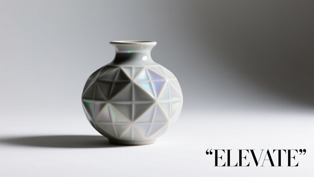
Art Deco isn’t merely a design trend—it’s a language of confidence, symmetry, and quiet opulence. Emerging from the exuberant optimism of the 1920s and 1930s, its aesthetic fused industrial precision with luxurious materials, geometric boldness with refined craftsmanship. Today, couples seeking sophistication without sentimentality are turning to Art Deco for wedding stationery that feels both historic and strikingly modern. Unlike floral or rustic themes that lean into softness, Art Deco invitations communicate intention: clean lines, purposeful contrast, and an unwavering sense of ceremony. This isn’t about nostalgia—it’s about curating presence. Whether you’re commissioning custom letterpress or designing digitally, understanding the core principles—and avoiding common missteps—ensures your invitations resonate with authenticity, not pastiche.
The Defining Elements of Authentic Art Deco Design
True Art Deco goes beyond adding a sunburst motif or swapping fonts. Its power lies in disciplined composition and intentional restraint. At its heart are five interlocking characteristics:
- Geometry as structure: Triangles, chevrons, stepped forms (ziggurats), sunbursts, and radiating lines create rhythm and hierarchy—not decoration for its own sake.
- Symmetry and balance: Centered layouts dominate. Text is rarely justified left or right; instead, it’s anchored on the vertical axis, often flanked by mirrored decorative elements.
- High-contrast palette: Black and ivory remain foundational, but rich accents—emerald green, sapphire blue, deep ruby, metallic gold or silver—are used sparingly and deliberately, never diffusely.
- Stylized figuration: Human figures, flora, and fauna appear abstracted—elongated, simplified, and rhythmic—never literal or illustrative.
- Material consciousness: Texture matters profoundly. Think velvet-lined envelopes, foil-stamped borders, thick cotton stock with deckled edges, or translucent vellum overlays—all reinforcing tactile luxury.
Crucially, Art Deco rejects ornamentation that competes with function. Every line serves a structural or directional purpose. A chevron doesn’t just “look cool”—it guides the eye toward the date or names. A sunburst doesn’t fill space—it creates focal energy. This functional elegance is what separates enduring design from fleeting style.
Typography That Speaks With Authority
In Art Deco, type is architecture. Fonts aren’t chosen for readability alone—they’re selected for their sculptural weight, vertical emphasis, and geometric integrity. Serifs like Bodoni and Didot are staples, prized for their dramatic contrast between ultra-thin hairlines and robust vertical strokes. Their high-waisted capitals and sharp serifs echo the streamlined silhouettes of Deco skyscrapers and automobiles.
For display text—names, dates, or monograms—geometric sans-serifs like Futura, Avant Garde Gothic, or custom-drawn lettering with squared terminals and uniform stroke widths deliver crisp authority. Avoid rounded, friendly, or irregular fonts; they undermine Deco’s disciplined ethos.
Tip: Set body text at 10–11 pt in Bodoni Bold Italic for ceremony details—its sharp slant adds dynamism without sacrificing legibility. Never use all caps for full paragraphs; Deco relies on elegant variation, not uniform shouting.Spacing is non-negotiable. Generous letter-spacing (tracking) in headlines—especially monograms—creates breathing room and reinforces monumentality. Line spacing (leading) should be tight enough to suggest cohesion but open enough to avoid visual crowding. When layering type (e.g., names over a sunburst), ensure the negative space around each character remains unbroken—no overlapping or clipping.
Color Strategy: Less Is Luxurious
Art Deco color use is strategic, not expressive. Its palette emerged from the era’s material innovations: chrome plating, lacquered wood, black marble, and hand-blown glass. That legacy informs a strict hierarchy:
| Role | Recommended Colors | Usage Guidance |
|---|---|---|
| Base | Ivory, cream, charcoal, matte black | Choose one dominant base. Ivory conveys warmth; charcoal adds modern gravity. Avoid pure white—it reads clinical, not Deco. |
| Accent | Gold foil, silver foil, emerald green, sapphire blue | Use *one* accent color max. Foil must be applied via hot stamping—not digital print—to achieve true reflectivity and depth. |
| Text | Black (on light bases), ivory/cream (on dark bases) | Never use gray text. Contrast must be absolute. If using foil for names, pair with flat black for details to maintain hierarchy. |
| Pattern Fill | Same as accent or base only | Geometric patterns (chevrons, zigzags) should use only base + 1 accent. No gradients, no textures within shapes. |
Metallics are not “extras”—they’re structural. Gold foil on ivory evokes Gatsby-era glamour; silver foil on charcoal suggests sleek 1930s modernism. Crucially, metallics should appear in bold, defined areas (borders, monogram frames, initial flourishes), not delicate linework—fine foil details crack or lift during handling.
A Real-World Execution: The Chen & Dubois Invitation Suite
When Maya Chen and Julian Dubois planned their Chicago rooftop wedding, they rejected both vintage reproductions and minimalist interpretations. Instead, they collaborated with letterpress studio Atelier Lumière to develop a suite rooted in Deco’s architectural logic—not its iconography.
Their invitation began with a 120 lb. ivory cotton stock, debossed with a subtle stepped border—a nod to the Tribune Tower’s crown. Names appeared in custom-drawn Bodoni capitals, hot-stamped in matte gold foil, centered precisely 1.5 inches from the top edge. Below, ceremony details were set in 10.5 pt Bodoni Bold Italic, tightly tracked, in deep charcoal ink—not black, to soften contrast while preserving authority. A single 3/8-inch chevron band, also gold foil, ran horizontally beneath the text block, acting as both separator and directional cue.
The RSVP card inverted the palette: charcoal stock with ivory ink and a thin silver foil border. Envelopes featured hand-calligraphed addresses in charcoal ink, with a discreet gold foil “C&D” monogram debossed on the flap. No sunbursts, no palm fronds—just proportion, precision, and material honesty. Guests consistently remarked that the suite felt “weighty with meaning,” not just expensive. As Maya noted: “It didn’t scream ‘1920s.’ It whispered ‘this moment matters.’”
“Authentic Art Deco stationery succeeds when the design serves the couple’s presence—not the era’s clichés. The strongest pieces feel inevitable, not researched.” — Lena Petrova, Founder, Atelier Lumière & former curator of the Cooper Hewitt’s Graphic Design Collection
Production & Practical Checklist
Translating Deco vision into physical reality requires careful vendor selection and timeline discipline. Digital printing cannot replicate the dimensional quality of letterpress or the luminosity of true foil stamping. Here’s what to prioritize:
Essential Production Checklist
- Secure your printer early: Reputable letterpress and foil studios book 6–8 months ahead. Request physical samples before committing.
- Finalize copy before design begins: Deco’s rigid hierarchy means every word impacts layout. No last-minute date changes.
- Order extra stock: Foil stamping has higher spoilage rates. Order 15% more invitations than guests.
- Test envelope fit: Thick stock + foil + vellum overlays increase bulk. Ensure envelopes have adequate seam strength and gum adhesion.
- Plan assembly logistics: Hand-tie silk ribbons? Insert vellum? Factor in 10–14 days for assembly—don’t assume DIY is faster.
Also consider sustainability: many premium cotton stocks are FSC-certified, and soy-based inks work beautifully with foil stamping. Avoid plastic-coated papers or synthetic foils—they contradict Deco’s reverence for natural, honest materials.
Common Pitfalls & How to Avoid Them
Even well-intentioned designs falter when Deco principles are diluted. These missteps erode authenticity:
- Overloading with motifs: Layering sunbursts, chevrons, and Egyptian lotus patterns creates visual noise—not harmony. Choose one primary motif and execute it with rigor.
- Misusing metallics: Using gold as a background color or filling intricate linework makes foil look cheap and muddy. Reserve metallics for bold, simple shapes.
- Ignoring scale: A tiny chevron border on a large invitation reads as timid, not precise. Motifs must relate proportionally to the paper’s dimensions—test print at 100% size.
- Confusing Deco with Mid-Century Modern: MCM favors organic curves and playful asymmetry; Deco demands angularity and axial symmetry. Mixing them creates cognitive dissonance.
- Skipping proofing on final stock: A design that looks perfect on screen or newsprint fails on textured cotton. Always approve a press proof on the exact paper and ink combination.
FAQ: Clarifying Key Decisions
Can I incorporate photography into an Art Deco suite?
Yes—but sparingly and stylized. A single black-and-white portrait, cropped tightly and printed in duotone (black + one accent color), can anchor an enclosure card. Avoid full-color photos, filters, or collage. The image must function as a graphic element, not a memory trigger.
Are Art Deco invitations appropriate for daytime or casual weddings?
Absolutely—if executed with intention. Swap gold foil for matte silver or deep plum ink; use a lighter-weight stock; simplify motifs to a single stepped border. Deco’s strength is adaptability through discipline, not rigidity. A garden ceremony can feature ivory stock with sage green foil and a subtle leaf motif rendered in strict geometric abstraction.
How do I ensure my calligrapher understands Deco aesthetics?
Provide reference images showing *how* letters connect��not just what they look like. Emphasize upright, even spacing, minimal flourishes, and strong vertical emphasis. Request a test of your names in the chosen script on the actual invitation stock. True Deco calligraphy avoids looping connectors and exaggerated swashes.
Conclusion: Your Invitation as First Impression, Lasting Statement
Your wedding invitation is the first tangible expression of your union’s character. In an age of digital ephemera and algorithmic aesthetics, choosing Art Deco is a quiet act of conviction—a declaration that elegance resides in clarity, not clutter; in substance, not surface. It asks you to edit ruthlessly, honor proportion, and trust that restraint communicates more than abundance ever could. This isn’t about recreating the Jazz Age—it’s about borrowing its courage to define beauty on your own terms: structured, intentional, and deeply personal.
Start now—not with fonts or colors, but with questions: What feeling do you want guests to carry before they arrive? What does “timeless” mean for your story? Let those answers guide every decision, from paper thickness to the angle of a single chevron. When done with integrity, your Art Deco invitations won’t just announce a wedding. They’ll stand as a small, exquisite artifact—proof that thoughtfulness, executed with precision, never goes out of style.
💬 Have you designed or received an Art Deco invitation that stopped you in your tracks? Share the details—the choice that made it unforgettable—in the comments below. Your insight might inspire another couple’s perfect first impression.