Handwriting remains a deeply personal expression of identity, clarity, and attention to detail. Among the alphabet’s more structurally complex letters, the lowercase \"h\" stands out for its vertical stroke, graceful curve, and subtle balance between strength and fluidity. Whether you're refining your cursive script, practicing print precision, or exploring calligraphy, mastering the letter \"h\" can elevate your overall handwriting quality. This guide breaks down the mechanics, common pitfalls, and advanced techniques to help you write a clean, confident, and aesthetically pleasing \"h\".
The Anatomy of a Well-Written Letter \"h\"
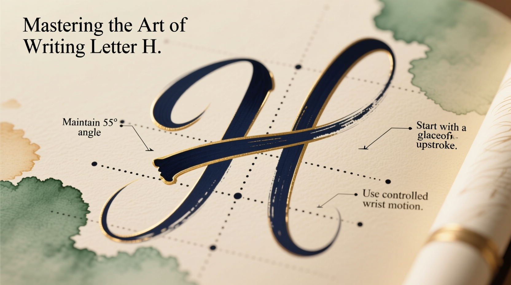
The lowercase \"h\" consists of two primary strokes: the initial vertical stem and the rounded loop or shoulder that extends to the right. In cursive, it connects seamlessly to adjacent letters; in print, it maintains distinct separation while preserving proportion. The key to an elegant \"h\" lies in understanding its structure:
- Stem: A straight, downward stroke starting from the top line.
- Shoulder: A curved extension beginning near the middle of the stem, flowing rightward like a small hill.
- Proportion: The shoulder should be about half the height of the stem, aligning with the x-height in most scripts.
When these elements are balanced, the \"h\" appears grounded yet dynamic—neither too stiff nor overly loose.
Tip: Begin each \"h\" with a light touch, increasing pressure slightly as you descend the stem to create visual weight and consistency.Step-by-Step Guide to Writing a Flawless \"h\"
Follow this structured approach to build muscle memory and precision in forming the letter \"h\":
- Position your hand correctly: Rest your forearm on the surface, hold the pen at a 45-degree angle, and let your fingers guide the motion with minimal tension.
- Start at the top line: Begin with a controlled vertical stroke descending to the baseline. Keep it straight and uniform in thickness.
- Lift slightly and reposition: After completing the stem, lift the pen just enough to reset for the shoulder (in print) or connect smoothly (in cursive).
- Draw the shoulder: From the midpoint of the stem, draw a smooth, upward-and-right arc, peaking at the x-height, then curving back down to meet the baseline.
- Connect or finalize: In cursive, extend a thin exit stroke to link to the next letter. In print, close the loop cleanly without trailing lines.
Repeat this sequence slowly at first, focusing on form over speed. Gradually increase velocity as accuracy improves.
Common Mistakes and How to Avoid Them
Even experienced writers fall into habits that compromise legibility and elegance. Below is a comparison of frequent errors and their corrections:
| Mistake | Why It’s Problematic | Solution |
|---|---|---|
| Curved or slanted stem | Weakens structural integrity and disrupts alignment | Use lined paper; practice vertical strokes separately |
| Overly large shoulder | Makes \"h\" look bloated and unbalanced | Limit shoulder height to x-height; use guidelines |
| Inconsistent spacing | Causes crowding or gaps in words like \"hand\" or \"high\" | Leave one-letter-width space between characters |
| Heavy downstroke with no variation | Results in monotonous, mechanical appearance | Apply slight pressure on downstrokes, ease up on curves |
Mini Case Study: Improving Legibility in Daily Notes
Sophie, a university student, struggled with hurried notes during lectures. Her \"h\" often appeared as a zigzagged line with no defined shoulder, making words like \"history\" and \"help\" difficult to read later. She dedicated ten minutes daily to practicing isolated \"h\" forms using dotted midline paper. Within three weeks, her shoulder curves became smoother, and her word spacing improved dramatically. Peers began commenting on the clarity of her study guides—a direct result of focused attention on one foundational letter.
Advanced Techniques for Stylistic Refinement
Once the basics are mastered, consider enhancing your \"h\" with stylistic flourishes suited to your writing style:
- Cursive flow: Ensure the exit stroke from the shoulder connects naturally to the following letter, especially in words like \"he\" or \"home.\"
- Calligraphic variation: Use a broad-tipped pen to emphasize thick downstrokes and thin upstrokes, giving the \"h\" a professional, engraved look.
- Italic slant: Angle all strokes at 5–15 degrees to the right for a sleek, modern appearance.
“Precision in individual letters compounds into confidence across entire paragraphs. The 'h' is a cornerstone of strong handwriting.” — Dr. Alan Pierce, Handwriting Analyst & EducatorTip: Trace over well-formed \"h\"s printed on transparent paper to internalize correct shape and proportions.
Essential Practice Checklist
To ensure steady progress, follow this actionable checklist weekly:
- ✅ Practice the \"h\" for 10 minutes daily using lined or grid paper.
- ✅ Focus on stem straightness and shoulder symmetry.
- ✅ Write sample words: \"hat,\" \"hope,\" \"highlight,\" \"human.\"
- ✅ Compare before-and-after samples every five days.
- ✅ Experiment with different pens (ballpoint, fountain, gel) to observe stroke variation.
- ✅ Record yourself writing to spot unconscious habits like tilting or lifting too high.
Frequently Asked Questions
Why does my \"h\" look different from other letters in my writing?
Inconsistency often stems from uneven stroke pressure or misaligned proportions. Revisit your basic technique and practice the \"h\" in isolation until it visually matches the rhythm of your other letters.
Should the shoulder of the \"h\" cross the stem?
No. The shoulder should begin at the stem but not overlap or intersect it heavily. A clean join ensures readability and elegance, especially in cursive.
Can I personalize my \"h\" once I’ve mastered the standard form?
Absolutely. Once you’ve built a solid foundation, subtle customization—such as elongating the stem slightly or adding a soft tail—can reflect your unique style without sacrificing legibility.
Final Thoughts and Call to Action
Mastering the letter \"h\" may seem minor, but it represents a larger principle: excellence emerges from attention to detail. Every time you write a clear, balanced \"h,\" you reinforce discipline, control, and aesthetic awareness. These qualities ripple outward, improving not just your handwriting but your focus and self-expression.
Don’t wait for perfection—start today. Grab a notebook, choose your favorite pen, and dedicate the next ten minutes solely to crafting the perfect \"h\". Repeat tomorrow. And the day after. Small efforts compound into remarkable results.
💬 Share your progress! Post a photo of your \"h\" practice in the comments or tag us on social media. Let’s build a community of mindful writers, one letter at a time.