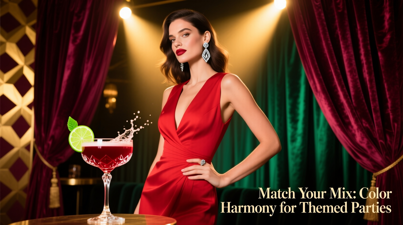
Themed parties thrive on intentionality—not just in décor or music, but in the subtle, cohesive details that signal thoughtfulness and style. One often-overlooked opportunity lies at the intersection of fashion and mixology: your cocktail. A well-chosen drink isn’t merely a refreshment; it’s a chromatic extension of your ensemble—a liquid accessory that reinforces your aesthetic narrative. When your navy blazer meets a cobalt-blue Aviation, or your coral silk dress echoes a vibrant Paloma rimmed with pink salt, you’re not just attending the party—you’re curating its visual rhythm. This alignment goes beyond aesthetics: studies in environmental psychology suggest that color harmony increases perceived confidence and social ease, making coordinated outfit-and-cocktail pairings a quiet tool for presence and poise. Below is a field-tested framework—grounded in color theory, bartender insight, and real-world party logistics—for matching cocktail hues to your attire with authenticity and flair.
Understanding the Color Wheel: Beyond “Matching”
True coordination isn’t about duplicating a hue—it’s about creating resonance. The traditional RYB (red-yellow-blue) color wheel remains the most intuitive guide for beverage and apparel pairing because it reflects how pigments (and thus liquors, syrups, and garnishes) interact visually. Start by identifying your outfit’s dominant color family—not just the shade, but its temperature and saturation. Is your emerald-green satin skirt cool-toned and jewel-bright? Or is it a muted, olive-leaning green softened by beige undertones? These distinctions determine whether you’ll seek a complementary accent (like a ruby-red pomegranate spritz) or an analogous echo (a verdant basil-cucumber gin fizz).
Three relationships matter most:
- Analogous pairing: Colors adjacent on the wheel (e.g., violet + blue + indigo). Ideal for monochromatic or tonal outfits—think lavender dress + butterfly pea flower lemonade + edible violets.
- Complementary pairing: Colors opposite each other (e.g., orange + blue). Delivers high-impact contrast without clashing—perfect for bold statements like burnt-orange trousers paired with a clarified blue curaçao sour.
- Triadic harmony: Three evenly spaced colors (e.g., red, yellow, blue). Best for maximalist themes (e.g., circus, carnival) where your outfit anchors one hue and your cocktail embodies another—like a crimson jumpsuit with a golden turmeric-mezcal smash and a blueberry foam cap.
Crucially, value (lightness/darkness) and chroma (intensity) must align. A pale blush gown pairs poorly with a neon-pink vodka cranberry—it overwhelms. Instead, choose a delicate rose petal–infused gin fizz with a whisper of hibiscus, preserving softness and sophistication.
Tip: Before finalizing your cocktail, hold a swatch of your outfit fabric next to a photo of the drink—or better yet, a physical sample of its base spirit (e.g., pour a splash of Campari into a glass to assess its true crimson depth against your scarf).A Practical Step-by-Step Matching Guide
Follow this five-step process to select a cocktail that complements—not competes with—your look:
- Identify your outfit’s anchor color. Choose one dominant hue—not an accent or pattern element. If wearing a floral print, isolate the most saturated, recurring tone (e.g., the deep teal in a botanical blouse).
- Determine its temperature and intensity. Is it warm (reds, oranges, yellows) or cool (blues, greens, purples)? Is it high-chroma (vibrant, electric) or low-chroma (muted, dusty, earthy)?
- Select your color relationship. Use the wheel: analogous for elegance and flow; complementary for drama and definition; triadic for playful energy. Avoid direct duplication unless intentionally minimalist (e.g., all-black ensemble + blackstrap rum Old Fashioned with activated charcoal garnish).
- Verify ingredient realism. Not every hue is achievable or palatable. A “true yellow” cocktail often relies on artificial dyes or overly sweet citrus—opt instead for golden-hued options like turmeric-ginger shrub with rye, or a saffron-infused martini. Prioritize natural color sources: beetroot (ruby), matcha (moss green), butterfly pea flower (sky blue), activated charcoal (matte black), hibiscus (crimson).
- Test the full composition. Consider the drink’s layers: base spirit (often clear, amber, or brown), mixer (juice, syrup, soda), and garnish (herb, fruit, salt rim, edible flower). A pale peach dress might pair beautifully with a clear prosecco float over apricot nectar—but only if the garnish is a single, fresh mint leaf—not a neon-orange maraschino cherry.
Do’s and Don’ts: Cocktail-Color Coordination at a Glance
| Action | Do | Don’t |
|---|---|---|
| For neutral outfits (black, white, gray, beige) | Use the cocktail as your sole pop of color—e.g., ivory tuxedo + blood orange negroni with rosemary | Choose muddy or desaturated drinks (e.g., brownish whiskey sour) that lack vibrancy |
| For metallic accents (gold, silver, rose gold) | Match metal tone to drink finish—gold jewelry + sparkling gold-dusted cocktail; rose gold + rosé-based spritz | Ignore metallic undertones—pairing silver hardware with a copper-mint julep creates visual dissonance |
| For seasonal themes (e.g., autumn harvest) | Embrace warm, layered tones: burnt sienna dress + spiced pear brandy sour with cinnamon foam | Rely solely on clichéd colors—pumpkin spice lattes aren’t cocktails, and bright orange “pumpkin” liqueurs rarely taste authentic |
| For patterned ensembles | Pull a secondary, less dominant color from the pattern—e.g., navy-and-white gingham shirt + navy-blue butterfly pea gin & tonic | Try to match every color in the pattern—creates visual chaos and limits drink options |
| For skin-tone harmony | Consider how the cocktail’s hue reflects light near your face—cool-toned drinks (lavender, mint) flatter cooler complexions; warm-toned (amber, rust) enhance warmer undertones | Assume “universal” colors exist—neon green may energize one person but wash out another’s complexion |
Real-World Case Study: The Midnight Garden Soirée
When interior designer Lena hosted her “Midnight Garden” party—a moody, botanical theme featuring deep indigo walls, silver mercury glass, and climbing ivy—the dress code asked guests to wear “nocturnal elegance.” Lena chose a floor-length dress in crushed sapphire velvet with silver-thread embroidery and vintage moonstone earrings. Her initial instinct was to serve classic martinis—but they felt too stark, too “white tie,” lacking the lushness of her vision.
She applied the step-by-step guide: Anchor color = sapphire (cool, high-chroma, deep value). Temperature/intensity = cool and rich. Relationship = analogous (blue → violet → purple). Ingredient realism = butterfly pea flower (naturally blue, pH-reactive) + blackberry purée (deep violet) + dry vermouth (amber, adding warmth without muddying). She crafted a “Nocturne Fizz”: butterfly pea infusion steeped in cold gin, shaken with blackberry shrub and lemon, topped with soda, and garnished with a single, fresh violet and a dusting of edible silver luster.
The result was seamless. The drink shifted from deep blue to twilight violet as guests sipped—mirroring the way light played across her dress’s velvet pile. Silver luster echoed her jewelry; the violet garnish tied back to the garden’s night-blooming flowers. Guests didn’t just notice the drink—they felt the intention behind it. As one guest remarked, “It’s like the cocktail knew what your dress was thinking.”
“Color coherence in hospitality isn’t decoration—it’s emotional architecture. When a guest sees their outfit reflected thoughtfully in their first sip, they feel seen before they’ve even said hello.” — Chef & Beverage Director Mateo Ruiz, award-winning experiential bar group *Lumen Collective*
Building Your Themed Cocktail Toolkit
Preparation prevents panic. Keep these versatile, naturally colored bases on hand for any theme—and know how to adjust them to match your wardrobe:
- Blue: Butterfly pea flower tea (steep 1 tsp dried flowers in ½ cup hot water, chill). Add lemon juice to shift to violet; pair with gin, tequila, or sparkling wine.
- Green: Fresh matcha (½ tsp ceremonial grade whisked into 1 oz hot water, chilled) or basil-cucumber juice (blend ½ cup leaves + ½ cucumber, strain). Works with vodka, pisco, or sherry.
- Red/Pink: Hibiscus tea (steep 2 tbsp dried flowers in 1 cup hot water, chill and strain) or beetroot juice (freshly juiced, strained). Complements rum, mezcal, or sparkling rosé.
- Golden/Amber: Turmeric-ginger syrup (simmer 1 cup water + ½ cup sugar + 1 tbsp grated turmeric + 1 tbsp grated ginger, strain and chill) or toasted sesame oil–infused vermouth (add ¼ tsp to 1 oz dry vermouth). Ideal with bourbon, rye, or aged tequila.
- Black/Charcoal: Activated charcoal powder (⅛ tsp per drink, mixed with syrup first to prevent clumping) or blackstrap molasses (½ tsp in stirred drinks). Best with smoky spirits like mezcal or heavily peated scotch.
Always pre-test ratios: a little hibiscus goes a long way—too much overwhelms acidity and turns drinks bitter. And never skip the garnish: it’s the final brushstroke. A single dehydrated lime wheel adds dimension to a golden cocktail; a sprig of rosemary grounds a violet drink in earthiness.
FAQ: Cocktail-Color Coordination Clarified
What if my outfit has multiple strong colors?
Focus on the color that appears largest or most centrally located—usually the main garment (dress, suit jacket, jumpsuit). If truly balanced (e.g., equal blocks of red and teal), choose the color that best represents the party’s core theme or your personal statement. Then use the complementary relationship: red outfit → teal cocktail (or vice versa). Avoid splitting the difference with a muddy “purple” drink—it dilutes impact.
Can I match with non-alcoholic drinks?
Absolutely—and often more effectively. Without spirit opacity or amber tones, zero-proof options offer truer, brighter hues. Think: cascading raspberry-lavender shrub with soda (pink-purple), cold-brew coffee infused with activated charcoal and oat milk (deep matte black), or clarified tomato water with smoked paprika oil (rust-red). Their clarity makes color alignment more precise and intentional.
My cocktail looks perfect in the glass—but dull under indoor lighting. What now?
Indoor lighting (especially warm LED or incandescent) mutates color perception. Test your drink under the same bulbs used at the venue—or take a photo using your phone’s flash off, then compare it to a photo of your outfit taken in the same light. If the cocktail appears washed out, boost saturation with a small amount of natural pigment: a drop of beet juice for reds, a pinch of spirulina for deeper greens, or a dusting of freeze-dried berry powder on the foam or rim.
Conclusion: Drink with Intention, Dress with Confidence
Cocktail-color coordination isn’t about rigid rules or performative perfection. It’s about extending your personal narrative into every sensory detail—from the drape of your sleeve to the shimmer in your glass. When you choose a drink that resonates with your outfit, you’re not chasing trends—you’re practicing visual literacy, honoring craftsmanship (both in tailoring and mixology), and inviting others into a world you’ve carefully composed. That navy suit doesn’t just hold your posture; it sets the stage for the indigo-tinged gin fizz that arrives moments later, completing the story before a word is spoken. In an age of fleeting digital impressions, this kind of tangible, thoughtful harmony feels quietly revolutionary.
Start small: pick one upcoming event. Identify your anchor color. Browse the natural pigment list above. Make one drink—not for Instagram, but for the quiet satisfaction of seeing your intention realized in liquid form. Then notice how people pause, how eyes linger, how conversation flows more easily when every element feels considered. You’re not just matching colors. You’re composing moments.
💬 Your turn. Try one pairing this month—and share what worked (or what surprised you) in the comments. Did a dusty-rose cocktail elevate your terracotta dress? Did charcoal-infused agave deepen your all-black look? Real stories inspire real confidence.