Photography has transformed how we celebrate life’s milestones—from engagement parties and rooftop weddings to golden-hour brunches and holiday soirées. In these moments, what you wear matters—but so does what you hold, sip, and surround yourself with. A well-chosen cocktail isn’t just a drink; it’s a compositional element that can harmonize or clash with your outfit, lighting, and backdrop. When styled intentionally, cocktail color becomes a subtle yet powerful extension of personal style—elevating visual storytelling in ways fabric alone cannot. This isn’t about rigid rules or trend-chasing. It’s about understanding how light, pigment, and context interact across seasons—and using that knowledge to create images that feel intentional, balanced, and authentically *you*.
Why Cocktail Color Matters More Than You Think
In professional and social photography, color is the first thing the eye registers—before cut, texture, or even expression. A vibrant fuchsia martini beside a muted sage dress may unintentionally draw attention away from the subject. Conversely, a pale lavender gin fizz beside a lilac silk blouse creates visual continuity that guides the viewer’s gaze naturally across the frame. Seasonal palettes aren’t arbitrary: they reflect natural shifts in light temperature, foliage, sky saturation, and cultural associations. Spring brings high-chroma pastels and fresh greens; summer favors saturated jewel tones and sun-bleached neutrals; autumn leans into earthy ochres and burnt ambers; winter embraces cool monochromes and rich, deep accents. Matching cocktail hues to these broader seasonal energies ensures cohesion—not mimicry. The goal isn’t to replicate your sweater in liquid form, but to echo its undertones, intensity, and emotional resonance.
“Color harmony in lifestyle photography isn’t decoration—it’s visual grammar. When drink, clothing, and environment speak the same chromatic language, the image gains quiet authority.” — Lena Torres, Editorial Stylist & Color Consultant for Vogue Living and Martha Stewart Weddings
Seasonal Palette Mapping: From Outfit to Glass
Effective matching begins with decoding seasonal color families—not just surface-level shades, but their underlying temperature (cool vs. warm), saturation (vivid vs. muted), and value (light vs. dark). Below is a practical reference table aligning common seasonal outfit tones with cocktail ingredients and presentation strategies that reinforce harmony without monotony.
| Season | Typical Outfit Tones | Cocktail Color Strategy | Realistic Ingredient Pairings | Styling Tip |
|---|---|---|---|---|
| Spring | Blush pink, mint green, butter yellow, dove gray (light, soft, slightly cool) | Use translucent, delicate hues with gentle contrast—avoid opacity or neon intensity | Rhubarb syrup + dry vermouth (rosé-hued); cucumber-infused gin + elderflower liqueur (pale green); chamomile tea–infused vodka + lemon (sunlit gold) | Serve in clear glassware; garnish with edible flowers or single mint sprig—no heavy citrus wheels |
| Summer | Terracotta, cobalt blue, coral, ivory, seafoam (bright, warm, high-saturation) | Embrace bold, juicy clarity—think “sunlit transparency” rather than murky depth | Fresh watermelon juice + tequila + lime (vibrant pink); blue curaçao + coconut water + lime (electric aqua); blood orange + mezcal + agave (fiery tangerine) | Use textured glassware (ribbed highballs, cut-crystal coupes); garnish with citrus twists or herb stems for dimension |
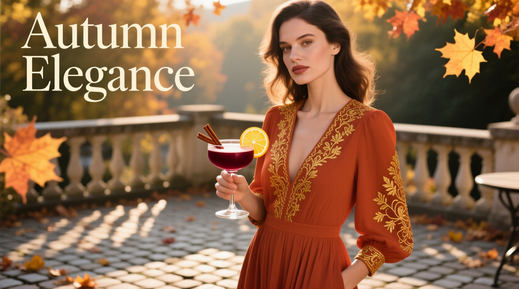
| Autumn | Burnt sienna, forest green, mustard, plum, charcoal (rich, complex, medium-to-low lightness) | Prioritize depth and warmth—amber, russet, and olive tones with visible texture or sediment | Aged rum + spiced pear syrup + bitters (copper-gold); blackberry shrub + bourbon + lemon (deep magenta); roasted beetroot + apple cider vinegar + rye (earthy ruby) | Serve in weighted rocks glasses or matte ceramic mugs; garnish with cinnamon sticks, dried orange slices, or toasted nuts |
| Winter | Charcoal, deep navy, burgundy, cream, silver-gray (cool, elegant, high-contrast) | Lean into clarity, metallic sheen, or subtle iridescence—avoid muddy browns or flat pastels | Blackstrap molasses + rye + walnut bitters (glossy mahogany); violet liqueur + gin + lemon (cool amethyst); activated charcoal–infused simple syrup + vodka + grapefruit (matte slate) | Opt for smoked glass, frosted crystal, or brushed steel vessels; garnish with crystallized rosemary or a single juniper berry |
The Step-by-Step Styling Workflow
Applying seasonal color theory doesn’t require a degree in design. Follow this repeatable five-step process before any photo-centric event:
- Analyze your primary outfit piece. Identify its dominant hue, temperature (warm/cool), and saturation (vivid/muted). Is that rust-colored sweater warm-leaning and moderately saturated? Or is the navy blazer cool and deeply saturated?
- Determine the season’s dominant light quality. Is it bright and direct (summer), diffused and hazy (spring), golden and angled (autumn), or stark and contrast-rich (winter)? This dictates whether your cocktail should appear luminous, translucent, rich, or crisp.
- Select a base spirit and modifier aligned with your palette. Gin and vodka offer clean canvases for botanical or floral infusions (ideal for spring/summer); aged rum, whiskey, and brandy provide inherent amber depth (autumn/winter).
- Choose one signature ingredient to anchor the color. Prioritize natural pigments: hibiscus (ruby), matcha (mint), turmeric (gold), activated charcoal (slate), butterfly pea flower (indigo). Avoid artificial dyes—they photograph unnaturally flat.
- Finalize vessel and garnish to reinforce harmony. A copper mug enhances warmth; a frosted coupe cools down intensity; a sprig of rosemary echoes forest green; a dehydrated lemon wheel reinforces sun-bleached brightness.
Real-World Case Study: The Lakeside Engagement Shoot
Mira wore a custom-made, hand-dyed linen dress in “dusty sage”—a low-saturation, cool-leaning green with subtle gray undertones. Her partner chose charcoal trousers and an ivory shirt. The shoot took place at sunset on a misty late-spring lakeside dock. Initial test shots felt disjointed: a bright lime margarita clashed with the soft, diffused light, while a brown whiskey sour looked muddy against the silvery water.
Stylist Anya adjusted using the seasonal workflow. She identified the scene as *cool spring*: low saturation, high atmospheric haze, and a dominant green-gray-blue triad. She created a “Lake Mist Fizz”: gin infused with foraged pine needles (adding subtle resinous depth), shaken with crème de violette (cool purple, not blue), lemon juice, and soda. Served in a clear, wide-rimmed coupe with a single edible violet and a whisper of dry ice vapor, the drink appeared ethereal and translucent—echoing the lake’s surface without competing. The violet’s cool undertone harmonized with the sage’s gray base, while the gin’s botanical clarity mirrored the linen’s texture. Final images achieved serene cohesion: the couple, the landscape, and the drink all occupied the same chromatic and emotional space.
Your Seasonal Cocktail-Outfit Matching Checklist
- ✅ I’ve identified my outfit’s dominant hue, temperature (warm/cool), and saturation (vivid/muted)
- ✅ I’ve confirmed the season’s natural light behavior (e.g., summer = high-contrast, direct; autumn = long shadows, golden hour dominance)
- ✅ I’ve chosen a base spirit that supports the desired depth (clear spirits for lightness; aged spirits for richness)
- ✅ My color-anchoring ingredient is naturally pigmented and seasonally appropriate (e.g., rhubarb for spring, blackberry for autumn)
- ✅ My glassware and garnish reinforce—not contradict—the palette (e.g., no bright citrus wheels with a muted winter outfit)
- ✅ I’ve tested the cocktail’s appearance under similar lighting conditions (natural light > phone flash)
- ✅ I’ve ensured the drink’s color reads clearly in-frame—not washed out or oversaturated
FAQ: Practical Questions Answered
Can I use food coloring if natural pigments are unavailable?
Only as a last resort—and only with professional-grade, highly concentrated gel or powder dyes. Liquid food coloring dilutes flavor, clouds clarity, and often photographs with an artificial, plasticky sheen. Natural alternatives like steeped hibiscus, matcha, or activated charcoal yield more nuanced, photogenic results and add authentic flavor layers.
What if my outfit is black, white, or neutral?
Neutrals are versatile but not neutral in practice. Black absorbs light and benefits from cocktails with high chromatic contrast (e.g., a vivid crimson negroni or electric blue gin fizz) to avoid visual flattening. White reflects light and pairs beautifully with translucent, luminous drinks (elderflower spritz, yuzu gimlet) that glow without overpowering. Charcoal or heather gray works best with drinks possessing subtle depth—think a smoky mezcal sour with burnt sugar rim or a walnut-bitter old fashioned.
How do I handle group photos with varied outfits?
Anchor the composition around the dominant seasonal tone. If three people wear coral, navy, and olive, the shared season is *summer*—so prioritize a unifying warm, saturated cocktail like a blood orange paloma or grilled pineapple margarita. Serve identical drinks to simplify styling and create rhythm. Alternatively, assign complementary variations: coral → tangerine fizz, navy → indigo gin smash, olive → basil-cucumber cooler—each echoing the same seasonal energy through different expressions.
Conclusion: Drink With Intention, Not Just Flavor
Cocktail color coordination isn’t performative aesthetics—it’s visual literacy applied to everyday joy. When you understand how a pale apricot aperitif resonates with cherry-blossom light in April, or how a smoked maple old fashioned deepens the drama of falling leaves in October, you stop choosing drinks and start composing moments. These choices accumulate: the way your friend’s blush gown glows beside a rose-petal spritz at her garden wedding; how your own navy coat feels grounded by a glossy blackstrap rum sour on a frosty December evening; the quiet satisfaction of scrolling back through photos and recognizing intention in every frame. You don’t need a bar cart full of obscure syrups or a closet of color-coded dresses. Start with one seasonal pairing this month—choose your next outfit, identify its core tone, then build a drink that speaks the same language. Capture it. Reflect. Refine. Repeat. Because the most photo-worthy moments aren’t accidental. They’re designed—one thoughtful hue at a time.
💬 Try it this season—and share your pairing in the comments. What cocktail did you match to your favorite seasonal outfit? Include the season, outfit tone, and drink name—we’ll feature standout combinations in our next seasonal roundup!